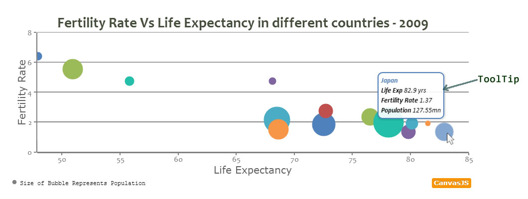
Overview – Chart ToolTip
When user hovers on a dataPoint or dataSeries, a toolTip appears with information about the dataPoint and dataSeries. Size of the toolTip is automatically adjusted depending on the content it holds.
In this Section we will study on how to set the content inside “toolTip” and style it.
Default ToolTip
By default, ToolTip content is automatically chosen based on various factors like type of the chart, whether ToolTip is shared or not, etc. ToolTip also has a border with color same as color of dataPoint or dataSeries (which can be modified).
In the example below, try different chart types to see default behaviour of toolTip.
toolTipContent – dataSeries/dataPoint
Default Tooltip can be modified at dataSeries or dataPoint level. You can add content to be displayed in toolTip using toolTipContent. toolTipContent set at dataPoint will override toolTipContent set at dataSeries level. toolTipContent can either be literal string or keywords. You can also use HTML tags.
- toolTipContent mentioned at dataSeries applies to all dataPoints unless overwritten by toolTipContent at dataPoint level.
- While setting toolTipContent, user can use the property names as a keyword.
eg: toolTipContent: "x: {x}, y: {y} " - Customize the content with any css property using inline CSS.
eg: toolTipContent: "y: <span style='\"'color: red;'\"'>{y}</span>" - In case of stacked, pie and doughnut charts you can also use special keywords like #percent & #total.
eg: toolTipContent: "{y} / #total = #percent% " - In toolTipContent, You can also use properties which are arrays as keywords. Below is an example.
In case of Range Chart :
toolTipContent: " x: {x}, y: {y[0]} , {y[1]} "
In case of candlestick and ohlc Chart :
toolTipContent: " x: {x}, y: {y[0]}, {y[1]}, {y[2]}, {y[3]} " - You can also use color of dataPoint/dataSeries as keyword {color} as part of CSS.
eg: toolTipContent: "{x}<br/> <span style='\"'color: {color};'\"'>{name}</span>, <strong>{y}</strong>", - Like we have seen above, we can give property name as keyword. Below are some of most commonly used properties.
eg: toolTipContent: "x:{x}, y: {y} <br/> name: {name}, label:{label}" - Further various html5 tags can also be used, like <h1></h1>, <strong></strong>, <br/> , <hr/> etc
eg: toolTipContent: "{label} <hr/> x: {x}, y: {y}" - Often it is required to show a hyperlink in the toolTip. One can use anchor tag and add source as shown below.
eg. toolTipContent: "<a href = '\"'http://apple.com'\"' target='\"'_blank'\"' >{label} </a> <hr/> x: {x}, y: {y}"
Try various combinations below.
toolTip Object
toolTip object controls the behaviour of toolTip for Chart. Syntax for toolTip Object.
var  chart =  new  CanvasJS.Chart("container",
{
 .
 .
 toolTip:{
      // toolTip properties
 },
 .
 .
});
chart.render();
There are number of attributes we can set inside toolTip object and Style it the way we want to. Table below lists toolTip attributes.
| Attribute | Type | Default | Options/Examples |
|---|---|---|---|
| animationEnabled | Boolean | true | true, false |
| enabled | Boolean | true | true, false |
| shared | Boolean | false | true, false |
| borderColor | String | dataPoint/dataSeries Color | “green”, “#FF0312”.. |
| content | String | auto | – |
| fontColor | String | “black” | “green”, “#FF0312”.. |
| fontStyle | String | “italic” | “normal”, “italic”,”oblique” |
| fontSize | Number | 14 | 16, 12, etc |
| fontFamily | String | “Calibri, Arial, Georgia, serif” | “arial” , “tahoma”, “verdana” .. |
| fontWeight | String | “normal” | “lighter”, “normal”, “bold” , “bolder” |
| borderThickness | Number | 2 | 1, 3 etc |
| cornerRadius | Number | 5 | 1, 3 etc |
| reversed | Boolean | false | true, false |
| contentFormatter | Function | null | function(e) { } |
| backgroundColor | String | “white” | “black”, “#FFFFFF” etc |
Shared toolTip
In a Multi-Series or a Combinational Chart, it is often required to display all values common to x value in the same ToolTip. Settings “shared” property to true will highlight all the dataPoints for the x value and display data in a single toolTip.
Setting Content of toolTip Object
toolTip for entire chart can be set by adding content at toolTip object. content is a string and contentFormatter is a custom function that returns HTML/String to be displayed inside the toolTip.
- Here is an example that uses a combination of string literals and keywords.
eg. content: "Category {x} <br/>Value: {y} units" - When content is set to a custom function, you can return any value to be displayed in the toolTip.
Where toolTip can be shown, CanvasJS sends an object containing event related values (like dataPoint, dataSeries, etc) as a parameter to the function. Structure of the parameter sent to the functione: { // parameter sent to function chart, toolTip, entries: [ //entries array {dataPoint, dataSeries}, //first dataSeries {dataPoint, dataSeries}, // second dataSeries . . ] } - Value set at toolTipContent at dataSeries and dataPoint overrides values set in content at toolTip object.
Below is an example where a simple function returns value of dataSeries name and y value.
toolTip: { contentFormatter: function(e){ return ( e.entries[0].dataSeries.name + " " + e.entries[0].dataPoint.y + "" ) ; }, } - toolTip for entire chart can be set by adding content at toolTip object. See its implementation in next example.
contentFormatter function for Shared toolTip.
When writing a custom function for shared toolTip, the parameter sent to the function has values of all dataSeries in the entries array, hence you need to recursively pass through the array length and create your custom toolTip. Function can return Text or HTML Content.
var str = "";
 contentFormatter: function(e){
    for (var i = 0; i < e.entries.length; i++){
        var temp = (e.entries[i].dataSeries.name);
        str = str.concat(temp);
    }
    return (str);
},
Also See:
54 Comments
Hey,
Is there anyway to make the toolTip only appear when the user clicks on a part of the chart/pie? Its way of behaving is particularly irritating on a doughnut.
I can’t figure how to use the onclick event properly.
Cheers!
Basilesimon,
As of now API has not been exposed to show/hide toolTip programatically. Hence it won’t be possible to show toolTip only on click event.
—
Sunil
Just checking if toolTip can already be shown programmatically as of date?
Would like to show toolTip upon click (more useful in tablets, hovering not applicable).
Thanks.
Currently, toolTip works just fine in tablets, with touch or tab.
Hi, How can I display the tooltip always close to the cursor? My tooltips sometimes display far from the graph.
Thanks,
Carlos.
@Carlos I’m getting the same thing. Always seems to be quite a bit below my mouse cursor and the graph. Any ideas anyone?
I meet the same problem. It might be caused when you are using some bootstrap template at the same time.
Can you please create a jsfiddle that can reproduce the issue so that we can figure out what is going wrong?
Hi, is there a solution for the problem? I have currently the same issue that the tooltip is even not visible on the screen because it’s far away from the data point. Problem appears when setting width to chart and div container has scrolling enabled.
Hope this explanes it: https://jsfiddle.net/ts9epkq1/
sebastian,
Thanks for reporting the bug. We will fix it and get back at the earliest.
I had a similar issue when the CanvasJS container div is within another wrapper div that defines the width and height (possibly due to float attribute). I got it working by specifying ‘height’ attribute for the chart itself.
is there any way to hide tooltio?
sorry ..
i found it
toolTip:{
enabled: false, //enable here
},
I hide the label of axis x because i want show just in tooltip, but for hide the label i set to ” “, according with comments in subject page, and now in tooltip is this (empty) that shows. can someone help?
Instead of setting the label to empty string, the better way to hide the label is set the valueFormatString to empty string which hides the label but shows the value in toolTip. Here is an example which can help you.
IS there any way to qualify with custom attributes the points of a graphic with additional info than x,y and label?
For example I want to list the lowest price line of an item. The price might be coming from different stores and I would like my tooltip to list from where I the price was listed:
ex:
for an iphone
x: 400, y: September, store: Target
x:500, y: October, store: Walmart
x: 450, y: November, store: Amazon
…
Ok I saw that you actually can add custom attributes to datapoint thanks
I want to display Mouse Cursor point in Cursor tooltip events…….
Anyone can help me its urgent……..
@ dominique Please let know how could add custom attributes to datapoint — Thanks
Neelima,
Please refer to this example.
Hey if i write
toolTipContent:'<a href=”{x}”>display</a>’
it’s not returning the object x value in the link
if i write object value say {x} inside href ex : href=”{x}”
its not returning me the x value
The tool tip keeps moving away from my mouse so I can’t click on the link within it – how do I stop this?
Thanks
I have the same trouble as Gavin. I would like to be able to click a link in the tool tip or somehow react to a marker selected event.
I discovered the click event to do this. Super easy. https://canvasjs.com/docs/charts/chart-options/data/click/
Hello
Is it possible to make a tooltip to have the following design, I have tried but I can’t seem to understand what is possible:
DATE
——
A: 1
B: 2
C: 3
I’m trying to edit the tooltip used for the High Performance Line charts. I’m doing several diagrams over power output during several days. If you have two or more days it will be hard to notice when you jump from one date to another.
Thank you!
Kind regards
Richard
Richard,
You can use contentFormatter of toolTip in this case as shown in this example.
Whenever you have large number of dataPoints, it becomes hard to see differences between individual dataPoints and also to jump from one dataPoint to the next as there will be too many dataPoints. In such cases we suggest zooming into the region of interest in order to see finer details – we have enabled zooming in the above example.
Hello Sanjoy
Awesome, that is exactly what I need! Thank you! =o]
Kind regards
Richard
Hello Sanjoy
It seems like the tooltip lost the colour schemes it had (the colours of the lines). What am I missing in the code you have given me, so it will also get this aspect? Is it just html styling, like ” + entry.dataSeries.name + “, or is something else required?
Kind regards
Richard
Ah, it stripped the html coding.
span class = colourOfLine
entry.dataSeries.name
span
Kind regards
Richard
” + entry.dataSeries.name + ”
Yes, it did the trick. Is this a normal way of doing it (what standard are you using?)?
Hello again
Is it possible to have a fixed position of the tooltip?
Now with all the data that is presented and with an image, it takes up alot of space and comes in the way of the cursor so it prevents the user from enjoying the data that is presented.
Kind regards
Richard
Richart,
Given that toolTip is a DOM element, you can write css to customize its behavior. Here is an example for the same.
Hello Sanjoy
Awesome, I should be able to find a nice style for the website!
Thank you!
Kind regards
Richard
I have a shared tooltip, and I was wondering if you could colour the tooptip name/values into the representing colour on the graph.
An example of this is your shared tooltip graph above, is it possible to colour the Q1 blue, Q2 red,Q3 purple and Q4 green, with the values in this colour?
I’ve seen the content formatter but I’m unsure how I would colour the tooltip/get the appropriate colour per label.
I’ve actually been looking into more, and figured some bits out, thought I would reply to my own comment if anyone else wants a quick answer for this:
Use the contentFormatter as shown above, it has all the information you need. You can just write HTML for it to take, and the colours are defined in the event (e), entry.dataSeries._colorSet[0]. It passes in the colour set per title.
Is it possible to use arithmetic operators on Tool tip content.? For example: #Total/100 etc (divide total by 100).
This is not possible. But you can customize toolTip using contentFormatter method.
Thanks. That was helpful.
How to format the toolTip’s ${y} value such as in JavaScript Number(y).toFixed(2)
For example, changing $10.4 to $10.40.
Thanks!
Max,
You can format toolTip’s y-value using yValueFormatString. Here is an example
Is there a way to hide tooltips for individual data points?
Yes. Here is an example.
It is possible to display time in 24h format in tooltip?
Is it possible to display the time and date in the tooltip in the format of: “HH-mm-ss MM/DD/YYYY”? I cannot find the way to format the time format on the tooltip as of now.
Evan,
You can use formatDate and toolTip-contentFormatter to achieve this. Here is the solution for your case in-which tooltip content is in the format of “HH-mm-ss MM/DD/YYYY”
I have noticed that with Pie charts, the tooltip doesn’t disappear when the mouse cursor moves away from the data set as with the other charts, is this a bug or an intentional function and is there a way to resolve this?
Tooltip has been designed this way and its not a bug. As long as the mouse is inside plotArea, tooltip will continue to show on the last hovered dataPoint.
how to see the points on the chart with out mouse hover on the chart
Krishnaveni,
ToolTip will be shown on mouse-hover. If you are trying to show data-values even without mouse-hover, you can use indexLabel.
Hello, is it possible to let CanvasJS calculate missing datapoints in the tooptip box? Best explained with an example:
dataset one:
dataPoints: [
{ x: 1, y: 10 },
{ x: 2, y: 20 },
{ x: 3, y: 30 },
{ x: 4, y: 40 },
{ x: 5, y: 50 }
]
dataset two:
dataPoints: [
{ x: 1, y: 50 },
{ x: 5, y: 10 }
]
When the tooltip would hover over point X on number 2 that it would say:
dataset one : 20
dataset two: 40 (calculated)
Can this be done without calculating the points in between directly into “dataset two” ?
Eesger,
As of now auto calculation for missing data is not possible. However you can programmatically calculate missing data using the equation of straight line and pass to the chart.
Thank you Sanjoy for answering.
I am juggling with very large amounts of data and was hoping to avoid entering even more data..
If I really need to see that information I understand there is no other way, a “harsh conclusion”, but at least I know now I don’t need to search further ;)