Overview – RangeSelector in StockChart
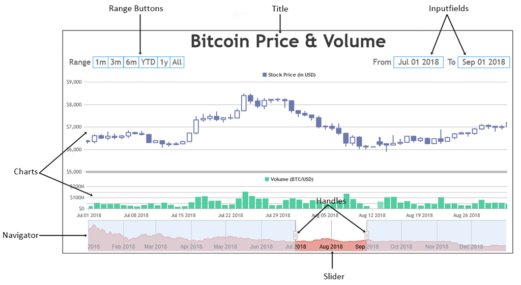
RangeSelector is used to control the range of data being shown in viewport of charts by entering the range manually. It comprises of buttons with pre-defined ranges and Inputfields to enter start and end values of range as text.
Notes- You can also integrate third party libraries like jQuery Datepicker with inputFields as shown here.
Syntax
var stockChart = new CanvasJS.StockChart("container",
{
 .
 .
 rangeSelector: {
   height: 100,
   .
   .
   buttons: [{
   .
   .
   }],
   inputFields: {
   .
   .
   }
 },
 .
 .
});
stockChart.render();
rangeSelector Object
Below are properties which can be used to customize RangeSelector.
| Applies To | Attribute | Type | Default | Options/Examples | Remarks |
|---|---|---|---|---|---|
| rangeSelector | enabled | Boolean | true | false, true | |
| rangeSelector | width | Number | Takes stockchart container’s width by default | 400, 800, etc. | |
| rangeSelector | height | Number | Auto calculated based on stock-chart size | 50, 100, etc. | |
| rangeSelector | verticalAlign | String | “top” | “top”, “bottom” | |
| rangeSelector | label | String | “Range” | “Zoom”, “Range”, etc. | |
| rangeSelector | selectedRangeButtonIndex | Number | none | 1, 2, etc. |
You can set the initially selected range button programmatically using selectedRangeButtonIndex property as shown below.
buttons Array
buttons array is a collection of Range Buttons to be shown inside the Range Selector.
var stockChart = new CanvasJS.StockChart("container",
{
 .
 .
 rangeSelector: {
   .
   .
   buttons: [
     {
       label: "1Month",
       range: 1,
       rangeType: "month"
     }
   ]
   .
   .
 }
 .
 .
});
stockChart.render();
Below are properties which can be used to customize Range Buttons.
| Applies To | Attribute | Type | Default | Options/Examples |
|---|---|---|---|---|
| buttons | label | String | Automatically assigned based on the range | “1M”, “5M” |
| buttons | range | Number | Auto Calculated based on data | 1, 4 … |
| buttons | rangeType | String | “month” | “numeric”, “millisecond”, “second”, “minute”, “hour”, “day”, “week”, “month”, “year”, “ytd”, “all” |
Customizing Range Buttons
You can customize the number of buttons, their range and labels (text) to be shown using the properties listed above. Here is an example:
Styling Range Buttons
There are number of attributes you can set inside buttonStyle object to customize the look and feel of the Range Buttons.
var stockChart = new CanvasJS.StockChart("container",
{
 .
 .
 rangeSelector: {
   buttonStyle: {
     backgroundColor: "grey",
     .
     .
   },
   .
   .
 },
 .
 .
});
stockChart.render();
Below are the button styling attributes.
| Applies To | Attribute | Type | Default | Options/Examples | Remarks |
|---|---|---|---|---|---|
| buttonStyle | backgroundColor | String | “white” | “blue”, “#a0beec” | |
| buttonStyle | backgroundColorOnHover | String | “#41a5f5” (varies based on themes) | “grey”, “#2196f3” | |
| buttonStyle | backgroundColorOnSelect | String | “#008eff” | “darkSlateBlue”, “#eaeaea” | |
| buttonStyle | borderColor | String | “#2196f3” (varies based on themes) | “Crimson”, “#41a5f5” | |
| buttonStyle | borderThickness | Number | 1 | 2, 4 … | |
| buttonStyle | labelFontColor | String | “grey” | “red”, “#FAC003” | |
| buttonStyle | labelFontColorOnHover | String | “grey” | “yellow”, “#FAC003” | |
| buttonStyle | labelFontSize | Number | Auto Calculated based on Stockchart Size | 14, 16 … | |
| buttonStyle | labelFontStyle | String | “normal” | “normal”, “italic”, “oblique” | |
| buttonStyle | labelFontFamily | String | “Calibri, Optima, Candara, Verdana, Geneva, sans-serif” | “calibri”, “tahoma”, “verdana” | |
| buttonStyle | labelFontWeight | String | “normal” | “lighter”, “normal”, “bold”, “bolder” | |
| buttonStyle | width | Number | Auto Calculated based on Stockchart Size | 8, 10, 11 … | |
| buttonStyle | maxWidth | Number | Auto Calculated based on Stockchart Size | 4, 8, 16 … | |
| buttonStyle | padding | Number | { left: 5, right: 5, top: 2, bottom: 2 } | { left: 2, right: 2, top: 2, bottom: 2 }, 2 , 3 | |
| buttonStyle | spacing | Number | 0 | 1, 3, 4 … | |
| buttonStyle | cursor | String | “pointer” | “pointer”, “move”, “crosshair” |
Here is an example which shows how to style range buttons using the above properties.
inputFields Object
inputFields allows you to set range of the data to be displayed on all charts. You can also integrate third party libraries like jQuery Datepicker with inputFields as shown here.
var stockChart = new CanvasJS.StockChart("container",
{
 .
 .
 rangeSelector: {
   inputFields: {
     startValue: new Date(2017, 06, 01),
     endValue: new Date(2017, 09, 01)
   },
   .
 },
 .
 .
});
stockChart.render();
Below are properties which can be used to customize Inputfields.
| Applies To | Attribute | Type | Default | Options/Examples | Remarks |
|---|---|---|---|---|---|
| inputFields | enabled | Boolean | true | true, false | |
| inputFields | startValue | Number/Date/Timestamp | Automatically Calculated based on data. | 20, 100, new Date(2017, 06, 01) | |
| inputFields | endValue | Number/Date/Timestamp | Automatically Calculated based on data. | 400, 700, new Date(2017, 09, 04) | |
| inputFields | valueType | String | Automatically Calculated based on data. | “number”, “dateTime” | |
| inputFields | valueFormatString | String | null | “DD-MM-YYYY” | Auto Formatted |
Setting the Initial Range using Inputfields
You can set the initial range of data by using startValue and endValue of inputFields as shown in below example. Note that slider (inside Navigator) adjusts its range accordingly.
Styling Inputfields
You can style the Inputfields by using style object under inputFields.
var stockChart = new CanvasJS.StockChart("container",
{
 .
 .
 rangeSelector: {
   inputFields: {
     style: {
       backgroundColor: "#d8d8d8"
     },
     .
     .
   },
   .
   .
 },
 .
 .
});
stockChart.render();
Below are the styling attributes.
| Applies To | Attribute | Type | Default | Options/Examples | Remarks |
|---|---|---|---|---|---|
| style | backgroundColor | String | “white” | “blue”, “#a0beec” | |
| style | borderColor | String | “#2196f3” | “blue”, “#d3d1dc” | |
| style | borderColorOnFocus | String | “#008eff” | “black”, “#eaeaea” | |
| style | borderThickness | Number | 2 | 3, 4 | |
| style | fontColor | String | “#000000” | “black”, “#d3d1dc” | |
| style | fontSize | Number | 12 | 1, 2 | |
| style | fontStyle | String | “normal” | “normal”, “italic” , “oblique” | |
| style | fontFamily | String | “Trebuchet MS, Helvetica, sans-serif” | “Arial, Trebuchet MS, Tahoma, sans-serif” | |
| style | fontWeight | String | “normal” | “lighter”, “normal”, “bold” , “bolder” | |
| style | width | Number | Auto Calculated | 90, 100 | |
| style | maxWidth | Number | Auto Calculated | 750, 960 | |
| style | padding | Number | 2 | 6, 10 | |
| style | cursor | String | “text” | “pointer”, “crosshair” |
Here is an example which shows how to style Inputfields using the properties listed above.