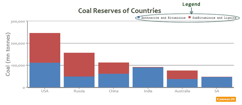
Overview – Chart Legend
When the data appearing in a chart contains multiple dataSeries, it becomes more readable if they are shown in a legend. This helps in identifying each dataSeries/dataPoint in the chart.
In this section we will study about Styling and Aligning Legend.
Enabling Default Legend
When we want Legend to appear for a dataSeries, we set showInLegend to true in that dataSeries, this makes the dataSeries to appear in legend. This way you can choose which dataSeries to show in legend.
By default name of series is shown in legend. To Customize the text, you can mention legendText in dataSeries.
In the next example we will enable legend and add custom text to it.
Legend Object
After Enabling Legend for Charts, we can control the appearance, positioning and Styling of legend.
var  chart =  new  CanvasJS.Chart("container",
{
 .
 .
 legend:{
   //legend properties
 },
 .
 .
});
chart.render();
| Applies To | Attribute | Type | Default | Options/Examples |
|---|---|---|---|---|
| legend | cursor | String | null | “pointer”, “crosshair”.. |
| legend | fontSize | Number | 12 | 25, 30 .. |
| legend | fontFamily | String | “Trebuchet MS, Helvetica, sans-serif” | “arial” , “tahoma”, “verdana” .. |
| legend | fontColor | String | “#333333” | “red”, “yellow” ,”#FF0000″ .. |
| legend | fontWeight | String | “bold” | “lighter”, “normal, “bold”, “bolder” |
| legend | fontStyle | String | ““normal”” | “normal”,“italic”, “oblique” |
| legend | markerMargin | Number | Auto calculated based on fontSize | 4, 12.. |
| legend | itemclick | Function | null | function (e){….} |
| legend | itemmouseover | Function | null | function (e){….} |
| legend | itemmousemove | Function | null | function (e){….} |
| legend | itemmouseout | Function | null | function (e){….} |
| legend | reversed | Boolean | false | true, false |
| legend | maxWidth | Number | Automatically calculated based on the chart size. | 200, 300, etc. |
| legend | maxHeight | Number | Automatically calculated based on the chart size. | 200, 300, etc. |
| legend | itemMaxWidth | Number | Automatically calculated based on the chart size. | 200, 300, etc. |
| legend | itemWidth | Number | Automatically calculated based on the chart size. | 200, 300, etc. |
| legend | itemWrap | Boolean | true | true, false |
| legend | itemTextFormatter | Function | null | function(e) {} |
| legend | dockInsidePlotArea | Boolean | false | true, false |
Below Chart we will Add font Properties to Style the text appearing in legend.
Aligning Legend
Legend can be positioned in 8 different places by combining verticalAlign and horizontalAlign properties. Below is a table showing various combinations.
| Options | horizontalAlign | verticalAlign |
|---|---|---|
| 1 | “left” | “top” |
| 2 | “left” | “center” |
| 3 | “left” | “bottom” |
| 4 | “center” | “top” |
| 5 | “center” | “bottom” |
| 6 | “right” | “top” |
| 7 | “right” | “center” |
| 8 | “right” | “bottom” |
Finishing it up.
In the next example, we add legend in a chart and style it by adding legend object to the Chart Options.
50 Comments
Padding (and Line-height) control for legends would be nice because the legend touches the right border of the canvas box sometimes.
Gilles,
If you can create a fiddle showing the issue, we’ll fix the same at the earliest. I’ll add Padding to the wish list.
Hi, you can take a look at this : http://jsfiddle.net/toubia95/wCAgE/
And by the way, congrats for your work on CanvasJS !!
Thank you… A margin of few pixels should fix the issue. I’ll do the same in the next release…
Is that posible to hide the coresponding dataseries in the chart by clicking the legend text….?
Madhan, this feature is not available as of now. But am planning to implement it in future versions…
Update: This is possible from version 1.4. Here is an example.
how do we specify line color for a line chart? Please help
You can use the color property of data series – https://canvasjs.com/docs/charts/chart-options/data/color/
Is there any way to specify a background color and border for the legend, to make it stand out a bit from the background?
Brian, it is not possible yet. But I’ll consider it for future versions.
Is it possible to define a legend for each column, when there is only one series of data?
It is not possible to show legend for each column that way. But you workaround this by creating multiple series – each with a single dataPoint.
Can we apply hyperlink to legendtext?
It is not possible turn legend into a hyperlink
Is it possible to dynamically change the ” legendText ” when updating the datapoints (without refreshing the page) ?
What I mean by this is, on a multi-line dynamic chart, I would like to remove a add another one, this works..except for the legend text and tooltip/name……how do you update those ?
Not to worry…. I worked it out thanks..
I put the chart creation in it’s own function, then when I remove/add a line, I set the datapoints on all lines to zero and then call the the chart creation function…refreshing the chart with the new info.
You should be able to do it easily.. Check out this jsfiddle. http://jsfiddle.net/canvasjs/eq6Uw/
Excellent….thank you very much for the jsfiddle, definitely a lot easier than my approach :)
Hi is possible to draw border with rounded corners arround legend?
Hi Sunil, Thanks for such wonderful charts.
Have you ever got chance to work on Padding (and Line-height) control for legends ? Legend touches the right border of the canvas box sometimes.
Someone already created a fiddle for this, I am reusing that.
http://jsfiddle.net/toubia95/wCAgE/
He is it possible to extend the legend outside of the chart area, as I would like to enable filtering of the data points on a separate table. For now the only thing I see is being able to use the legend within the Chart area.
Hi,
Its not possible to render legend outside the chart area. But in case you want to filter data in a table or something based on the legend clicked by the user, you can do so by subscribing to legend’s itemClick event.
Hi,
Is it possible to set Legend height and width (Not legend label size)?
karthik,
It is not possible yet. But currently we are implementing maxWidth and maxHeight property for legend which should be available in the next version – by the end of this month.
okay thanks for reply.. I am waiting for release of next version..
Hi, Ihave a problem,
How i can to show legend , value , and data in multiline chartjs with database?
msp,
Please refer to this example in php.
Hi, I am plotting multi charts. Is it possible to keep legends in left bottom of the page , currently it is at just below the charts. ??
Also Is it possible to create each legend in new line, currently all legend are grouping horizontally with space separating. ??
You can do the same by setting horizontalAlign as “left”, verticalAlign as “bottom”,
and maxWidth suitably to wrap legend.
This doesn’t work very well if you have multiple lines/legends (50+) in the chart.
– Even if verticalAlign=left and horizontalAlign=bottom is set this doesn’t work after ~ 50 legends. There will be more than one legend per line and each item seems to be stripped.
– The size of the legend (amount of items/length) affects the size of the chart. there should be a way for force the width+height for the chart and legend separately.
We’ve put a limit on the maximum height of Legend (relative to chart height) so that it doesn’t keep reducing chart’s size and that is why it gets clipped after a certain number. You can override this behavior by setting maxHeight property of legend. Generally it is not recommended to have too many (>40) legends. Still, if it not avoidable, you increase the chart’s height itself in order to accommodate all the legends.
That’s one idea but the chart height (chart + legend) does vary if you have e.g. 20 legends compared to 30 legends. The result is that also the chart (plot area) varies in size for these two examples. In other words, the legend size is growing and consuming space from the chart plot area.
I assume everyone would like to have the same dimensioning of the actual chart area independently of the amount of legends. One solution could be to implement variables for setting fixed size of the chart area and then just let the legend grow according to needs.
Thanks for the suggestion. Though this feature is not available as of now, we’ll consider this in future versions.
This is an outstanding work. Thanks very much!
Just one simple question, instead of giving a fixed value like fontSize: 20, I would like to use relative fontsize: 3em.
How could I do that? If this feature is not supported, it would be nice to use CSS to alter the size from outside.
Thanks again,
Germán
Sorry, but we only support pixel values as of now.
Ok, thanks.
In a splineArea chart, the legend icons are triangles. Can the legend icon shape be changed to a square?
You can do the same by setting legendMarkerType to “square”.
Error when i used two charts. second 2 is not appear.
Can you please create a jsfiddle so that we may look into the issue.
Hi, Can some one help me to add padding between legend text and legend marker?
As of now we don’t have padding feature available in legend.
Thanks Sanjoy
Great job guys!! Such a handy and easy graph through canvasjs.
How can I show legends of my choice in bar graph. in given bar graph below. I want orange color should be shown as : “used”, green as “free”, red as “not available”, blue as “faulty”. It is bar graph. so legend should be defined on the basis of color.
dataPoints: [
{ label: “avb0”, y: 100, color: “orange” },
{ label: “avb1”, y: 100, color: “green” },
{ label: “avb2”, y: 100, color: “orange” },
{ label: “avb3”, y: 100, color: “blue” },
{ label: “avb4”, y: 100, color: “orange” },
{ label: “avb5”, y: 100, color: “green” },
{ label: “avb6”, y: 100, color: “red” },
{ label: “avb7”, y: 100, color: “orange” },
{ label: “avb8”, y: 100, color: “orange” },
{ label: “avb9”, y: 100, color: “blue” },
{ label: “avb10”, y: 100, color: “green” },
{ label: “avb11”, y: 100, color: “orange” },
{ label: “avb12”, y: 100, color: “red” },
{ label: “avb13”, y: 100, color: “blue” },
{ label: “avb14”, y: 100, color: “orange” },
{ label: “avb15”, y: 100, color: “orange” },
]
sorry sorry its a column chart.
Legends are present at dataSeries-level for column-charts, and not at dataPoints-level as of now. Here is a workaround for your case.
Thanks!!! It worked for my case.
how to display the data to this chart from database values.
Krishnaveni,
Here are some of the examples on how to pass data from database to CanvasJS.
Example 1, Example 2, Example 3