Overview – Tick Marks, Grid Lines and Interlaced Colors
Tick Marks, Grid Lines & Interlaced Colors are part of Axis and they improve readability of a chart. Below is an image showing all three elements. Tick Marks have been exaggerated so that they are easily visible.
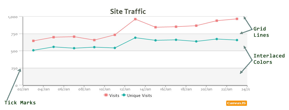
Tick Marks
Ticks are small lines between axis and their labels. The interval of tick marks can be set by varying interval property of parent axis. Note that interval property in axis applies to ticks, grid lines, labels and interlaced colors.
The visual properties of ticks can be varied by using the following properties.
| Applies To | Attribute | Type | Default | Examples |
|---|---|---|---|---|
| axisX/axisY/axisY2 | tickLength | Number | 5 | 15, 20 |
| axisX/axisY/axisY2 | tickColor | String | “black” | “red”, “#006400” .. |
| axisX/axisY/axisY2 | tickThickness | Number | 1 | 5, 8.. |
You can try out various tick properties on in the below snippet.
Grid lines
To display grids, set gridThickness to a value greater than zero on the corresponding axis. The repetition of grid lines can be controlled by setting interval property.
Grid lines have two properties for varying their appearance.
| Applies To | Attribute | Type | Default | Examples |
|---|---|---|---|---|
| axisX/axisY/axisY2 | gridThickness | Number | 0 | 5, 8.. |
| axisX/axisY/axisY2 | gridColor | String | “#A0A0A0” | “red”, “#006400” .. |
| axisX/axisY/axisY2 | gridDashType | String | “solid” | “dot”, “dash” .. |
We assign different gridline properties to all three axis in the below snippet.
Interlaced Colors
Interlacing in a Chart is when a color alternates between a set interval. If user doesn’t set interval, then the auto calculated interval is considered.
We can enable interlacing by setting interlacedColor to a color name or hex Code in the corresponding axis.
Finishing it up.
Learning all the properties, Tick marks, Grid lines, Interlaced Colors, based on interval attribute, we can draw a neat chart with higher readability using above concepts.
Also See:
16 Comments
How can I draw an horizontal specific line in the point I want? For example, a green line in the 150 (employee performance)
Hi,
I’d have the same question as Bony: is it possible to draw a specific line at a specific x or y point?
Thanks,
Cissou,
We have been working on this feature. You should be able to see this feature in the a week or so. Ping me next week on our forum and I’ll give you a new build with this feature.
—
Sunil
Is this feature now available?
Yes. Please check out StripLines.
Thank you. I did find that in the meantime :)
Is there a way to disabled them? I’m currently using the same as background color, which in my opinion is a terrible hack.
Correction: “disable”
How can I capture the color of the last line added? I need to make a legend of the chart. Thanks
thanks Mr.Sunil. I’m Indonesian and i love CanvasJS!
You are welcome. We are glad that you liked CanvasJS Charts… :-)
Hi I Am Using Line Graph and in that i want to show multiple line in this.
but the problem is if any line has higher value then automatically y axis range take that value range because of that i am not able to see lower value .they are getting merged with x axis.
so is there any solution for that so i can see both higher and lower values clearly.
Thanks.
Rupesh,
You can use secondary Y axis in this case. Here is an example.
How to display the database values to the UVcharts in xaxis one value is there and in y axis multiple values is there please help me
I retrieve data from sql server, but not show graph, do you have any solution?
KEA,
It’s hard to guess issues without looking into code. Please can you create an jsfiddle and also provide a sample JSON data, so that we can look into it and help you out.