Overview – Markers in Chart
Markers are used to uniquely represent a particular dataSeries or dataPoint. Markers can appear in two different place – on charts and in legend. By default Markers are automatically enabled when number of dataPoints are less – automatically determined based on Chart Size. You can manually override the automatic enabling/disabling of markers by setting markerSize to a value equal to or greater than zero. Below we see an image representing markers in a chart.
Notes- Currently markers are supported in Line Charts, Area Charts, Scatter Charts and Bubble Charts only – not available in Column/Bar charts.
- To disable marker use markerType as “none”.
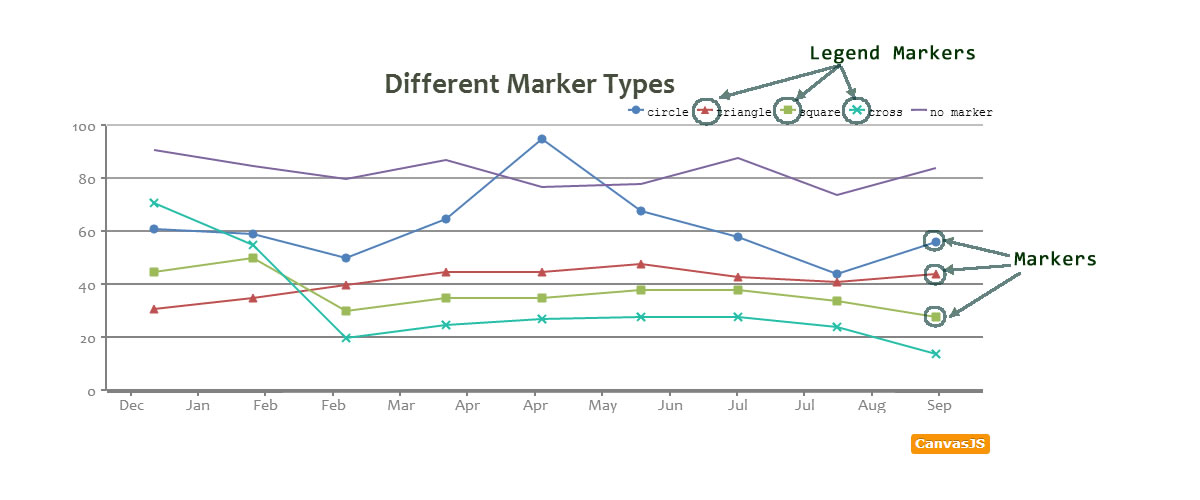
Different Type of Markers
markerType property can have five possible values – “circle”, “square”, “triangle” ,”cross” & “none”. Below is an example showcasing the same.
Styling Marker
Default markers can be overridden by setting marker properties. You can customize markers using the below properties/attributes.
| Applies To | Attribute | Type | Default | Options/Examples |
|---|---|---|---|---|
| dataSeries/ dataPoint | markerType | String | “circle” | “none”, “circle”, “square”, “cross”, “triangle”, “line” |
| dataSeries/ dataPoint | markerColor | String | auto. takes dataSeries/dataPoint color | “red”, “#DEB887”, rgb(255,0,0), … |
| dataSeries/ dataPoint | markerSize | Number | auto. Zero for area chart | 5, 10.. |
| dataSeries/ dataPoint | markerBorderColor | String | marker Color | “red”, “#1E90FF”.. |
| dataSeries/ dataPoint | markerBorderThickness | Number | 1 | 4,6.. |
Custom Marker for individual dataPoint
Certain times we may want a dataPoint to stand out from the rest. In these cases, you can override default marker behaviour only for that particular dataPoint as shown below.
Styling Legend Markers
If you want a different set of marker in legend from those plotted on chart, you can use the following properties of dataSeries/dataPoint.
| Applies To | Attribute | Type | Default | Examples |
|---|---|---|---|---|
| dataSeries/ dataPoint | legendMarkerType | String | “circle” | “none”, “circle”, “square”, “cross”, “triangle” |
| dataSeries/ dataPoint | legendMarkerColor | String | marker Color | “red”,”#1E90FF”.. |
| dataSeries/ dataPoint | legendMarkerBorderColor | String | dataSeries Color | “red”,”#1E90FF”.. |
| dataSeries/ dataPoint | legendMarkerBorderThickness | Number | 0 | 2, 4.. |
In the below code snippet, we will have different looking markers on dataSeries and inside legend. Though this is not recommended, we have provided the feature because of some special cases.
Finishing it up.
Below is an example that uses all the above concepts.
Also See:
16 Comments
Can I rotate a marker? For example, if I want to make a wind graph with ‘flags’ that show wind direction would it be possible using “rotate” in some way?
Mike, It is not possible to rotate markers.
Currently, the point markers disappear when the points reach a predetermined density. This is great. It would be very nice if this behavior would work the same way when zoomed. For example, if the user zooms below the trigger density then the point markers would reappear.
Marker color examples above look like a copy-paste error.
Can the legend markers inherit the markerBorder properties?
Can I configure graph, for showing markers only when mouse over point on grpah line, and otherwise do not show any markers when mouse out of graph line?
You can do so by setting markerSize to zero as shown in this jsfiddle.
Hi, i have a chart with 2 custom markers a green for min and a red for max. The max can be seen easily , but the green is at the bottom of the chart and is almost invisible. Can you help me please.
Here is a picture of my chart http://postimg.org/image/46ur05c4d/ .
This is my configuration units,min and max are my variables. I tried changing includzero to true but it didnt work.
axisY: {
includeZero: false,
title: units,
viewportMinimum: min -2,
viewportMaximum: max
}
Hi here i am using line graph what i want is whether it is possible that single line graph can be drawn with 2 different colors like half of the graph is blue and remaining half red?
This feature is not available yet. But you can workaround this problem by drawing two different dataSeries side by side – multiseries chart.
My markers are disappearing for no good reason in my real-time chart. It does not matter what I set markerSize to. The time the markers disappear depends on the width of your screen. On my desktop screen they disappear in about 45 seconds. On an iPad they disappear in about 25 seconds. You can witness this behavior by going to http://www.abacharts.com and clicking start and then click “response” and “reinforcer” a few times and just wait.
It is very important that the markers stay on the chart ALWAYS for this project, otherwise the chart is useless. Is there any way to force this behavior? Thank you.
Shaun,
I just looked into your code and it doesn’t seem like you are setting markerSize in reinforcer – you’ve only set markerType to cross. Unless the markerSize is set, chart tries to handle it by itself – showing markers when there are less number of dataPoints and removing them when there are large number of dataPoints.
Here is a jsfiddle where we are setting markerSize and it works fine.
Thanks, I must have had a typo before in “markerSize” before because it wasn’t doing anything, so I took it out. Now it’s working!
It seems makers only support “circle”, “square”, “triangle” ,”cross” & “none” as of now.
Does the markers also support URL to any graphic, like attribute given on this form: “url(graphic.png)”?
Thanks
XinQian,
Sorry, as of now chart doesn’t support adding image as marker type.
is there any way can i show marker of select data set on graph both on touch and desktop?
Venkat,
You can use click event and set markerSize to select on click. Here is an example.