Overview – Available Chart elements in CanvasJS
Below is an image showing all the basic elements of a chart.
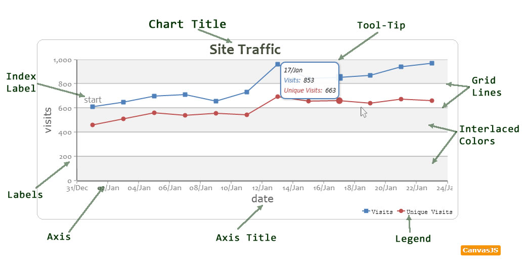
Chart Title
A Charts Title is used to describe the chart.
Legend:
Chart Legend that you can position in in 8 different places.
Grid Lines:
To Improve readability of the chart, Grid lines are used. You can display Horizontal and Vertical Grid Lines.
Tool-Tip
ToolTip displays additional information about a dataPoint/dataSeries upon hovering.
Label:
Labels that appear on an axis are either auto-generated or set by the user.
Axis:
X & Y Axis for Chart. CanvasJS supports one X Axis and Two Y Axis (Primary & Secondary)
Axis Title:
Title of an Axis. Each Axis has its own title Property.
Index Label:
Index Labels can be used to display additional information about a dataPoint. Its orientation can be either horizontal or vertical
Interlaced Color:
An alternating band of color that appears on the plot area.
In the coming sections, you can learn more about each of these elements and customizing them.
17 Comments
how to show multiple Doughnut chart in single page please give ur suggestion please….
Here is an example http://jsfiddle.net/canvasjs/ScLPk/
Thanks a lot sir ….
How to create chart with different color each time i visit the page
Here’s an example of the same:- http://jsfiddle.net/canvasjs/7n8BV
This page demonstrates “how to create a CanvasJS colorset” with your set of chosen colors.
In the demonstrated example/jsfiddle, I am generating some random number of colors (atleast 4), pushing them in a new ColorSet, and passing the same to be used in CanvasJs.
Since, the generation happens every time you land on the page, you experience diverse colors.
how can I dynamically call the value in doughnut chart width loop. let me explain u in brief , I have to show students marks after completing his/her test …and chart show marks according subject wise…
i am using dynamic data i want to hide the indexLabel if the value is 0 incase of pie chart.
Hi Sunil, how to create heart rate or pule chart.
nagapriya,
Can you please explain what you mean by heart rate chart. Any reference/ link would be helpful.
my requirement is to draw human pulse chart in php, mysql,wamp server.
I have the xval=1,25,… and yval=2,4… (i do not have the llive dataset, i have to manualy prepare it)
can you please help
Hi,
It is possible to add an area for comments?
This area is to display the filters applied to generate the chart.
Sorry my English, is not my native language.
You can consider using subtitles for the same.
Thank you for your answer.
But this way is kind of weird the distribution of elements. It would be best if it could be placed below the graph.
My suggestion is to add an attribute to the caption that allows you to move it to the footer. Or create another element to this function.
You can place it below the graph using verticalAlign and position it horizontally using horizontalAlign property.
Thanks!
How change background color for chart?..currently its showing white color..
You can do the same by using backgroundColor property.