Login to Ask a Question or Reply
Forum Replies Created by Indranil
-
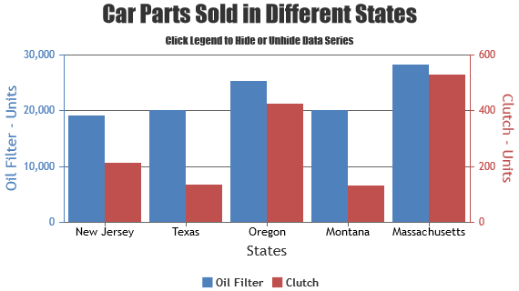
You can customize chart elements like Title, Legend, Axis, Data using chart options like fontFamily, fontColor, labelFontColor, labelFontFamily, labelFontSize, lineColor, makerColor, etc. Please refer to this documentation page for list of customization options available.
In particular, for example, to make the effect of waterlighting the lines of the chart, add the effect of ripple of chart points and chart elements. Could it be possible to use existing libraries with canvasjs connectivity?
Could you please provide a pictorial representation of your requirement so that we can understand your scenario better and help you out with appropriate resources?
___________
Indranil Deo
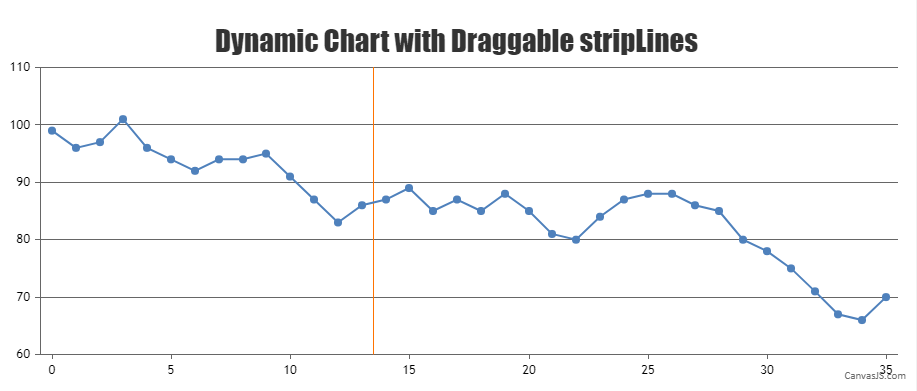
Team CanvasJSYes, you can have a draggable stripLine over x-axis in dynamic chart. The stripLine can be made draggable by first checking if the mousedown event is fired within the bounds of the stripLine as shown in the code below –
$(".canvasjs-chart-canvas").last().on("mousedown", function(e) {
  // Get the selected stripLine & change the cursor
  var parentOffset = $(this).parent().offset();
  var relX = e.pageX - parentOffset.left;
  var relY = e.pageY - parentOffset.top;
  var snapDistance = 10;

  for(var i = 0; i < chart.options.axisX[0].stripLines.length; i++) {
    if(relX > chart.axisX[0].stripLines[i].get("bounds").x1 - snapDistance && relX < chart.axisX[0].stripLines[i].get("bounds").x2 + snapDistance && relY > chart.axisX[0].stripLines[i].get("bounds").y1 && relY < chart.axisX[0].stripLines[i].get("bounds").y2) {
      selected = i;
      $(this).css("cursor","pointer");
    }
  }
});
If the mousedown event is fired within the bounds of the stripLine then update the stripLine value on movement of mouse pointer and de-select the stripLine on mouseup event –
$(".canvasjs-chart-canvas").last().on("mousemove", function(e) {
  // Move the selected stripLine
  if(selected !== -1) {
    var parentOffset = $(this).parent().offset();
    var relX = e.pageX - parentOffset.left;
    chart.options.axisX[0].stripLines[selected].value = chart.axisX[0].convertPixelToValue(relX);
    chart.render();
  }
});

$(".canvasjs-chart-canvas").last().on("mouseup", function(e) {
  // Clear Selection and change the cursor
  selected = -1;
  $(this).css("cursor","default");
});
Please take a look at this JSFiddle for a complete working code.
___________
Indranil Deo
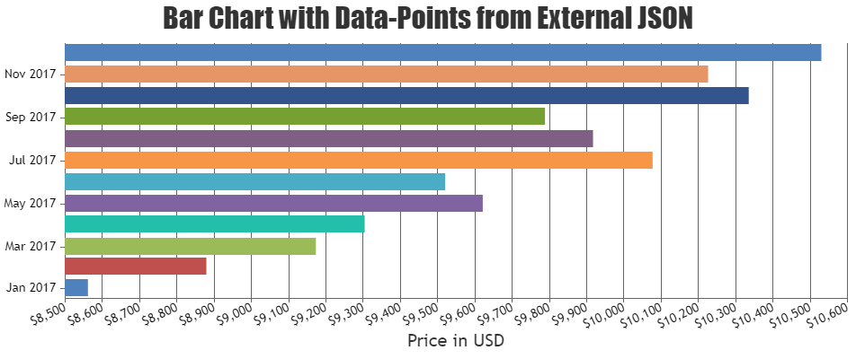
Team CanvasJSTo create chart from JSON data you need to loop through the JSON source and parse it to the format accepted by CanvasJS as shown in the code snippet below –
$.getJSON("https://api.npoint.io/15a2e36f801cc544c90b", function(data) {
  $.each(data, function(key, value){
    dataPoints.push({x: data[key].x, y: parseInt(data[key].y)});
  });
  chart.render();
});
Please take a look at this documentation page for step to step instruction on rendering chart from JSON data. Also, kindly check this StackBlitz example for complete code on rendering chart from JSON data in Angular.
___________
Indranil Deo
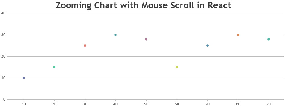
Team CanvasJSYou can use react onWheel event to zoom into the chart by updating the viewportMinimum and viewportMaximum properties as shown below –
wheelHandler = (e) => {
  e.preventDefault();
  if(e.clientX < chart.plotArea.x1 || e.clientX > chart.plotArea.x2 || e.clientY < chart.plotArea.y1 || e.clientY > chart.plotArea.y2)
    return;

  var axisX = chart.axisX[0];
  var viewportMin = axisX.get("viewportMinimum"),
      viewportMax = axisX.get("viewportMaximum"),
      interval = axisX.get("minimum");

  var newViewportMin, newViewportMax;

  if (e.deltaY < 0) {
    newViewportMin = viewportMin + interval;
    newViewportMax = viewportMax - interval;
  }
  else if (e.deltaY > 0) {
    newViewportMin = viewportMin - interval;
    newViewportMax = viewportMax + interval;
  }

  if(newViewportMin < chart.axisX[0].get("minimum"))
    newViewportMin = chart.axisX[0].get("minimum");

  if(newViewportMax > chart.axisX[0].get("maximum"))
    newViewportMax = chart.axisX[0].get("maximum");

  if((newViewportMax - newViewportMin) > (2 * interval)){
    dataPointCounter = 0;
    for ( var i = 0; i < chart.options.data[0].dataPoints.length; i++ ){
      if(chart.options.data[0].dataPoints[i].x > newViewportMin && chart.options.data[0].dataPoints[i].x < newViewportMax){
        dataPointCounter++;
      }
    }
    if(dataPointCounter > 2){
      chart.axisX[0].set("viewportMinimum", newViewportMin, false);
      chart.axisX[0].set("viewportMaximum", newViewportMax);
    }
  }
};
Please take a look at this StackBlitz for an example.
___________
Indranil Deo
Team CanvasJSThe panning behavior seems to be working as designed. For the zoom/pan functionality to work there should be a minimum of 3-4 dataPoints within the viewport – behavior is designed such that zooming is limited upto a certain region, so the user doesn’t end up zooming into a blank-region (region with no dataPoints). Due to this restriction, it’s not possible to pan chart as you zoom into the region with just 2 dataPoint.
In the above JSFiddle example to make the panning functionality work, you can add a limit to zooming beyond 3 dataPoints as shown in the code snippet below –
if((newViewportMax - newViewportMin) > (2 * interval)){
  dataPointCounter = 0;
  for ( var i = 0; i < chart.options.data[0].dataPoints.length; i++ ){
    if(chart.options.data[0].dataPoints[i].x > newViewportMin && chart.options.data[0].dataPoints[i].x < newViewportMax){
      dataPointCounter++;
    }
  }
  if(dataPointCounter > 3){
    chart.axisX[0].set("viewportMinimum", newViewportMin, false);
    chart.axisX[0].set("viewportMaximum", newViewportMax);
  }
}
Please take a look at this JSFiddle for the complete code.
___________
Indranil Deo
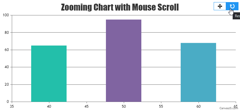
Team CanvasJSYou can reset the chart range programmatically by setting the viewportMinimum and viewportMaximum of x-axis to null inside the rangeChanged event handler as shown in the code snippet below –
rangeChanged: function(e) {
  if(e.trigger === "reset"){
    e.chart.options.axisX[0].viewportMinimum = null;
    e.chart.options.axisX[0].viewportMaximum = null;
    e.chart.render();
  }
},
Please take a look at this JSFiddle for complete working code.
___________
Indranil Deo
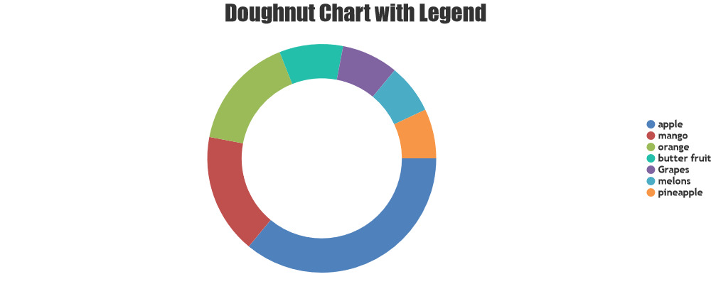
Team CanvasJSYou can show custom text in legend-items by setting legendText property (which falls back to name property). You can achieve this by passing legendText property along with label for each dataPoint as shown in the below code-snippet.
dataPoints.push({
	label: (points[0]),
	legendText: (points[0]),
	y: parseFloat(points[1])
});
If you are still facing issue, kindly create JSFiddle reproducing the issue you are facing and share it with us so that we can look into the code / chart-options being used, understand the scenario better and help you resolve.
___________
Indranil Deo
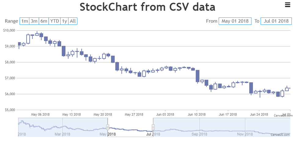
Team CanvasJSYes, you can draw all chart types available in CanvasJS using CSV data. You will have to get the CSV Data using AJAX call and convert the same to the format accepted by CanvasJS as shown in the code snippet below –
function getDataPointsFromCSV(csv) {
  var dataPoints = csvLines = points = [];
  csvLines = csv.split(/[\r?\n|\r|\n]+/);

  for (var i = 1; i < csvLines.length; i++)
    if (csvLines[i].length > 0) {
      points = csvLines[i].split(",");
      dataPoints.push({
        x: new Date(points[0]),
        y: [parseFloat(points[1]), parseFloat(points[2]), parseFloat(points[3]), parseFloat(points[4])]
      });
    }
  return dataPoints;
}
Please take a look at this JSFiddle for a working example.
___________
Indranil Deo
Team CanvasJSApril 27, 2021 at 6:40 pm in reply to: CanvasJS v3.2.15 in React TypeScript project – does not work! #34140Can you kindly create a sample project reproducing the issue you are facing and share it with us over Google-Drive or Onedrive along with sample data so that we can run the code locally to understand the scenario better and help you resolve it?
From what we have observed, sometimes things get delayed mostly when we are not able to reproduce the issue at our end or not able to understand the exact requirements or due to the variation in chart-options being used by you and us. Because of these reasons we expect you to share sample project along with sample data(dummy data) which helps us run it locally at our end to understand the use case and help you resolve it.
___________
Indranil Deo
Team CanvasJSLabels are rendered at every interval on the axis and not to every dataPoint. For datapoints2 the label is not shown at the specific dataPoint whereas, it is shown for datapoints1 as the label for datapoints1 falls at the specific interval. Hence, there is a difference in the axis labels being shown for both the dataPoints set.
___________
Indranil Deo
Team CanvasJSSorry, adding a line break to axis labels is not available as of now.
___________
Indranil Deo
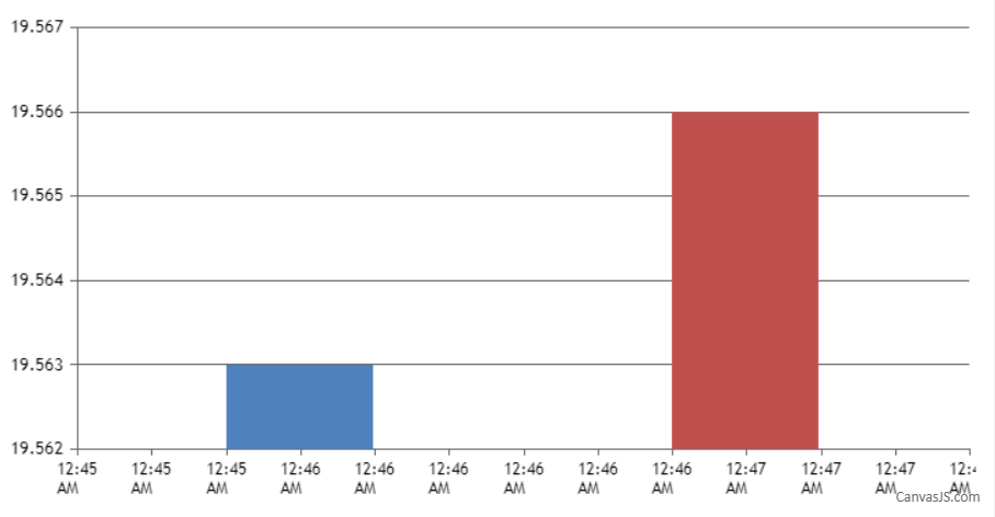
Team CanvasJSvalueFormatString sets how values must be formatted before they appear on Axis X and it is not applied for dataPoints label property. In your case, you can set the xValueType to dateTime for displaying date-time using the timestamp provided in x-value and format the same using valueFormatString as shown in the code snippet below –
axisX: {
  valueFormatString: "hh:mm TT"
},
data: [{
  xValueType: "dateTime",
  dataPoints: [
    {
      x: 1619032560000,
      //label:"Apr-22-2021 00:46",
      y: 19.563,
    }, {
      x: 1619032620000,
      //label: "Apr-22-2021 00:47",
      y: 19.566,
    }
  ],
}
]
Also, please take a look at this JSFiddle for a working example.
___________
Indranil Deo
Team CanvasJSCan you please explain the behavior of drilldown chart in your context? Do you mean opening a new page when a dataPoint is clicked – with a chart being displayed on the new page?
___________
Indranil Deo
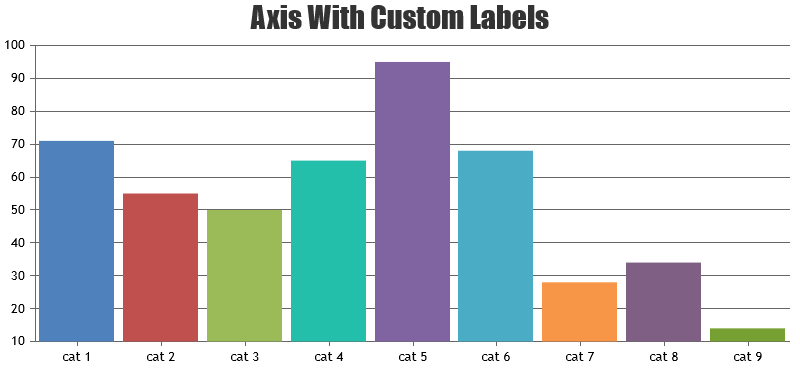
Team CanvasJSThe labels on axis-x are displayed at a specific interval and not for each dataPoint. However, if you like to show labels for each dataPoint, you can use label property instead of x-value.
___________
Indranil Deo
Team CanvasJS