Login to Ask a Question or Reply
Forum Replies Created by Indranil
-
@rck,
In the sample shared above PhantomJS is required for rendering the chart on server and exporting the same as an image. page.render() helps in rendering the web page(containing the chart) to an image buffer and then saves it as an image with the specified filename.
___________
Indranil Singh Deo
Team CanvasJSMarch 29, 2022 at 6:49 pm in reply to: Cannot display stable graph on iphone (both safari and google chrome) #37274[Update]
We have released v3.6 GA with improved memory management. Please refer to the release blog for more information. Do download the latest version from download page & let us know your feedback.
___________
Indranil Singh Deo
Team CanvasJS@jcv,
[Update]
We have released v3.5 GA with support for CSP. Please refer to the release blog for more information.
We have just released Chart v3.5 Beta-1 with a few improvements related to CSP. Please refer to the release blog for more information. Do download the latest version from download page & let us know your feedback.
___________
Indranil Singh Deo
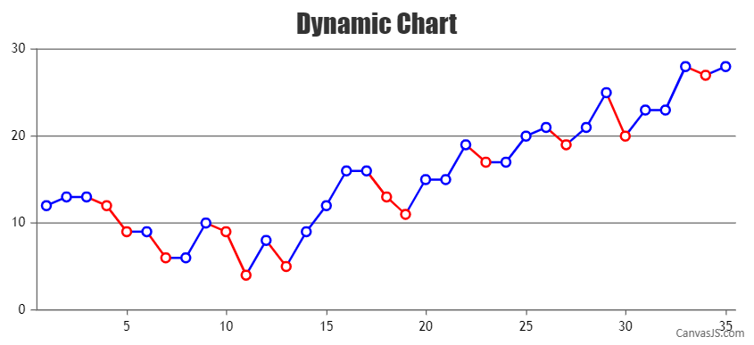
Team CanvasJSYou can set markerBorderColor & lineColor based on your condition (Comparing current y-value with the previous y-value and checking if it’s even or odd) to achieve this. Please find the code-snippet below –
var updateChart = function () {

  yVal = yVal +  Math.round(5 + Math.random() *(-5-5));

  if(dps.length && yVal < dps[dps.length - 1].y)
  {
    //Setting markerBorderColor and lineColor for each specific dataPoint
    color = (yVal % 2 === 0 ? "red" : "blue");
    dps.push({x: xVal, y: yVal, markerBorderColor: color});
    dps[dps.length - 2].lineColor = color;
  }
  else if(dps.length)
  {
    //Setting markerBorderColor and lineColor for each specific dataPoint
    color = (yVal % 2 === 0 ? "blue" : "red");
    dps.push({x: xVal, y: yVal, markerBorderColor: color});
    dps[dps.length - 2].lineColor = color;
  }
  else
    dps.push({x: xVal, y: yVal, markerBorderColor: "blue"});

  xVal++;
  chart.render();
}
Please take a look at this JSFiddle for the complete code.
___________
Indranil Singh Deo
Team CanvasJSMarch 8, 2022 at 6:26 pm in reply to: An example of a graph with the designation of colored segments #37107You can set markerBorderColor & lineColor based on your condition (Comparing current y-value with the previous y-value and checking if it’s even or odd) to achieve this. Please find the code-snippet below –
var updateChart = function () {

  yVal = yVal +  Math.round(5 + Math.random() *(-5-5));

  if(dps.length && yVal < dps[dps.length - 1].y)
  {
    //Setting markerBorderColor and lineColor for each specific dataPoint
    color = (yVal % 2 === 0 ? "red" : "blue");
    dps.push({x: xVal, y: yVal, markerBorderColor: color});
    dps[dps.length - 2].lineColor = color;
  }
  else if(dps.length)
  {
    //Setting markerBorderColor and lineColor for each specific dataPoint
    color = (yVal % 2 === 0 ? "blue" : "red");
    dps.push({x: xVal, y: yVal, markerBorderColor: color});
    dps[dps.length - 2].lineColor = color;
  }
  else
    dps.push({x: xVal, y: yVal, markerBorderColor: "blue"});

  xVal++;
  chart.render();
}
Please take a look at this JSFiddle for the complete code.
Considering this thread as a duplicate of Line Chart Connector Colors and hence closing the same.
___________
Indranil Singh Deo
Team CanvasJSMarch 8, 2022 at 6:23 pm in reply to: Cannot display stable graph on iphone (both safari and google chrome) #37106We have optimized the memory consumption in v2.3 and it is working in the latest version. We will further check possibilities to optimize it in our future versions.
In the meantime, you can try lazy-loading the charts. We tested the same using jquery.inview & it seems to perform better compared to the regular way of rendering charts. Please download this sample project for an example on rendering charts with Lazy loading.
___________
Indranil Singh Deo
Team CanvasJSTo render a dynamic chart, you will have to create a function that checks the dataPoint value before assigning it to the chart options/data and accordingly customize the markerBorderColor and lineColor. The function can be called at regular intervals to add new dataPoint using setInterval() as shown in the code snippet below –
var updateChart = function () {

  yVal = yVal +  Math.round(5 + Math.random() *(-5-5));

  if(dps.length && yVal < dps[dps.length - 1].y)
  {
    dps.push({x: xVal,y: yVal, markerBorderColor: "red"});
    dps[dps.length - 2].lineColor = "red";
  }
  else if(dps.length)
  {
    dps.push({x: xVal, y: yVal, markerBorderColor: "blue"});
    dps[dps.length - 2].lineColor = "blue";
  }
  else
    dps.push({x: xVal, y: yVal, markerBorderColor: "blue"});

  xVal++;
  chart.render();
};
setInterval(function(){updateChart()}, updateInterval);
Please take a look at this documentation page for a step-by-step tutorial to create a dynamic chart that updates dataPoints at regular intervals. Also, take a look at this JSFiddle for a working example.
In case this doesn’t fulfill your requirement, kindly brief us further about the logic based on which the line color is defined.
___________
Indranil Singh Deo
Team CanvasJSCan you please try setting the browser zoom and scale option under display setting to 100%?
In case you are still facing the issue, kindly create a JSFiddle reproducing the issue and share it with us along with Browser(browser name and its version) and OS details so that we can run it locally to understand the scenario better and help you out.
___________
Indranil Singh Deo
Team CanvasJSIs it possible to show text near only one whisker and pick near left/right/top/bottom to show?
You can show a specific indexLabel by checking its index parameter within indexLabelFormatter as shown in the code snippet below –
indexLabelFormatter: function(e){
  if(e.index === 0)
    return e.dataSeries.name + " -  " + e.dataPoint.y[1];
  else
    return " ";
}
In your case, you can use indexLabelPlacement to postion the indexLabel to left or right of whisker but positioning to it to top or bottom is not available as of now.
Please take a look at this JSFiddle for a working example with complete code.
Ideally would be awesome if this text can be shown at the tick side (inside bar if it fits, or outside if not).
Can you please brief us more on the above requirement?
___________
Indranil Singh Deo
Team CanvasJSBy default, axis reserves some space around it which can be removed by setting
margin: -5. You can also achieve the same by returning an empty string in labelFormatter as shown below –labelFormatter: function(e) { return ""; }Please take a look at this updated JSFiddle for a working example with complete code.
___________
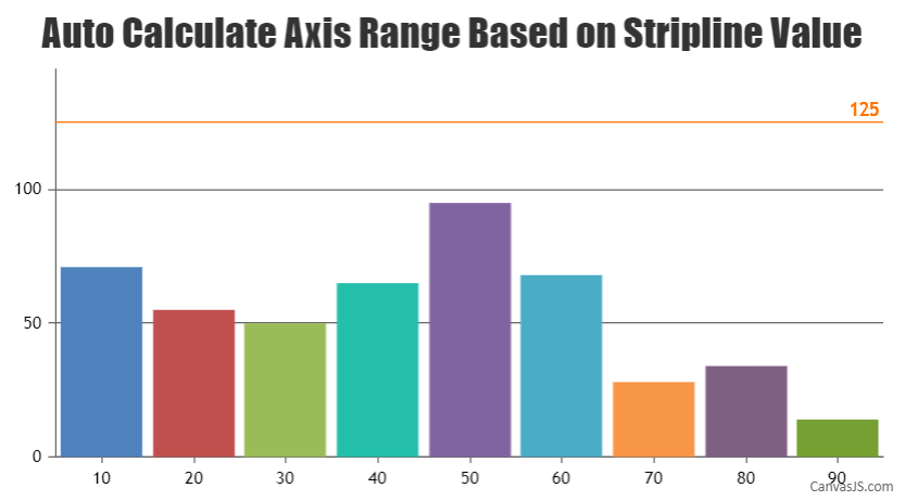
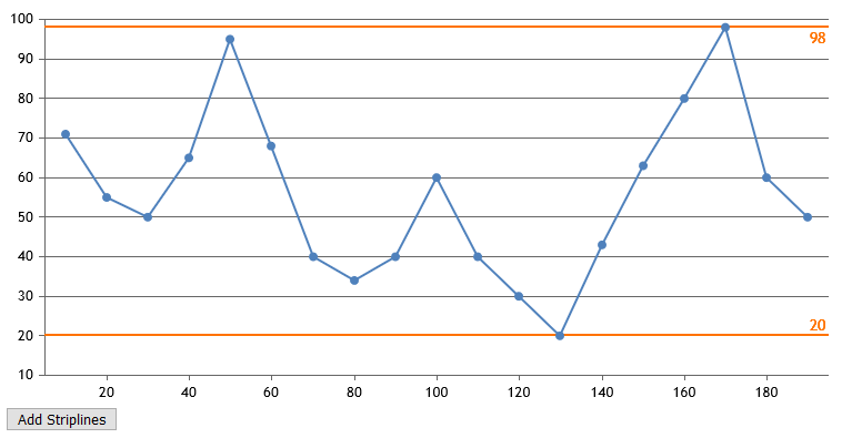
Indranil Singh Deo
Team CanvasJSAxis range is calculated according to the datapoint values and not the striplines. So if the stripline value is more than that of the axis range, it won’t be shown in the plot-area. In this scenario, you can dynamically set the axis range to show stripline with the help of set method as shown below –
chart.axisY[0].set("maximum", chart.axisY[0].stripLines[0].get("value") + chart.axisY[0].get("interval"));Kindly take a look at this JSFiddle for a working example with complete code.
___________
Indranil Singh Deo
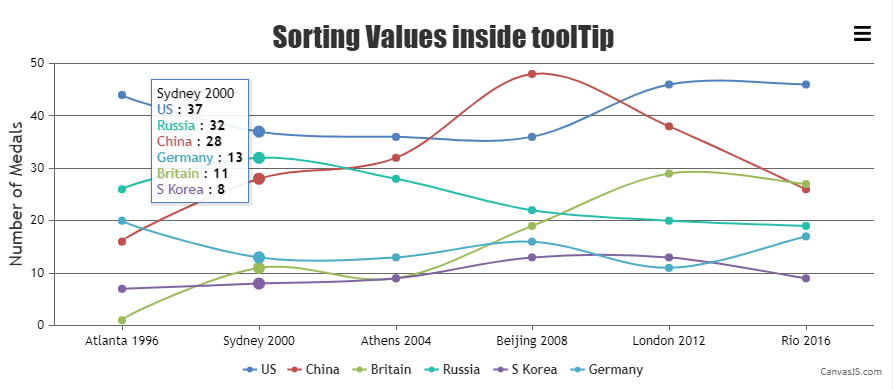
Team CanvasJSCanvasJS chart supports sorting the tooltip based on y-values with the help of contentFormatter. Please find the code-snippet below –
toolTip: {
  shared: true,
    contentFormatter: function (e) {
      var content = "";

      e.entries.sort(function(a,b) {
        return b.dataPoint.y - a.dataPoint.y;
      });

      content	+= e.entries[0].dataPoint.label;
      content += "<br/>";

      var entries = e.entries;
      for(var j = 0; j < entries.length; j++) {
        content	+= "<span style=\"color:" + entries[j].dataSeries.color+"\"\>" + entries[j].dataSeries.name + " </span>: " + "<strong>" + entries[j].dataPoint.y + "</strong>";
        content += "<br/>";
      }
      return content;

    }
},
Kindly take a look at this JSFiddle for a working example with complete code.
___________
Indranil Singh Deo
Team CanvasJSDecember 21, 2021 at 7:53 pm in reply to: Push StripLine values using JSON in .Net Core Razor Page Application #36548Push Strip Line Values
You’ll see from the code that I currently push the chart Data Points using an AJAX call and returning JSON data. However, I also need to return values for the 3 strip lines (average, upper and lower) which I have set manually within the demo project. These values are already calculated in the JSON function, however, I don’t know how to return them to the chart along with the Data Points.You can add striplines dynamically using addTo method to any desired value. Please refer the below code-snippet to add striplines at minimum & maximum values of dataSeries –
chart.axisY[0].addTo("stripLines", { value: minY, label: minY, thickness:2 }, false);
chart.axisY[0].addTo("stripLines", { value: maxY, label: maxY, thickness:2 });
Also, kindly take a look at this JSFiddle for complete code.
Dummy dataSeries for legends average, upper and lower
I have also added dummy data series to the chart to create legends for the average, upper and lower strip lines. I also need to be able to push values to each of these dataSeries, i.e. the name and data point.I’ve also noticed that when adding the dummy dataSeries that it squashes the chart values, can this be solved?
In your case, you have added dataPoints to the dummy dataSeries whose x-values are comparatively higher than that of the dataPoints present in the first dataSeries, as a result, it is reserving the space for those dataPoints. You can overcome this by dynamically adding the x-value of first dataPoint(from first dataSeries) to the dummy dataSeries by updating chart options as shown below –
chart.options.data[1].dataPoints.push({ x: new Date(chart.options.data[0].dataPoints[0].x), y: 0 });
chart.options.data[2].dataPoints.push({ x: new Date(chart.options.data[0].dataPoints[0].x), y: 0 });
chart.options.data[3].dataPoints.push({ x: new Date(chart.options.data[0].dataPoints[0].x), y: 0 });
chart.render();
Please check this JSFiddle for an example on adding dataPoints and name to dataSeries by updating chart options.
___________
Indranil Singh Deo
Team CanvasJSCan you kindly create a JSFiddle reproducing the issue you are facing and share it with us along with sample data so that we can look into the code/chart options being used, understand the scenario better and help you out?
___________
Indranil Singh Deo
Team CanvasJS