You must be logged in to post your query.
Home › Forums › Chart Support › Сustom design of the chart elements
Tagged: custom design of the chart elements
Good afternoon Dear specialists! I ask for advice! Please tell me how to make a custom design of the chart elements? You can pass a css class by any method to change the graphical properties of a chart item. In particular, for example, to make the effect of waterlighting the lines of the chart, add the effect of ripple of chart points and chart elements. Could it be possible to use existing libraries with canvasjs connectivity?
@oleglr,
You can customize chart elements like Title, Legend, Axis, Data using chart options like fontFamily, fontColor, labelFontColor, labelFontFamily, labelFontSize, lineColor, makerColor, etc. Please refer to this documentation page for list of customization options available.
In particular, for example, to make the effect of waterlighting the lines of the chart, add the effect of ripple of chart points and chart elements. Could it be possible to use existing libraries with canvasjs connectivity?
Could you please provide a pictorial representation of your requirement so that we can understand your scenario better and help you out with appropriate resources?
___________ Indranil Deo Team CanvasJS
Effect example Good day! I am sending you a link, there is an example on the page that clearly demonstrates the effect that I need to add to the chart in order to get the ripple of the head of the running line of the current spot price.
Element highlighting effect example This example shows a visual application of the lighting effect decoration. By what means can this be achieved.
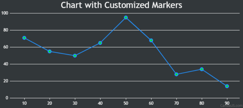
You can customize the line series to highlight the markers using the markerBorderColor, markerBorderThickness, markerColor, etc. properties as shown below –
data: [ { markerBorderColor:"#238EF6", markerBorderThickness: 3, markerColor: "#00FF00", lineColor: "#238EF6", type: "line", dataPoints: [ { x: 10, y: 71 }, { x: 20, y: 55}, { x: 30, y: 50 }, { x: 40, y: 65 }, { x: 50, y: 95 }, { x: 60, y: 68 }, { x: 70, y: 28 }, { x: 80, y: 34 }, { x: 90, y: 14} ] } ]
Please take a look at this JSFiddle for a working example. However, creating chart with ripple effect in the dataPoint is not possible as of now.
You must be logged in to reply to this topic. Login/Register