Login to Ask a Question or Reply
Forum Replies Created by Adithya Menon
-
Considering this thread as duplicate of Tabular presentation of graph data and hence closing the same.
—-
Adithya Menon
Team CanvasJSIt is not possible to create a graph in tabular form (based on your screenshot) using CanvasJS as of now. However, with a few lines of code, it is possible to create a table with data from the chart as shown in the code-snippet below,
function addTable(chart){
	var tableData = "";
	for(var i = 0; i < chart.data.length; i++){
  		tableData += "<tr>" + "<td style='color:" + chart.data[i].color + "'>■" + chart.data[i].name + "</td>";
      for(var j = 0; j < chart.data[i].dataPoints.length; j++){
      	tableData += ("<td>" + chart.data[i].dataPoints[j].y +"%</td>")
      }
      tableData += "</tr>";
  }
  $("#chartData").append(tableData)
}
Kindly take a look at this JSFiddle for an example on the same.
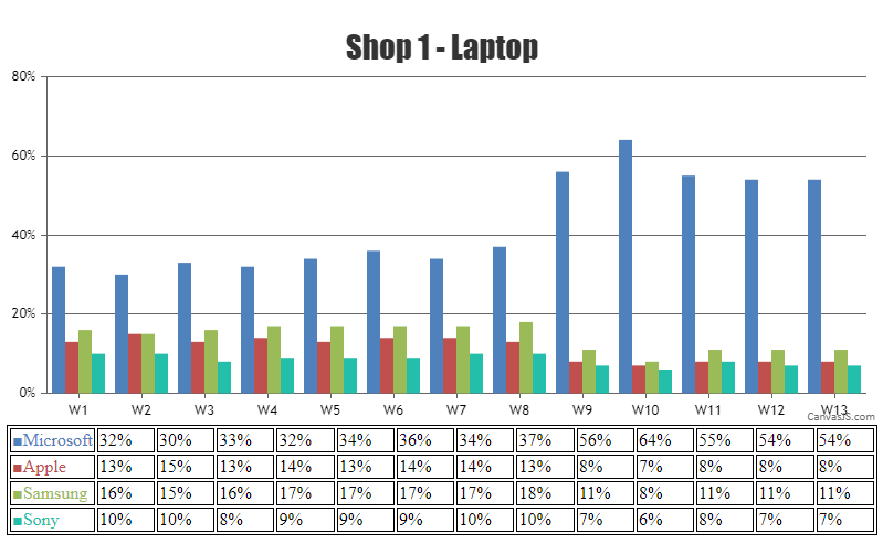
—
Adithya Menon
Team CanvasJSBased on the minimum x-value among all the data series, you can set the minimum for X-axis to add some space between the Y-axis line and the first datapoint as shown in the code-snippet below,
function setXMin() {
  var xMinValue = 0;
  for(var i = 0; i < chart.options.data.length; i++) {
    xValues.push(chart.options.data[i].dataPoints[0].x);
  }
  xMinValue = Math.min(...xValues);
  chart.axisX[0].set("minimum", xMinValue - chart.axisX[0].get("interval"))
}
Kindly take a look at this updated JSFiddle for an example on the same.
Please refer to this forum thread for more information & examples.
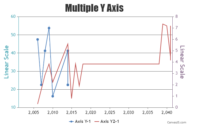
—
Adithya Menon
Team CanvasJSWhen just labels are passed without x-values, x-values are automatically added in successive order as 0,1,2,3,4…
In order to add a stripLine to a particular value, you can set the value property of the stripLines as the corresponding x-value of the dataPoint. You can use the label property in order to set the label of the stripline as an 8-char string format of time.
—
Adithya Menon
Team CanvasJSIn order to show the toolTip for the interpolated dataPoint, you will have to add the dataPoint to the dataSeries. However, you can hide the dataPoint by setting the markerSize property to
1and highlightEnabled property tofalse.Kindly take a look at this updated JSFiddle for an example on the same.
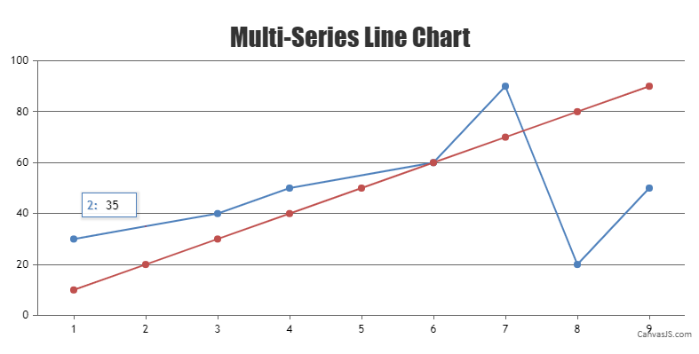
—
Adithya Menon
Team CanvasJS@vaibhav-babhulgaonkarpowerweave-com,
Sorry, it is not possible to scale/zoom a particular dataPoint (on a doughnut chart) on hover as of now.
—
Adithya Menon
Team CanvasJSYou can use the linear interpolation formula to find a point on a straight line. This interpolated value (
y = y1 + ((x – x1) / (x2 – x1)) * (y2 – y1)) can be added to your dataSeries to display the toolTip.Kindly take a look at this updated JSFiddle for an example on the same.
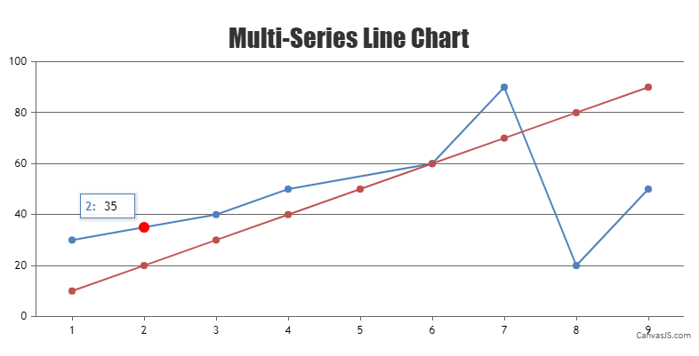
—
Adithya Menon
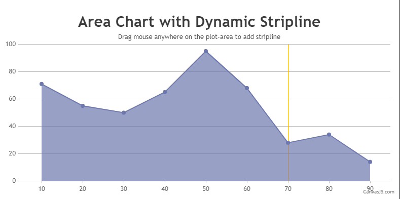
Team CanvasJSIt is possible to add stripLines dynamically on a chart by binding mouse events to the chart as shown in the code-snippet below,
$(".canvasjs-chart-canvas").last().on("mousedown", function(e) {
  var parentOffset = $(this).parent().offset();
  var relX = e.pageX - parentOffset.left;
  var relY = e.pageY - parentOffset.top;
  chart.options.axisX[0].stripLines = []; //Comment this line to add as many stripLine based on mouse events than single stripline
  startValue = chart.axisX[0].convertPixelToValue(relX);
});

$(".canvasjs-chart-canvas").last().on("mouseup", function(e) {
  var parentOffset = $(this).parent().offset();
  var relX = e.pageX - parentOffset.left;
  var relY = e.pageY - parentOffset.top;

  endValue = chart.axisX[0].convertPixelToValue(relX);
  if(startValue === endValue)
    chart.options.axisX[0].stripLines.push({value: startValue });
  else
    chart.options.axisX[0].stripLines.push({startValue: startValue, endValue: endValue});
  chart.render();
});
Kindly take a look at this JSFiddle for an example with complete code.
—
Adithya Menon
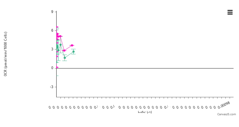
Team CanvasJSBy default, the whiskerLength gets limited to the dataPointWidth. Setting dataPointWidth property (dataPointWidth: 15) should work fine in this case.
Kindly take a look at this updated JSFiddle for an example on the same.
—
Adithya Menon
Team CanvasJSThank you for reporting the use case. It seems to be happening during different scenarios of the secondary Y-axis. We will revisit & reconsider this behavior in future releases.
As a workaround, you can add a dummy dataSeries attched to primary Y-axis as shown in the code-snippet below,
dataSeries.dataPoints = dataPoints;
data.push(dataSeries);
data.push({type: "line"});
Please take a look at this JSFiddle for an example with complete code.
—
Adithya Menon
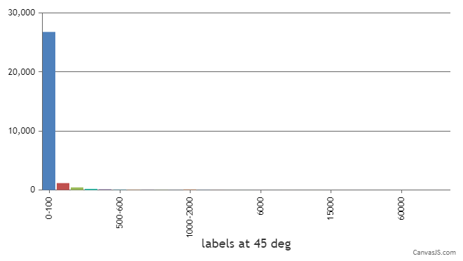
Team CanvasJSTo create a chart as per your requirement, you can go ahead and remove the x values passed to the dataPoints array. Passing only label and y properties to dataPoints should work fine in your case.
Kindly take a look at this updated JSFiddle for an example with complete code.
—
Adithya Menon
Team CanvasJSRagu,
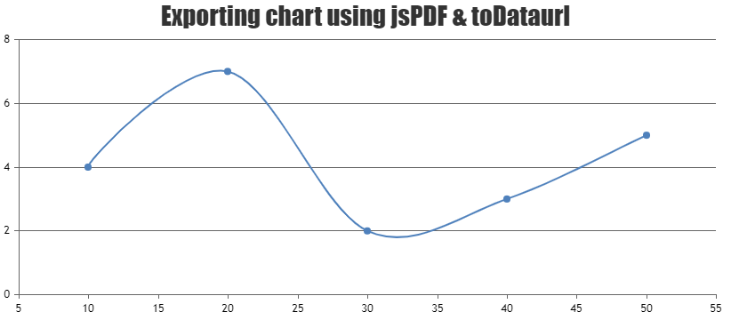
To export the chart in a pdf with a light theme, you can use chart.set() to change the theme to
light1orlight2right before fetching the base64 image of the chart as shown in the code-snippet below,$("#exportButton").click(function(){ var pdf = new jsPDF(); var chartTheme = chart.get("theme"); chart.set("theme", "light2"); var canvas = $("#chartContainer .canvasjs-chart-canvas").get(0); var dataURL = canvas.toDataURL(); chart.set("theme", chartTheme); pdf.addImage(dataURL, 'JPEG', 0, 0); pdf.save("download.pdf"); });Kindly take a look at this JSFiddle for an example on the same with complete code.
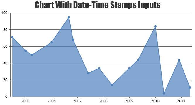
In order to convert PHP date to Charts (JavaScript timestamp), you need to convert PHP date to PHP timestamp using strtotime and then convert PHP timestamp to JavaScript timestamp by multiplying PHP timestamp by 1000 as shown below,
$phpDate = date("Y-m-d h:i:sa");
$phpTimestamp = strtotime($phpDate);
$javaScriptTimestamp = $phpTimestamp * 1000;
You also need to set xValueType property to ‘dateTime’ as x-value will be a timestamp.
__
Adithya Menon
Team CanvasJSWe don’t have any property to find the coordinates of the highest / lowest peak as an inbuilt feature for now. However, with a few lines of code, it’s possible to find the same using canvas API, which we have showcased in the example shared in the previous reply. The same can be further improved to make it work across different sets of datapoints. Below is the code-snippet which gets the image-data of canvas to find the top-most colored pixel coordinate. Converting the same to value-coordinate using convertPixelToValue will give you the y-value of the highest peak in the curve/spline chart,
for (var i = 0; i < imageData.length; i += 4) {
  if (i % (4 * parseInt(chart1.plotArea.width)) === 0) {
    coloredRegionData.push([]);
    temp = i;
  }
  if (imageData[i] === 255 && imageData[i + 1] === 0)
    coloredRegionData[coloredRegionData.length - 1].push((i - temp) / 4);
}
Please take a look at this updated JSFiddle for complete code.
____
Adithya Menon
Team CanvasJSThanks for the JSFiddle. We are looking into your query and will get back to you at the earliest.
____
Adithya Menon
Team CanvasJS