Login to Ask a Question or Reply
Forum Replies Created by Adithya Menon
-
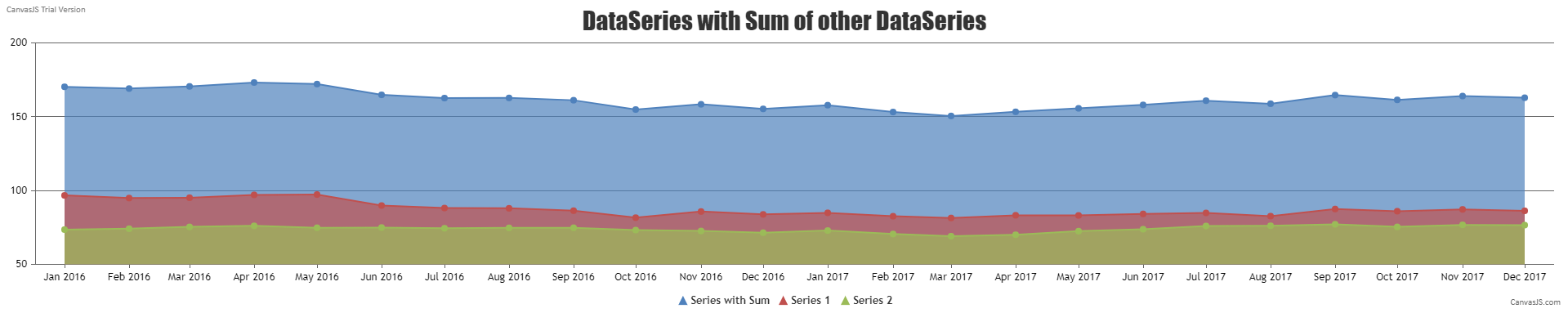
It is possible to create a new dataPoints array by summing up/subtracting each y value of the first 2 dataPoints array as shown below –
function createThirdDataSeries() {
  for(var i = 0; i < dps1.length; i++) {
    dps3.push({x: dps1[i].x, y: dps1[i].y + dps2[i].y})
  }
}
You can create a multi-series area chart by providing each of these dataPoints array as separate dataSeries.
Kindly take a look at this JSFiddle for an example on creating a multi-series area chart with the third dataSeries being the sum of the first two dataSeries.
Also, kindly take a look at this forum thread for your reference.
___________
Adithya Menon
Team CanvasJSTo render multiple charts in a page, you will have to create multiple chartContainers with separate id for each, and create multiple charts which you can assign to specific chartContainers and call the corresponding chart render method.
Please take a look at the code snippet below,var chart1 = new CanvasJS.Chart("chartContainer1",{ title :{ text: "Live Data" }, data: [{ type: "line", dataPoints : [ { label: "apple", y: 10 }, { label: "orange", y: 15 }, { label: "banana", y: 25 }, { label: "mango", y: 30 }, { label: "grape", y: 28 } ] }] }); var chart2 = new CanvasJS.Chart("chartContainer2",{ title :{ text: "Live Data" }, data: [{ type: "column", dataPoints : [ { label: "apple", y: 10 }, { label: "orange", y: 15 }, { label: "banana", y: 25 }, { label: "mango", y: 30 }, { label: "grape", y: 28 } ] }] }); chart1.render(); chart2.render();Also, kindly take a look at our documentation page for a step-by-step tutorial on how to render multiple charts in a page.
If you are still facing the issue, kindly create JSFiddle reproducing the issue and share it with us so that we can look into the code / chart-options being used, run it at our end to understand the scenario better and help you out.
__
Adithya Menon
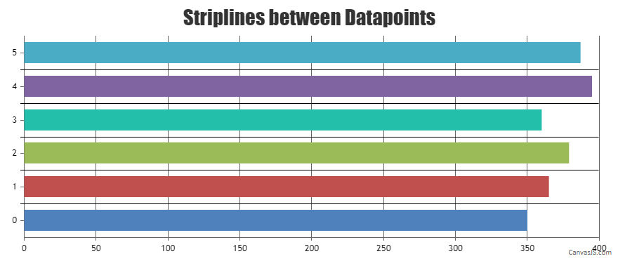
Team CanvasJSIt is possible to add a line between each dataPoint using stripLines. You can dynamically calculate the value between the dataPoints to find the value where stripline has to be added. Please take a look at the code snippet below,
function addStripLines() {
  var dataPoints  = chart.options.data[0].dataPoints;

  for(var i = 1; i < dataPoints.length; i++) {
    chart.axisX[0].addTo("stripLines", {
      value: dataPoints[i].x - (dataPoints[i].x - dataPoints[i-1].x) / 2,
      showOnTop: true,
      color: "black",
      thickness: 1,
      labelPlacement: "outside"
    }, false)
  }

  chart.render();
}
Kindly take a look at this JSFiddle for an example on creating Striplines inbetween Datapoints.
—
Adithya Menon
Team CanvasJSThe image links that you have shared to represent your use-case seems to be broken. We suggest you to create JSFiddle reproducing the issue you are facing and share it with us. Sharing JSFiddle with your use-case & along with a brief of the issue you are facing makes it easier for us to checkout your code / chart-options being used, understand the scenario better and help you resolve.
—
Adithya Menon
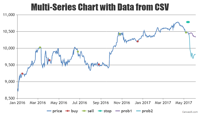
Team CanvasJSYes, it’s possible to create a multi-series chart with data from a CSV file. You can get the CSV data using AJAX call and parse the same to the format accepted by CanvasJS.
Here is the code snippet for the same,
  for(var j = 0; j < noOfSeries; j++)
    chart.options.data.push({ type: "line", showInLegend: true, dataPoints: [] });

  for (var i = 1; i < csvLines.length; i++) {
    if (csvLines[i].length > 0) {
      points = csvLines[i].split(";");
      dateTime = points[0].split(".");
      dateTime = dateTime[2] - 1 + "-" + dateTime[1] + "-" + dateTime [0];

      for(var j = 1; j < points.length; j++) {
        chart.options.data[j-1].dataPoints.push({x: new Date(dateTime), y: points[j] === "" ? null : Number(points[j])});
      }
    }
  }
Kindly take a look at this JSFiddle for an example on creating multi-series chart with the data from CSV.
—
Adithya Menon
Team CanvasJSYes, it’s possible to create a multi-series chart with data from a CSV file. You can get the CSV data using AJAX call and parse the same to the format accepted by CanvasJS.
Here is the code snippet for the same,
  for(var j = 0; j < noOfSeries; j++)
    chart.options.data.push({ type: "line", showInLegend: true, dataPoints: [] });

  for (var i = 1; i < csvLines.length; i++) {
    if (csvLines[i].length > 0) {
      points = csvLines[i].split(";");
      dateTime = points[0].split(".");
      dateTime = dateTime[2] - 1 + "-" + dateTime[1] + "-" + dateTime [0];

      for(var j = 1; j < points.length; j++) {
        chart.options.data[j-1].dataPoints.push({x: new Date(dateTime), y: points[j] === "" ? null : Number(points[j])});
      }
    }
  }
Kindly take a look at this JSFiddle for an example on creating multi-series chart with the data from CSV.
Considering this thread as duplicate of chart from csv multiple lines. Hence closing the same.
—
Adithya Menon
Team CanvasJSIt is possible to create a new dataPoints array by summing up each y value of the first 2 dataPoints array as shown below –
$dataPoints3 = array();
 $sumDataPoints = array();

 foreach($dataPoints1 as $dps) {
    $sumDataPoints[$dps["x"]] = array_key_exists($dps["x"], $sumDataPoints) ? $sumDataPoints[$dps["x"]] + $dps["y"] : $dps["y"];
 }
 foreach($dataPoints2 as $dps) {
    $sumDataPoints[$dps["x"]] = array_key_exists($dps["x"], $sumDataPoints) ? $sumDataPoints[$dps["x"]] + $dps["y"] : $dps["y"];
 }

 foreach($sumDataPoints as $x => $dps) {
    array_push($dataPoints3,array("x" => $x, "y" => $sumDataPoints[$x]));
 }
You can create a multi-series area chart by providing each of these dataPoints array as separate dataSeries.
Kindly take a look at this Sample php project for an example on creating a multi-series area chart with the third dataSeries being the sum of the first two dataSeries.
___________
Adithya Menon
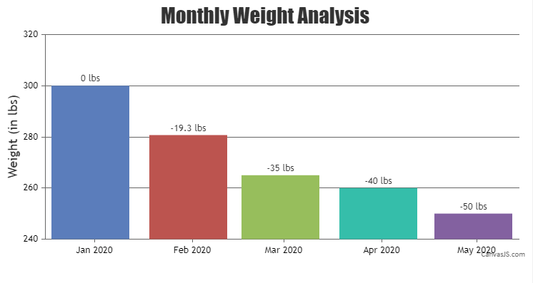
Team CanvasJSFebruary 16, 2021 at 3:16 pm in reply to: Show Difference Between First Datapoint and Last Datapoint #32802You can format a number to fix decimals using formatNumber method. Please take a look at this JSFiddle for an example.
—
Adithya A Menon
Team CanvasJSFebruary 15, 2021 at 7:09 pm in reply to: Show Difference Between First Datapoint and Last Datapoint #32792You can achieve your requirements by showing the difference between dataPoints as indexLabel as shown in this JSFiddle.
—
Adithya A Menon
Team CanvasJSYou can use line chart to achieve your requirements.Please take a look at this JSFiddle for an example on the same.
Considering this thread as a duplicate of Diagonal Trendline Support and hence closing the same.
___________
Adithya Menon
Team CanvasJSYou can use line chart to achieve your requirements.Please take a look at this JSFiddle for an example on the same.
—
Adithya Menon
Team CanvasJS-
This reply was modified 5 years, 7 months ago by
Adithya Menon.
-
This reply was modified 5 years, 7 months ago by