Login to Ask a Question or Reply
Forum Replies Created by Adithya Menon
-
Marco,
The behaviour of cancelling the zooming event on moving out of the chart is by design. It is not possible to zoom when you move out of the chart as of now.
—
Adithya Menon
Team CanvasJSMarco,
The behaviour of cancelling the zooming event on moving out of the chart is by design. It is not possible to zoom when you move out of the chart as of now.
Considering this thread as a duplicate of Zooms at the very beginning/end are not easy to do and hence closing the same.
—
Adithya Menon
Team CanvasJSThe trial version of charts seems to be working fine on the iPad. If you are still facing the issue, kindly create sample project reproducing the issue you are facing over Google-Drive / Onedrive, so that we can run it locally at our end, understand the scenario better and help you out.
From what we have observed, sometimes things get delayed mostly when we are not able to reproduce the issue or not able to understand the exact requirements or the solution that we provide may not work properly due to the variation in chart-options being used by you and us.
—
Adithya Menon
Team CanvasJSIt looks like JSFiddle that you have shared is working fine. If you are still facing issue, kindly fork/save the JSFiddle reproducing the issue you are facing and share the link with us so that we can look into your code, understand the scenario better and help you out.
—
Adithya Menon
Team CanvasJSAll the chart types including line, pie, column, etc. are working fine on the iPad. Can you please share sample project reproducing the issue you are facing over Google-Drive / Onedrive, so that we can run it locally at our end, understand the scenario better and help you out?
—
Adithya Menon
Team CanvasJSThe datapoint y-value can only accept numeric values as of now. Passing the dataPoints with numerical values as shown in the code-snippet below should work fine in your case,
dataPoints.Add(new DataPoint(new DateTime(2016, 01, 01), new double[] { 656.289978, 657.719971, 547.179993, 587.000000 }));Kindly refer to our gallery page for an example with complete code.
—
Adithya Menon
Team CanvasJSTo format the y-values to 2 decimal places, you can set the yValueFormatString property to
#,##0.00%. For more information on the supported formats, kindly refer to this documentation page.—
Adithya Menon
Team CanvasJSdata is an element of chart and not stockchart. Passing it in chart should work fine in your case. Kindly take a look at the code-snippet below,
stockChartA.charts[0].addTo("data", {
	type: "line",
	axisYType: "secondary",
	markerType: "none",
	lineDashType: "solid",
	color:"red",
	lineThickness: 1,
	toolTipContent: null,
	//markerSize: 1,
	dataPoints: [
	    { x: 1000, y: 970, markerType: "circle" },
	    { x: 1050, y: 970 }
        ]
});
If you are still facing issue, can you kindly create JSFiddle reproducing the issue you are facing & share it with us so that we can look into the code / chart-options being used, understand the scenario better and help you resolve?
—
Adithya Menon
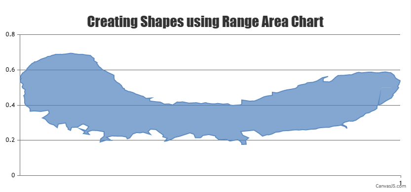
Team CanvasJSAs per your requirements you can use the Range Area Chart type. Area chart will not fit your current requirements due to the way it is designed.
The spike appears due to the y-values. Kindly take a look at this updated JSFiddle, where the spike doesn’t exist. You can further improve on the example by changing the y-values accordingly.
__
Adithya Menon
Team CanvasJSAdding scroller to y-axis is not available as a built-in feature as of now. However, you can place JQuery UI slider vertically to achieve the same as shown in the code-snippet below,
$("#slider").slider({
  range: true,
  orientation: "vertical",
  min: chart.axisY[0].get("minimum"),
  max: chart.axisY[0].get("maximum"),
  values: [ 50, 100 ], //Default zoom state
  slide: function( event, ui ) {
      chart.axisY[0].set("viewportMinimum", ui.values[0], false);
    chart.axisY[0].set("viewportMaximum", ui.values[1]);
  }
});
Please take a look at this JSFiddle for an example along with complete code.
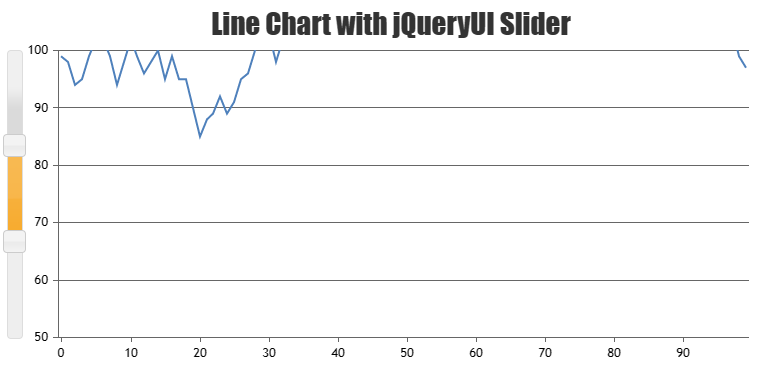
—
Adithya Menon
Team CanvasJSAdding scroller to y-axis is not available as a built-in feature as of now. However, you can place JQuery UI slider vertically to achieve the same as shown in the code-snippet below,
$("#slider").slider({
  range: true,
  orientation: "vertical",
  min: chart.axisY[0].get("minimum"),
  max: chart.axisY[0].get("maximum"),
  values: [ 50, 100 ], //Default zoom state
  slide: function( event, ui ) {
      chart.axisY[0].set("viewportMinimum", ui.values[0], false);
    chart.axisY[0].set("viewportMaximum", ui.values[1]);
  }
});
Please take a look at this JSFiddle for an example along with complete code.
—
Adithya Menon
Team CanvasJSYou can use a Range Area Chart type instead of an area chart for your scenario. You can use Range Area to fill the region by splitting the datapoints, from the value to an arbitrary point and removing the border of the area chart since you are using an arbitrary point. To have the border you can use a line chart type with the same datapoints. Please refer to this updated JSFiddle for an example on the same.
__
Adithya Menon
Team CanvasJSTo form a closed shape using area chart, the datapoint must be in a sequence making an enclosed shape. It seems like after a certain datapoint, the rest are not in a sequence making an enclosed shape. Kindly take a look at this updated JSFiddle which shows till which datapoint the charts seem to be rendering fine. Having a sequence for the rest of the datapoints should work fine in your case.
__
Adithya Menon
Team CanvasJS@avb,
Zooming is available in the individual charts of the StockChart, but with minor difference in the behavior. In StockChart, panning is enabled by default. You can enable zooming in chart by setting zoomEnabled property to true. Please refer to this documentation page for more information along with a live example.
—
Adithya Menon
Team CanvasJS