Login to Ask a Question or Reply
Forum Replies Created by Adithya Menon
-
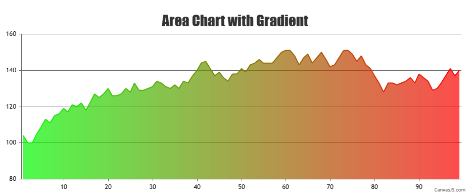
You can create a gradient effect on the area chart by looping through your data points array and creating a separate dataseries with color property for each of the datapoint. Kindly refer to this JSFiddle for an example on the same.
—
Adithya Menon
Team CanvasJSTo eliminate the calculation of plotting data, you can get the canvas context of the chart and draw a line directly on the canvas. Kindly take a look at this JSFiddle for an example on the same.
—
Adithya Menon
Team CanvasJSTo achieve your requirement, you can use the same line chart type and disable the markers and toolTip by setting the markerType property to
noneand the toolTipContent property tonull.Kindly take a look at this JSFiddle for an example on the same.
—
Adithya Menon
Team CanvasJSJune 26, 2023 at 7:56 pm in reply to: Chart Data not visible until screen size is changed in React #43200Mahdi,
The datapoint y-value can only accept numeric values as of now. Passing the y as numerical values should work fine in your case.
If you are still facing any issue, can you kindly create a sample project reproducing the issue you are facing and share it with us over Google-Drive or Onedrive along with sample data so that we can look into your code, run it locally at our end to understand the scenario better and help you out?
—
Adithya Menon
Team CanvasJSJune 21, 2023 at 6:42 pm in reply to: How to set labels inside each bar on horizontal bar chart #43155@emil-gustavssonauralight-com,
You can use indexLabel to show the labels on each column in a column chart. If you want to position the labels inside the column, you can set the indexLabelPlacement property to
inside.If this doesn’t fulfill your requirements, kindly share an example or a pictorial representation.
—
Adithya Menon
Team CanvasJSSorry for the inconvenience caused. I have forwarded this use-case to the backend team so that they can look into it.
Thanks for your feedback.
—
Adithya Menon
Team CanvasJSKurt,
Can you kindly create JSFiddle with sample JSON data, so that we can understand your scenario better and help you out with a suitable solution?
—
Adithya Menon
Team CanvasJSTo achieve your requirement, you can pass the toolTipContent property of the dummy data point as
null.Kindly refer to this JSFiddle for an example on the same.
If the solution suggested doesn’t fulfill your requirement, kindly brief us further about your use case so that we can understand your scenario better and help you out with an appropriate solution.
—
Adithya Menon
Team CanvasJSThe current behaviour of the null datapoint is as per design. However, to achieve your requirement, you can set the y-value of “May 23” to the same y-value as the previous datapoint and add a dummy datapoint with y-value as null in between the “May 23” and “June 23” data points. Kindly refer to this JSFiddle for an example on the same.
—
Adithya Menon
Team CanvasJSSorry for the inconvenience caused. We will be improving this behaviour in the future versions. Meanwhile, setting the minimum and maximum properties of the X axis seems to be working fine. Please take a look at this code snippet,
axisX : {
    minimum: 0.100,
    maximum: 0.1010
}
Kindly refer to this JSFiddle for an example on the same.
—
Adithya Menon
Team CanvasJSCan you kindly create JSFiddle reproducing the issue you are facing & share it with us so that we can look into the code / chart-options being used, understand the scenario better and help you out?
—
Adithya Menon
Team CanvasJSRagu nathan,
To use CanvasJS commercial version package, kindly download the commercial version files from the My Account Page and follow the instructions provided in the downloaded zip file.
—
Adithya Menon
Team CanvasJSTo display timestamp values as Date & Time, you will have to set xValueType property to “dateTime”. You can format the date-time values shown in axis labels and tooltip using xValueFormatString property and valueFormatString property accordingly.
—
Adithya Menon
Team CanvasJSMay 18, 2023 at 7:00 pm in reply to: duplicate _containerId being generated when using CanvasJSREact #42737Matt,
We have just added CanvasJS React Chart & StockChart packages to NPM registry. Now, you can add our React chart & stockchart packages to your React application via NPM. Please refer to the release blog for more information. Please check out our NPM package and let us know your feedback.
—
Adithya Menon,
Team CanvasJSWe have just added CanvasJS React Chart & StockChart packages to NPM registry. Now, you can add our React chart & stockchart packages to your React application via NPM. Please refer to the release blog for more information. Please check out our NPM package and let us know your feedback.
—
Adithya Menon,
Team CanvasJS