Login to Ask a Question or Reply
Forum Replies Created by Adithya Menon
-
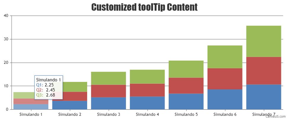
You can use the toolTipContent property to customize the content of the toolTip and add a prefix to the x-value as shown in the code snippet below,
toolTipContent: " Simulando {x} <br/> <span style='\"'color: {color};'\"'>{name}:</span> {y}",Kindly take a look at this JSFiddle for an example on customizing the toolTip content using toolTipContent property.
—
Adithya Menon
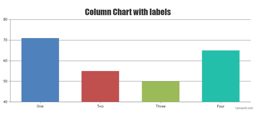
Team CanvasJSIn dataPoints, the x value can either be numeric or DateTime object. If you want to show a string as the X-axis label, you can use the label property.
Kindly take a look at this code-snippet for an example,
data: [{
  type: "column",
  dataPoints: [
      { label: "One", y: 71 },
      { label: "Two", y: 55 },
      { label: "Three", y: 50 },
      { label: "Four", y: 65 },
    ]
}]
Also, take a look at this JSFiddle for an example on column chart with labels.
We have just released CanvasJS Chart v3.2.16 with a bug fix related to the dateTime Formatting. Please refer to this release blog for more information. Do download the latest version from our download page and let us know your feedback.
—
Adithya Menon
Team CanvasJSIn the case of bootstrap tabs, since the second tab is not displayed initially, the second chart is rendered when the shown.bs.tab event is fired by bootstrap using the chart.render method as shown in the code-snippet below,
$('#bs-tab2').on("shown.bs.tab",function(){
      ct1();
      $('#bs-tab2').off();//to remove the binded event after initial rendering
});
Here is the working code for the same.
—
Adithya Menon
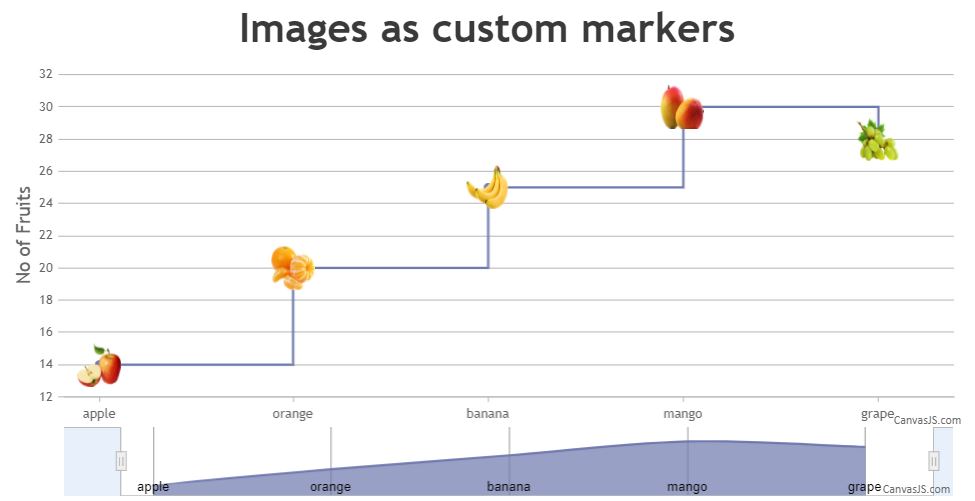
Team CanvasJSYou can position images on the StockChart by creating an array of images and then setting the CSS properties (top, left, display) of those images to the same position of the markers in a stepLine chart as shown in the code-snippet below,
function addImages(chart){
  for(var i = 0; i < stockChart.charts[0].data[0].dataPoints.length; i++){
    var label = stockChart.charts[0].data[0].dataPoints[i].label;

    if(label){
      fruits.push( $("<img>").attr("src", images[i].url)
                  .attr("class", label)
                  .css("display", "none")
                  .appendTo($("#chartContainer>.canvasjs-stock-container>.canvasjs-chart-panel"))
                 );
    }
    positionImage(fruits[i], i);
  }
}
Also, kindly take a look at this JSFiddle for an example with complete code to position images on the StockChart.
You can also take a look at this documentation page for a step-by-step tutorial on how to position images over a chart.
—
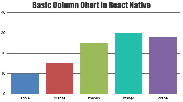
Adithya Menon
Team CanvasJSYou can render CanvasJS Charts & StockCharts in React-Native App with the help of Web-View.
Please take a look at this Sample Project for an example on the same.
—
Adithya Menon
Team CanvasJSCan you kindly create a JSFiddle reproducing the issue you are facing and share it with us along with sample data so that we can look into your code / chart-options being used, understand the scenario better and help you out.
Also take a look at this documentation page for a step-by-step tutorial on rendering charts with data fetched from JSON API using AJAX.
—-
Adithya Menon
Team CanvasJSThank you for reporting the use case. We will further look into it and get back to you at the earliest.
___________
Adithya Menon
Team CanvasJSApril 12, 2021 at 6:32 pm in reply to: canvasjs.min.js:144 Cannot read property ‘getTime’ of undefined at new X (ca #33936Glad you figured out the issue.
If you are still facing any issues, kindly create a sample project and share it over Google-Drive or Onedrive so that we can understand your code better and help you out.
___________
Adithya Menon,
Team CanvasJSSince the chart contains multiple dataPoints with the same x and y values, I would suggest you go to ahead with Multi Series charts to better visualize the data. In this case, you can use the shared property for toolTip as well, as shown in this code-snippet below,
toolTip: {
   shared: true
},
Please take a look at this updated JSFiddle for an example on a multi-series bubble chart with shared toolTip
—
Adithya Menon
Team CanvasJSBy using toolTipContent property, you can customize both the (y-value & label) values displayed in the toolTip. The code snippet below shows how you can achieve the same:
toolTipContent: "<span style='\"'color: {color};'\"'>0{label}</span>: {y}"Please take a look at this JSFiddle for an example adding custom toolTip Content.
—
Adithya Menon
Team CanvasJSYou can create a dynamic stripLine by adding a stripLine and then updating its value and label property to the subsequent y-value of the latest dataPoints which have been added dynamically.
Please take a look at the code snippet below,
function updateChart() {
  $.getJSON("https://canvasjs.com/services/data/datapoints.php?xstart=" + (dataPoints.length + 1) + "&ystart=" + (dataPoints[dataPoints.length - 1].y) + "&length=1&type=json", function(data) {
    $.each(data, function(key, value) {
      dataPoints.push({
        x: parseInt(value[0]),
        y: parseInt(value[1])
      });
      chart.options.axisY.stripLines[0].value = value[1];
      chart.options.axisY.stripLines[0].label = value[1];
    });
    chart.render();
    setTimeout(function(){updateChart()}, 1000);
  });
}
Also, kindly take a look at this JSFiddle for an example to create a dynamic stripLine.
—
Adithya Menon
Team CanvasJSThe x-axis labels are auto-calculated and displayed according to the x-values that you have passed in a sequential order (ascending). If you would like to show the x-axis labels in a reverse order (i.e descending order), please take a look at the reversed property of axisX to achieve the same.
As you have mentioned about having custom sequence, you can use labels instead of x-value. Kindly take a look at the code snippet below,
data: [
      {
        type: "column",
        dataPoints: [

        { label: "30", y: 71},
        { label: "20", y: 55},
        { label: "10", y: 50},
        { label: "50", y: 65},
        { label: "40", y: 95},
        ]
      }
     ]
If the solution doesn’t fit your requirement, kindly brief us further on your requirement so that we can understand it better and help you out with the same.
___________
Adithya Menon
Team CanvasJSYou can use indexLabel property to display text inside the dataPoint in a bubble chart. Although, it is not possible to display the text next to the marker as of now.
Please take a look at this code-snippet for the same,
data: [{
   type: "bubble",
   dataPoints: [
       { x: 10, y: 71, z: 43 },
       { x: 20, y: 55, z: 23 },
       { x: 30, y: 50, z: 25 },
       { x: 40, y: 65, z: 34 },
       { x: 50, y: 85, z: 78, indexLabel: "HIGH" },
       { x: 60, y: 68, z: 54 },
       { x: 90, y: 14, z: 12, indexLabel: "LOW" }
   ]
  }
]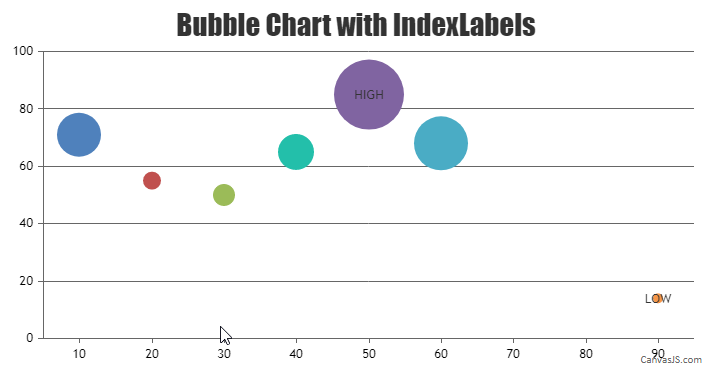
___________
Adithya Menon
Team CanvasJS
