Login to Ask a Question or Reply
Forum Replies Created by Adithya Menon
-
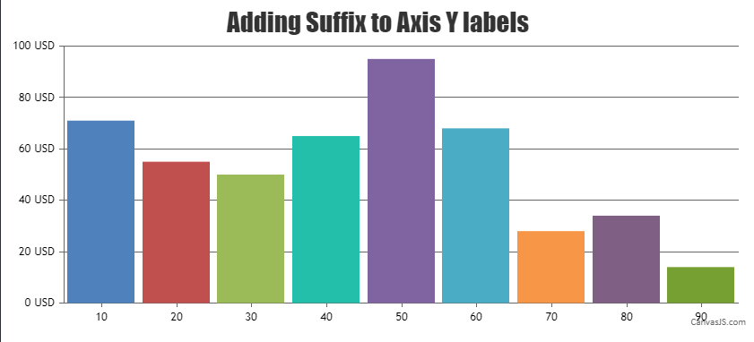
The suffix property seems to be working fine on the Y-axis (vertical axis on the left side) in the link provided.
If you are still facing an issue kindly create JSFiddle reproducing the issue you are facing and share it with us so that we can look into code / chart-options being used, understand the scenario better and help you out.
—
Adithya Menon
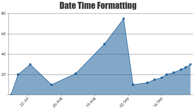
Team CanvasJSYou can use valueFormatString property to define how X-axis labels must be formatted before they appear. Please take a look at this code-snippet for an example on showing only date as the labels,
axisX:{
   valueFormatString: "DD-MMM" ,
},
Kindly, take a look at this JSFiddle for an example on the same.
—
Adithya Menon
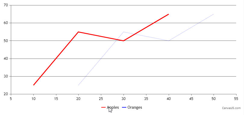
Team CanvasJSYes, you can align the x-axis across multiple charts using the same logic as mentioned above.
—
Adithya Menon
Team CanvasJSSorry, adding a line break to axis labels is not available as of now.
—
Adithya Menon
Team CanvasJSWhen the x-values passed are date-time, labels will be rendered at every interval based on the value of intervalType (For example: if interval is 1, intervalType is ‘month’ – labels will be shown at every 1 month).
In your case, where you want to show only working days, you can use label instead of x.
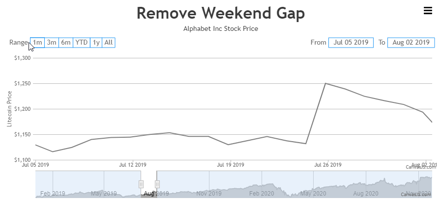
Alternatively, you can use scaleBreaks to remove the gap of the weekend as shown in the code-snippet below,
function removeWeekendGap(stockChart) {
  var scaleBreaks = [], dps = stockChart.charts[0].data[0].dataPoints;
  for(var i = 1; i < dps.length; i++) {
    if(dps[i].x.getDate() - 1 != dps[i-1].x.getDate())
      scaleBreaks.push({startValue: new Date(dps[i - 1].x.getTime() + (12 * 60 * 60 * 1000)), endValue: new Date(dps[i].x.getTime() - (12 * 60 * 60 * 1000))});
  }

  stockChart.options.charts[0].axisX.scaleBreaks.customBreaks = scaleBreaks;
  stockChart.render();
}
Please take a look at this JSFiddle for an example on removing the weekend gap.
—
Adithya Menon
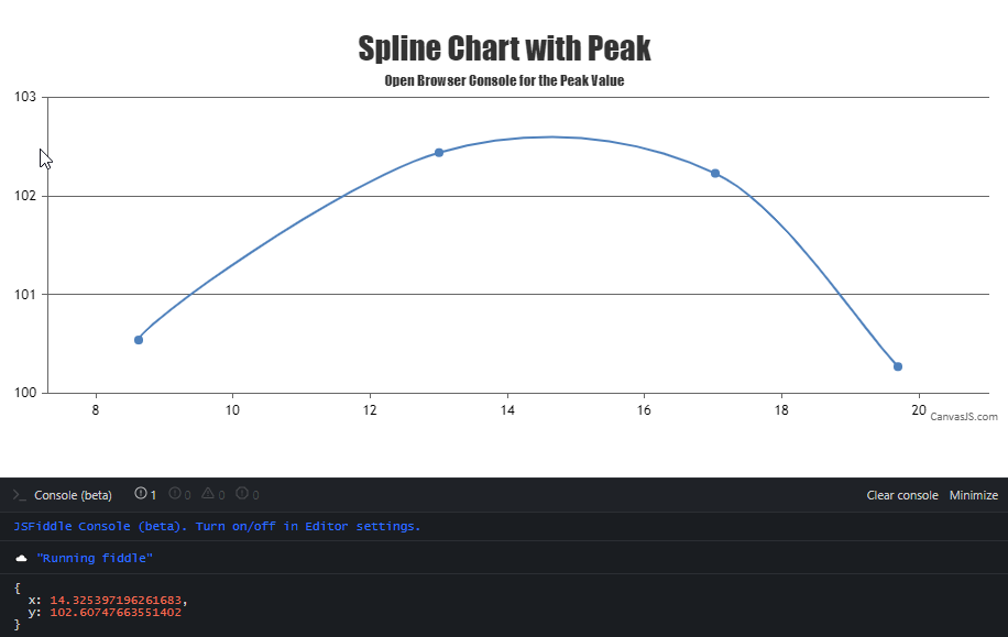
Team CanvasJSCanvasJS uses Bézier curve interpolation to represent the curve passing through the given dataPoints. We don’t have any property to find the coordinates of the highest / lowest peak as of now. However, you can achieve the same by getting the image from the rendered chart & processing it to find the colored pixel-coordinate from top to bottom. Later you can use convertPixelToValue to get the value corresponding to the pixel-coordinate as shown in the code-snippet below,
var imageData = chart1.ctx.getImageData(chart1.plotArea.x1, chart1.plotArea.y1, chart1.plotArea.width, chart1.plotArea.height).data;

coloredRegionData = [];
for (var i = 0; i < imageData.length; i += 4) {
    if (i % (4 * chart1.plotArea.width) === 0) {
      coloredRegionData.push([]);
      temp = i;
    }
    if (imageData[i] === 255 && imageData[i+1] === 0) {
      coloredRegionData[coloredRegionData.length - 1].push((i - temp) / 4);
    }
}

splinePixelCordinates = [];
for (var i = 0; i < coloredRegionData.length; i++) {
    for (j = 0; j < coloredRegionData[i].length; j++) {
      splinePixelCordinates.push({
        x: chart1.plotArea.x1 + coloredRegionData[i][j],
        y: chart1.plotArea.y1 + i
      })
    }
}
Please take a look at this JSFiddle for an example on finding the coordinates of the highest / lowest peak.
—
Adithya Menon
Team CanvasJSIt seems like you have provided us with the JSFiddle link which contains the template code.
Please fork/save the JSFiddle reproducing the issue and then share the link with us so that we can look into your code, understand the scenario better and help you out.
—
Adithya Menon
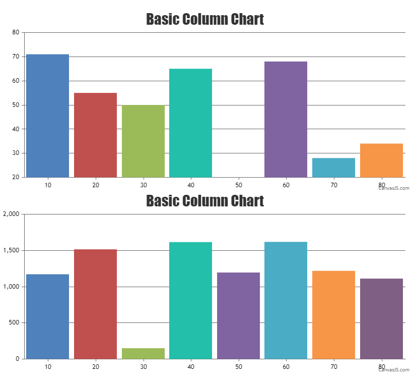
Team CanvasJSAligning y-axis for multiple charts can be achieved by setting the margin property. The margin value has to be calculated based on the bounds of y-axis as shown in the code below –
var axisYBoundMax = 0;
for (var i=0; i<charts.length; i++) {
  axisYBoundMax = Math.max(axisYBoundMax, charts[i].axisY[0].bounds.x2);
}

for(var i = 0; i < charts.length; i++) {
  charts[i].axisY[0].set("margin", axisYBoundMax - (charts[i].axisY[0].bounds.x2 - charts[i].axisY[0].bounds.x1));
}
Also, kindly take a look at this updated JSFiddle with the code to align the y-axis for multiple charts.
Sorry for the inconvenience caused while posting on the forum.
—
Adithya Menon
Team CanvasJSAligning y-axis for multiple charts can be achieved by setting the margin property. The margin value has to be calculated based on the bounds of y-axis as shown in the code below –
var axisYBoundMax = 0;
for (var i=0; i<charts.length; i++) {
  axisYBoundMax = Math.max(axisYBoundMax, charts[i].axisY[0].bounds.x2);
}

for(var i = 0; i < charts.length; i++) {
  charts[i].axisY[0].set("margin", axisYBoundMax - (charts[i].axisY[0].bounds.x2 - charts[i].axisY[0].bounds.x1));
}
Also, kindly take a look at this updated JSFiddle with the code to align the y-axis for multiple charts.
Considering this thread as duplicate of AxisY and AxisY2 margin/width. Hence closing the same.
—
Adithya Menon
Team CanvasJSThanks for reporting the issue. Based on testing it looks like a bug. We’ll be fixing it in future versions.
However, as a workaround, you can set a mouseout event to the chartCotainer div and call the custom function as shown in the code-snippet below,
 document.getElementById("chartContainer").addEventListener("mouseout", function() {
  mouseOut();
});
Kindly take a look at this JSFiddle for an example on the same.
—
Adithya Menon
Team CanvasJSSorry, it is not possible to set border/border color around each slice of the doughnut chart as of now.
—
Adithya Menon
Team CanvasJSMay 21, 2021 at 7:02 pm in reply to: Logarithmic charts break when axisY minimum is set to minimum #34394A logarithmic axis can only plot positive values. There simply is no way to put negative values or zero on a logarithmic axis.
Fundamental: If 10L = Z, then L is the logarithm (base 10) of Z. If L is a negative value, then Z is a positive fraction of less than 1.0. If L is zero, then Z equals 1.0. If L is greater than 0, then Z is greater than 1.0. Note that there no value of L will result in a value of Z that is zero or negative. Logarithms are simply not defined for zero or negative numbers.
—
Adithya Menon
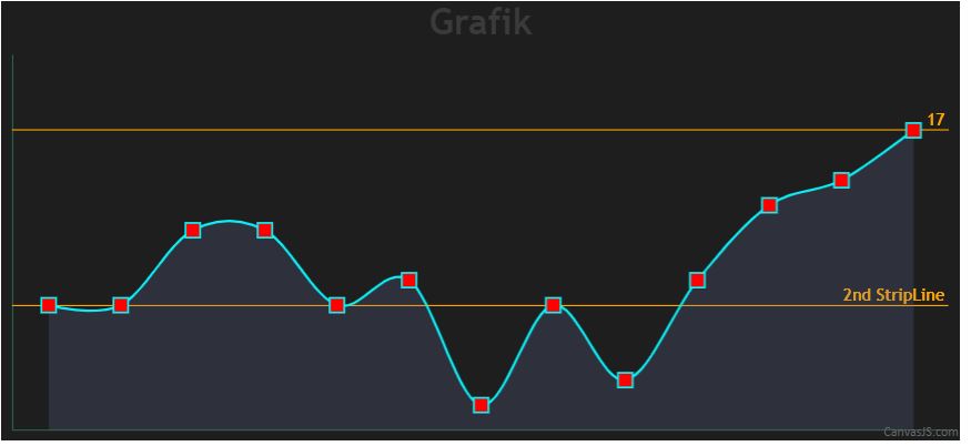
Team CanvasJSAs mentioned, You can add new stripLines dynamically by using the addTo method as shown in the code-snippet below,
chart.axisY[0].addTo("stripLines", {label: "2nd StripLine", value: 10})Kindly, take a look at this JSFiddle for an example on adding 2 stripLines to a dynamic chart.
—
Adithya Menon
Team CanvasJSYou can add new stripLines dynamically by using the addTo method. If you like to update the values of the existing stripLines, you can use the set method.
Considering this thread as a duplicate of Help to dynamically bind the stripline to the diagram! and hence closing the same.
—
Adithya Menon
Team CanvasJSYou can add new stripLines dynamically by using the addTo method. If you like to update the values of the existing stripLines, you can use the set method.
If you are facing any issues, kindly create JSFiddle reproducing the issue you are facing with sample/dummy data and share it with us so that we can look into your code/chart options being used, understand the scenario better and help you out.
—
Adithya Menon
Team CanvasJS