• Demos
    • JavaScript Charts
    • JavaScript StockCharts
  • Download
    • Download Chart
    • Download StockChart
  • Integrations
    • Front End Technology Samples
      • React Charts
      • Angular Charts
      • Vue.js Charts New!
      • jQuery Charts
      • Dashboards
    • Server Side Technology Samples
      • PHP Charts
      • Python Charts New!
      • ASP.NET MVC Charts
      • Spring MVC Charts
      • JSP Charts
  • License
  • Blog
  • Docs
    • Chart Documentation
    • StockChart Documentation
  • Support Forum
    • Chart Support
    • StockChart Support
  • My Account
  • My Account
  • KEY FEATURES
    • Chart with Index / Data Label
    • Chart with Zooming & Panning
    • Multi Series Chart
    • Chart with Multiple Axes
    • Combination Charts
    • Chart with Animation
    • Chart with Logarithmic Axis
    • Dynamic Chart
    • Chart with Data from AJAX
    • Drilldown Chart
    • Responsive Chart
    • Synchronized Charts
  • LINE CHARTS
    • Line Chart with Date-Time Axis
    • Dashed Line Chart
    • Multi Series Line Chart
    • Spline Chart
    • Multi Series Spline Chart
    • Step Line Chart
    • Multi Series Step Line Chart
  • BAR CHARTS
    • Bar Chart with Category Axis
    • Multi Series Bar Chart
    • Stacked Bar Chart
    • Stacked Bar 100% Chart
    • Stacked Bar 100% Chart with Indexlabels
  • COLUMN CHARTS
    • Column Chart with Numeric Axis
    • Multi Series Column Chart
    • Stacked Column Chart
    • Stacked Column 100% Chart
    • Stacked Column 100% Chart with Indexlabel
    • Waterfall Chart
    • Waterfall Chart with Indexlabels
    • Multi Series Waterfall Chart
  • PIE & DOUGHNUT CHARTS
    • Pie Chart with Index Labels
    • Pie Chart in Dark Theme
    • Doughnut Chart with Index Labels
    • Doughnut Chart in Dark Theme
  • AREA CHARTS
    • Area Chart with Indexlabels
    • Multi Series Area Chart
    • Spline Area Chart
    • Multi Series Spline Area Chart
    • Step Area Chart
    • Stacked Area Chart
    • Stacked Area 100% Chart
  • RANGE CHARTS
    • Range Column Chart
    • Multi Series Range Column Chart
    • Range Bar Chart
    • Multi Series Range Bar Chart
    • Range Area Chart
    • Multi Series Range Area Chart
    • Range Spline Area Chart
    • Multi Series Range Spline Area Chart
  • BUBBLE & SCATTER CHARTS
    • Bubble Chart with Indexlabels
    • Bubble Chart with 3 Dimensional Data
    • Multi Series Scatter Chart
  • FUNNEL & PYRAMID CHARTS
    • Funnel Chart with Index Labels
    • Funnel Chart without Neck
    • Pyramid Chart with Index Labels
  • FINANCIAL CHARTS
    • Candlestick Chart
    • Multi Series Candlestick Chart
    • OHLC Chart
    • OHLC Chart from JSON data
    • Box & Whisker Chart
  • COMBINATION CHARTS
    • Error Bar Chart
    • Pareto Chart
    • Range Area & Line Chart
    • Candlestick & Line Chart
    • OHLC Chart with Trend
  • DYNAMIC CHARTS
    • Dynamic / Live Line Chart
    • Dynamic / Live Column Chart
    • Dynamic / Live Multi Series Chart
  • JAVASCRIPT, REACT, VUE.JS, JQUERY
    • JavaScript Charts
    • React Charts
    • Vue.js Charts
    • jQuery Charts
  • SERVER SIDE TECHNOLOGIES
    • ASP.NET MVC Charts
    • JSP Charts
    • PHP Charts
    • Python Charts
    • Spring MVC Charts

Angular Area Charts & Graphs

Download Angular Chart Samples
  • Angular Chart Samples
  • JavaScript Chart Samples
  • React Chart Samples
  • Vue.js Chart Samples
  • jQuery Chart Samples
  • PHP Chart Samples
  • Python Django Chart Samples
  • ASP.NET Chart Samples
  • JSP Chart Samples
  • Spring MVC Chart Samples
  • Dashboard Samples
  • JavaScript StockChart Samples

Angular Area Chart is an extension of Line Chart where the region between the line and the baseline is filled with color. Area Charts are useful when you are interested in cumulative totals over a period of time or range of values. Angular Chart Component allows you to customize charts with smooth-curved line called Spline-Area Charts or with a step-shaped line called Step-Area Charts. Library also supports stacking one series on top of another using Stacked Area Chart & Stacked Area 100% Chart.

To make visualization better, markers are shown for every datapoint when there are less number of datapoints. However, markers will be hidden when the number of datapoints are large. Markers can also be added to individual datapoint to highlight it.
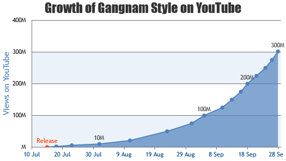
Angular Area Charts

Area Charts are useful when you are interested in cumulative totals over a period of time or range of values.

Angular Area Chart with Indexlabels
Area Chart with Indexlabels
Angular Multi Series Area Chart
Multi Series Area Chart

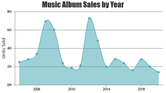
Angular Spline Area Charts

Spline Area Chart is similar to area chart except that the envelope of area is a smooth curve.

Angular Spline Area Chart
Spline Area Chart
Angular Multi Series Spline Area Chart
Multi Series Spline Area Chart

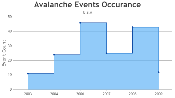
Angular Step Area Charts

Step Area charts are drawn by connecting the data points using vertical and horizontal lines and shading the enclosed area.

Angular Step Area Chart
Step Area Chart

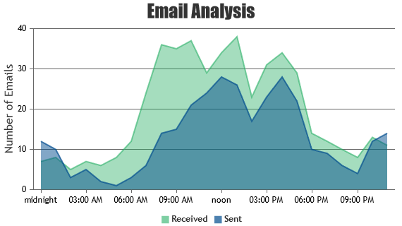
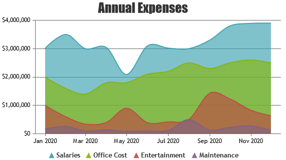
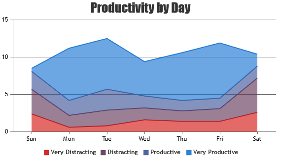
Angular Stacked Area Charts

Stacked Area is formed by stacking multiple data-series one on top of the other.

Angular Stacked Area Chart
Stacked Area Chart

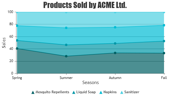
Angular Stacked Area 100% Charts

Stacked Area 100% is similar to “Stacked Area” except that areas are rendered as a percentage of total value at any given point.

Angular Stacked Area 100% Chart
Stacked Area 100% Chart

Features used Commonly in Angular Area Chart

Most commonly used features in Angular Area Chart includes animation, markers, index-labels, color, etc.

  • Animation can be enabled by setting animationEnabled property to true.
  • Size & type of the marker can be customized by setting markerSize & markerType properties.
  • Indexlabel can be shown next to particular bar by setting indexLabel property of datapoint.
  • Indexlabel can be shown for all the bars by setting indexLabel property in dataseries level.
  • Color of the filled region in area chart can be changed by setting color property.
  • Opacity of the filled region can be controlled by setting fillOpacity property.

How to Improve Performance of Angular Area Chart?

In most of the cases Angular Area Chart renders quickly with default options provided in the library. But in case you still want to optimize for performance, these are the tweaks to be done.

  • Avoid showing markers for all the datapoints if there are large number of datapoints. First of all it doesn’t look good when there are large number of datapoints. On top of that, it makes the chart slow.
  • In case of Dynamic Charts, don’t re-create chart each time you have to add a new datapoint. Instead, update the datapoints array & call render() method of chart.

Angular Area Chart Types

  • Angular Area Chart
  • Angular Spline Area Chart
  • Angular Step Area Chart
  • Angular Stacked Area Chart
  • Angular Stacked Area 100% Chart

General Tips for Angular Area Charts

  • Use multiple axes when two dataseries have different units / scale ranges.
  • Having too many series in a chart makes it look cluttered. Experts suggest to have not more than 4 series in a chart.
  • When you have more than 4 series, allow users to hide/unhide any series by clicking the legend
  • It is recommended to sort datapoints in ascending order of x values.
© fenopix
  • About Us
  • FAQs
  • Careers
  • Privacy Policy
Server Side Technologies
  • ASP.NET MVC Charts
  • PHP Charts
  • JSP Charts
  • Spring MVC Charts
Front End Technologies
  • JavaScript Charts
  • jQuery Charts
  • React Charts
  • Angular Charts
  • JavaScript StockCharts
Contact
  • Fenopix, Inc.
  • 2093 Philadelphia Pike,
  • #5678, Claymont,
  • Delaware 19703
  • United States Of America