Angular Range Charts & Graphs
Angular Range Charts include Range Column, Range Area, Range Bar Charts. They are drawn between a range of values - Low & High. Hence charts are floating and not fixed to the axis. Range charts are generally used to show variations (high & low) in a given time-range like temperature, price, etc. Just like Column & Bar charts, vertical ones are called Range Column & horizontal ones are called as Range Bar Chart.
In multi series range column/bar charts, datapoints from different series are placed next to one another and are differentiated by their series color. In case of range area, they overlap each other based on their value. In case of Range Bar Charts, x & y axis are swapped, i.e. x-axis is vertical & y-axis is horizontal.
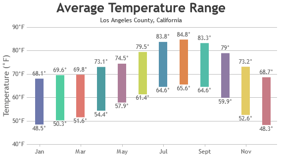
Angular Range Column Chart
Range Column Charts are also called Floating Column Chart as the columns are floating in given range instead of being attached to the base.
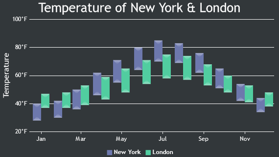
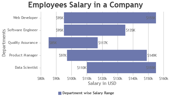
Angular Range Bar Chart
Range Bar Charts are similar to range column except that these are horizontally placed along with swapping x & y axis position.

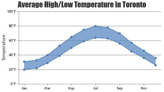
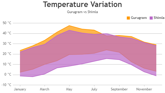
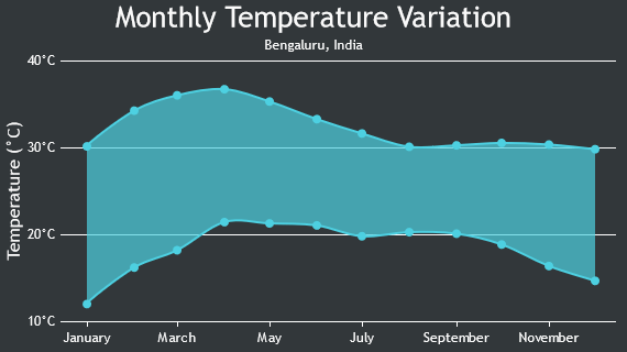
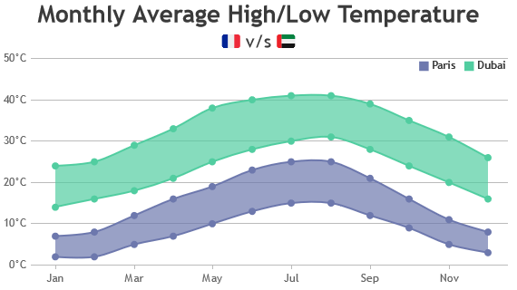
Angular Range Area Charts
Angular Range Area Chart is same as Area Chart except that it’s area is plotting between a given range.
Angular Range Spline Area Charts
Angular Range Spline Area Chart is same as Range Area Chart except that it uses a smooth curve.
Features used Commonly in Angular Range Charts
Most commonly used features in Angular Range Charts include animation, beveling the bars, index-labels, color, etc.
- Animation can be enabled by setting animationEnabled property to true.
- Beveling / Chisel effect on each bar can be enabled by setting bevelEnabled property to true.
- Indexlabel can be shown next to particular bar by setting indexLabel property of datapoint.
- Indexlabel can be shown for all the bars by setting indexLabel property in dataseries level.
- Color of the bar can be changed by setting color property.
Angular Range Chart Types
General Tips for Angular Bar Charts
- Try not to use includeZero property in Range Charts as the focus is on the range & setting includeZero can defeat the purpose
- Use multiple axes when two dataseries have different units / scale ranges.
- Having too many series in a chart makes it look cluttered. Experts suggest to have not more than 4 series in a chart.
- When you have more than 4 series, allow users to hide/unhide any series by clicking the legend
- It is recommended to sort datapoints in ascending order of x values.