• Demos
    • JavaScript Charts
    • JavaScript StockCharts
  • Download
    • Download Chart
    • Download StockChart
  • Integrations
    • Front End Technology Samples
      • React Charts
      • Angular Charts
      • Vue.js Charts New!
      • jQuery Charts
      • Dashboards
    • Server Side Technology Samples
      • PHP Charts
      • Python Charts New!
      • ASP.NET MVC Charts
      • Spring MVC Charts
      • JSP Charts
  • License
  • Blog
  • Docs
    • Chart Documentation
    • StockChart Documentation
  • Support Forum
    • Chart Support
    • StockChart Support
  • My Account
  • My Account
  • KEY FEATURES
    • Chart with Index / Data Label
    • Chart with Zooming & Panning
    • Multi Series Chart
    • Chart with Multiple Axes
    • Combination Charts
    • Chart with Animation
    • Chart with Logarithmic Axis
    • Dynamic Chart
    • Chart with Data from AJAX
    • Drilldown Chart
    • Responsive Chart
    • Synchronized Charts
  • LINE CHARTS
    • Line Chart with Date-Time Axis
    • Dashed Line Chart
    • Multi Series Line Chart
    • Spline Chart
    • Multi Series Spline Chart
    • Step Line Chart
    • Multi Series Step Line Chart
  • BAR CHARTS
    • Bar Chart with Category Axis
    • Multi Series Bar Chart
    • Stacked Bar Chart
    • Stacked Bar 100% Chart
    • Stacked Bar 100% Chart with Indexlabels
  • COLUMN CHARTS
    • Column Chart with Numeric Axis
    • Multi Series Column Chart
    • Stacked Column Chart
    • Stacked Column 100% Chart
    • Stacked Column 100% Chart with Indexlabel
    • Waterfall Chart
    • Waterfall Chart with Indexlabels
    • Multi Series Waterfall Chart
  • PIE & DOUGHNUT CHARTS
    • Pie Chart with Index Labels
    • Pie Chart in Dark Theme
    • Doughnut Chart with Index Labels
    • Doughnut Chart in Dark Theme
  • AREA CHARTS
    • Area Chart with Indexlabels
    • Multi Series Area Chart
    • Spline Area Chart
    • Multi Series Spline Area Chart
    • Step Area Chart
    • Stacked Area Chart
    • Stacked Area 100% Chart
  • RANGE CHARTS
    • Range Column Chart
    • Multi Series Range Column Chart
    • Range Bar Chart
    • Multi Series Range Bar Chart
    • Range Area Chart
    • Multi Series Range Area Chart
    • Range Spline Area Chart
    • Multi Series Range Spline Area Chart
  • BUBBLE & SCATTER CHARTS
    • Bubble Chart with Indexlabels
    • Bubble Chart with 3 Dimensional Data
    • Multi Series Scatter Chart
  • FUNNEL & PYRAMID CHARTS
    • Funnel Chart with Index Labels
    • Funnel Chart without Neck
    • Pyramid Chart with Index Labels
  • FINANCIAL CHARTS
    • Candlestick Chart
    • Multi Series Candlestick Chart
    • OHLC Chart
    • OHLC Chart from JSON data
    • Box & Whisker Chart
  • COMBINATION CHARTS
    • Error Bar Chart
    • Pareto Chart
    • Range Area & Line Chart
    • Candlestick & Line Chart
    • OHLC Chart with Trend
  • DYNAMIC CHARTS
    • Dynamic / Live Line Chart
    • Dynamic / Live Column Chart
    • Dynamic / Live Multi Series Chart
  • JAVASCRIPT, REACT, VUE.JS, JQUERY
    • JavaScript Charts
    • React Charts
    • Vue.js Charts
    • jQuery Charts
  • SERVER SIDE TECHNOLOGIES
    • ASP.NET MVC Charts
    • JSP Charts
    • PHP Charts
    • Python Charts
    • Spring MVC Charts

Angular Bubble Charts & Scatter Charts

Download Angular Chart Samples
  • Angular Chart Samples
  • JavaScript Chart Samples
  • React Chart Samples
  • Vue.js Chart Samples
  • jQuery Chart Samples
  • PHP Chart Samples
  • Python Django Chart Samples
  • ASP.NET Chart Samples
  • JSP Chart Samples
  • Spring MVC Chart Samples
  • Dashboard Samples
  • JavaScript StockChart Samples

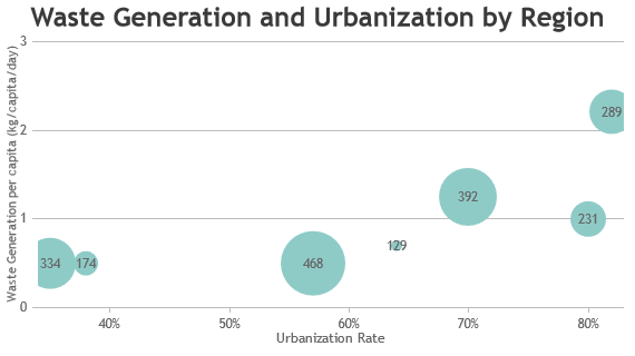
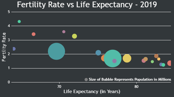
Angular Bubble Chart allows you to visualize data in 3 dimensions. It is very much similar to Scatter Charts except that size of bubble represents another parameter. Out of the three parameters required (x, y, z) to be present in a data point, x & y determine the bubble's position on X & Y Axis & z determines its size. One major difference in bubble from other charts is that size of the bubble is not linearly proportional to the z value.

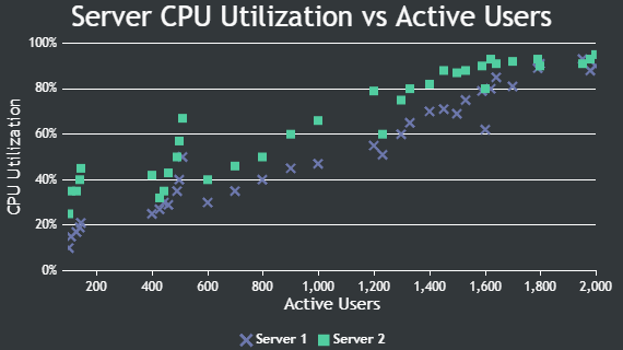
Angular Scatter charts represent data as a series of points with their axis co-ordinates determined by x and y value of data point. Sometimes it is also referred to as Scatter Plot or Point Chart. A marker is drawn at each point and its shape and size can be customized as required.

Angular Bubble Charts

Bubble Chart uses bubble-like symbols to depict data in the Plot Area.

Angular Bubble Chart with Index / Data Labels
Bubble Chart with Index Labels
Bubble Chart with 3 Dimensional Data

Angular Scatter Charts

Scatter Charts are also referred to as Scatter Plot / Point Chart.

Angular Multi Series Scatter Chart
Multi Series Scatter Chart

Features used Commonly in Angular Bubble & Scatter Charts

Most commonly used features in Angular Bubble & Scatter Charts include indexLabel, markers, etc.

  • Indexlabel can be shown for particular datapoint by setting indexLabel property of datapoint.
  • Indexlabel can be shown for all the datapoints by setting indexLabel property in dataseries level.
  • Size & type of the marker can be customized by setting markerSize & markerType properties.
  • Color of the marker can be changed by setting markerColor property

Angular Bubble & Scatter Chart Types

  • Angular Bubble Chart
  • Angular Scatter Chart

General Tips for Angular Bubble & Scatter Charts

  • Use bubble chart when there are less number of datapoints – an increase in the number of bubbles may result in congestion and overlapping.
© fenopix
  • About Us
  • FAQs
  • Careers
  • Privacy Policy
Server Side Technologies
  • ASP.NET MVC Charts
  • PHP Charts
  • JSP Charts
  • Spring MVC Charts
Front End Technologies
  • JavaScript Charts
  • jQuery Charts
  • React Charts
  • Angular Charts
  • JavaScript StockCharts
Contact
  • Fenopix, Inc.
  • 2093 Philadelphia Pike,
  • #5678, Claymont,
  • Delaware 19703
  • United States Of America