Login to Ask a Question or Reply
Forum Replies Created by Indranil
-
Yes, you can also check the range in pixels by converting the dataPoints x and y-value to pixel using convertValueToPixel() as shown in the code snippet below –
toolTip: {
  contentFormatter: function(e){
    var content = "", dataPoint, yWithinRange, xWithinRange;

    var toolTipXValue = e.chart.axisX[0].convertValueToPixel(e.entries[0].dataPoint.x);
    var toolTipYValue = e.chart.axisY2[0].convertValueToPixel(e.entries[0].dataPoint.y);

    for (var i = 0; i < e.chart.data.length; i++){

      dataPoint = e.chart.data[i].dataPoints[e.entries[0].index];

      if(dataPoint){

        yWithinRange = ((toolTipYValue - yRange) <= e.chart.axisY2[0].convertValueToPixel(dataPoint.y) && e.chart.axisY2[0].convertValueToPixel(dataPoint.y) <= (toolTipYValue + yRange));

        xWithinRange = ((toolTipXValue - xRange) <= e.chart.axisX[0].convertValueToPixel(dataPoint.x) && e.chart.axisX[0].convertValueToPixel(dataPoint.x) <= (toolTipXValue + xRange));

        if(yWithinRange === true && xWithinRange === true){

          content += "<span style='color:" + e.chart.selectedColorSet[i] + "'>" + e.chart.data[i].name + "</span>: " + "<strong>" + dataPoint.y + "</strong>";
          content += "<br/>";
        }
      }
    }
    return content;
  }
},
Also, kindly take a look at this JSFiddle for a working example with sample code.
___________
Indranil Deo
Team CanvasJSCan you kindly create a sample project reproducing the issue you are facing when CSS is declared in component and share it with us over Google-Drive or Onedrive so that we can run the sample locally at our end to understand the scenario better and help you out?
___________
Indranil Deo
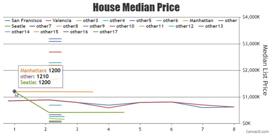
Team CanvasJSYou can show the dataPoints that are close to each other by selecting the dataPoints that fall within a specific range to the mouse pointer position. You can define the range by setting the following variables –
var yRange = 100;
var xRange = 10;
Then inside the toolTip contentFormatter you can display the dataPoints that fall within the given range as shown below –
toolTip: {
  contentFormatter: function(e){
    var content = "", dataPoint;
    toolTipXValue = e.entries[0].dataPoint.x;
    toolTipYValue = e.entries[0].dataPoint.y;

    for (var i = 0; i < e.chart.data.length; i++) {
      dataPoint = e.chart.data[i].dataPoints[e.entries[0].index];
      if(dataPoint && (toolTipYValue - yRange) <= dataPoint.y && dataPoint.y <= (toolTipYValue + yRange) && (toolTipXValue - xRange) <= dataPoint.x && dataPoint.x <= (toolTipXValue + xRange)){
        content += "<span style='color:" + e.chart.selectedColorSet[i] + "'>" + e.chart.data[i].name + "</span>: " + "<strong>" + dataPoint.y + "</strong>";
        content += "<br/>";
      }
    }
    return content;
  }
},
Please take a look at this JSFiddle for the complete code.

___________
Indranil Deo
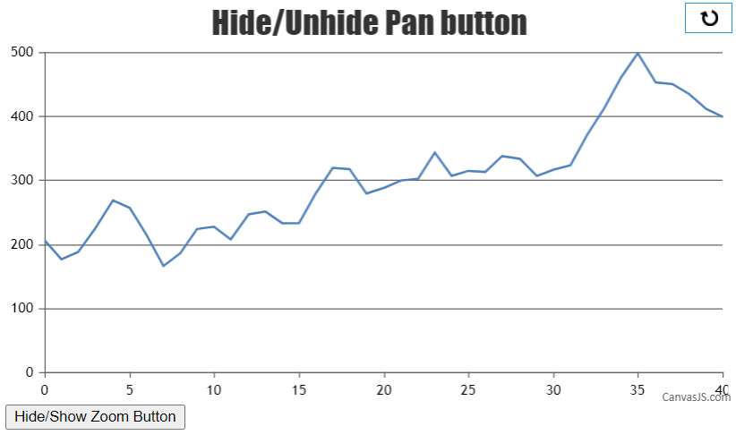
Team CanvasJSYou can hide the pan button by setting
display: none !important;for the specific HTML element(pan button) within a CSS class selector as shown below..hide-pan .canvasjs-chart-toolbar > button:first-child { display: none !important; }Then programmatically you can add or remove the CSS class to
chartContainer, in turn, hiding/unhiding the pan button.jQuery('#hideZoomPanButton').on('click', function() { if(jQuery('#chartContainer').hasClass('hide-pan')) jQuery('#chartContainer').removeClass('hide-pan'); else jQuery('#chartContainer').addClass('hide-pan'); });Please take a look at this JSFiddle for a complete working code.
___________
Indranil Deo
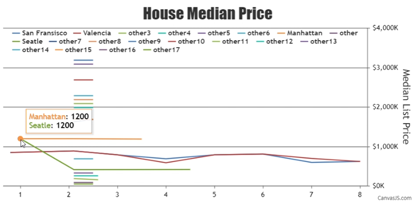
Team CanvasJSYou can modify the content of toolTip using contentFormatter to display each dataPoints having the same x and y values in a single toolTip. Please check the below code snippet for customizing the content of toolTip –
toolTip: {
  contentFormatter: function(e){
    var content = "", dataPoint;
    for (var i = 0; i < e.chart.data.length; i++) {
      dataPoint = e.chart.data[i].dataPoints[e.entries[0].index];
      if(dataPoint && dataPoint.x === e.entries[0].dataPoint.x && dataPoint.y === e.entries[0].dataPoint.y){
        content += "<span style='color:" + e.chart.selectedColorSet[i] + "'>" + e.chart.data[i].name + "</span>: " + "<strong>" + dataPoint.y + "</strong>";
        content += "<br/>";
      }
    }
    return content;
  }
},
Also, kindly take a look at this JSFiddle for a working example.
___________
Indranil Deo
Team CanvasJSIn case of line and area charts when you mouse hover on a specific series it gets highlighted. Hence, the toolTip is shown for the highlighted series based on the x-value of the nearest dataPoint to the mouse pointer position, even if, dataPoint of any other dataSeries are near to the cursor position. For example, if the series “Seatle” is highlighted then toolTip of the corresponding series would be shown based on the mouse pointer position to the nearest dataPoint. Please check the below screenshot for a reference –
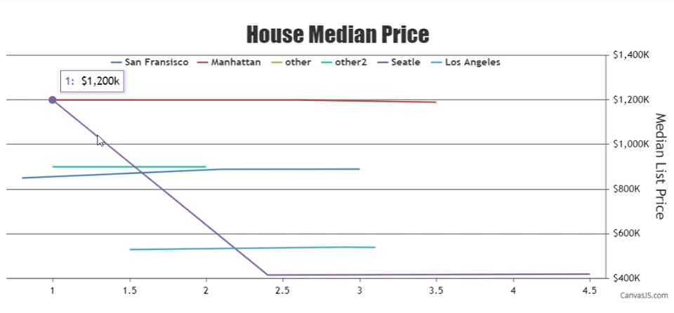
If the mouse pointer is shifted over a different series then the other series would be highlighted and toolTip for the other series would be shown. Please refer to the below screenshot for the same –
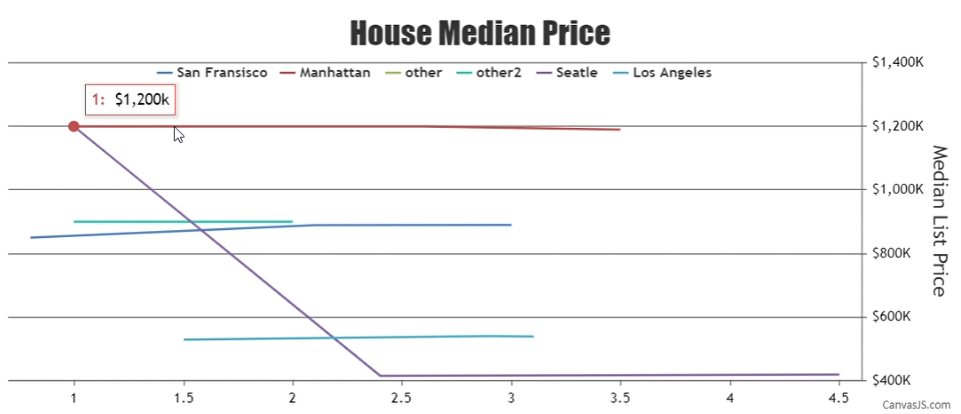
Based on the JSFiddle shared by you I would suggest you to use a shared toolTip.
___________
Indranil Deo
Team CanvasJSIf you like to disable interactivity with the chart (i.e. dataPoint highlight, toolTip, touch, and mouse events) you can set
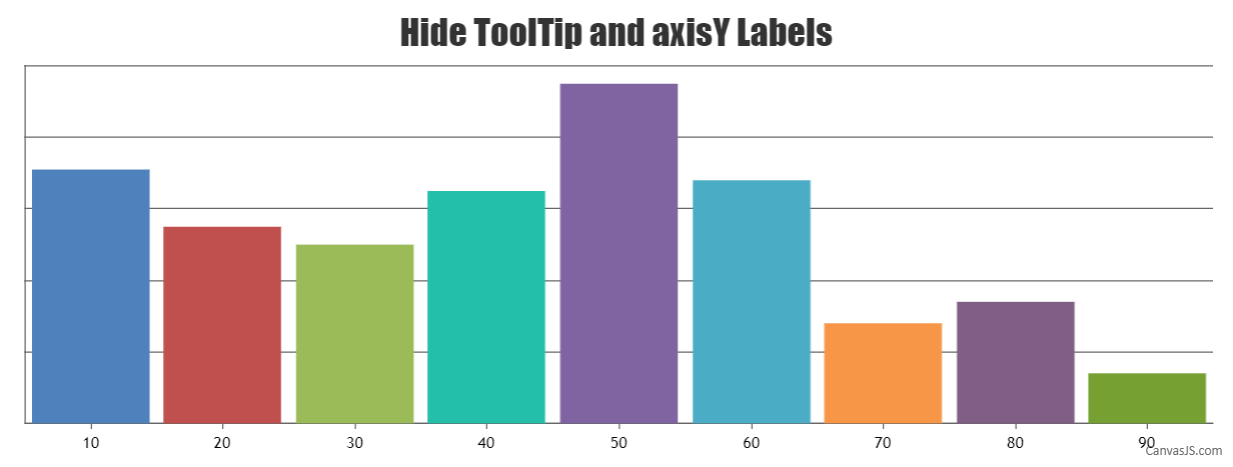
interactivityEnabled: false. However, if you want to highlight the dataPoint and just hide the toolTip you can disable it using enabled property as shown in the code below –toolTip:{ enabled: false, }To hide the y-axis labels and ticks you can return an empty string inside labelFormatter and set tickThickness to 0 as shown below –
axisY: {
  tickThickness: 0,
    labelFormatter: function(e) {
      return "";
    }
},
Also, kindly take a look at this JSFiddle for an example on hiding toolTip and y-axis labels.
___________
Indranil Deo
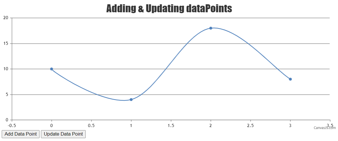
Team CanvasJSYou can update all chart elements including data and chart options dynamically by changing
chart.optionsand callingchart.render. Please check this documentation page for tutorial and live examples on updating chart options.If you are still facing issue, kindly create a JSFiddle reproducing the issue you are facing and share it with us so that we can look into the code / chart-options being used, understand the scenario better and help you resolve it.
___________
Indranil Deo
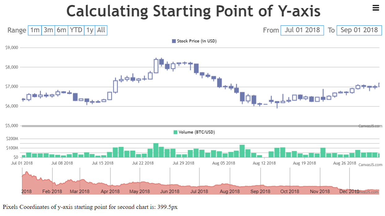
Team CanvasJSIn the code sample shared by you, the offsetTop value of chartContainer is added to the pixel coordinate of the axisY. The chartContainer contains the complete stockChart. Hence, to calculate the pixel coordinate of y-axis for a specific chart you need to add the offsetTop value of the chart with the pixel coordinate of the axisY as shown below –
stockChart.charts[1].container.offsetTop + stockChart.charts[1].axisY[0].convertValueToPixel(stockChart.charts[1].axisY[0].viewportMinimum)Also, kindly take a look at this JSFiddle for an example on calculating the starting/bottom point of y-axis.
___________
Indranil Deo
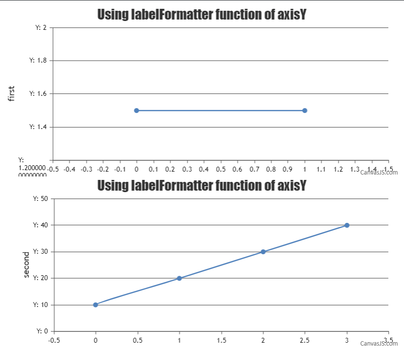
Team CanvasJSAligning y-axis for multiple charts can be achieved by setting the margin property. The margin value has to be calculated based on the bounds of y-axis as shown in the code below –
for(var i = 1; i < charts.length; i++) {
  charts[i].axisY[0].set("margin", charts[0].axisY[0].bounds.x2 - (charts[i].axisY[0].bounds.x2 - charts[i].axisY[0].bounds.x1));
}
Also, kindly take a look at this updated JSFiddle with the code to align the y-axis for multiple charts.
___________
Indranil Deo
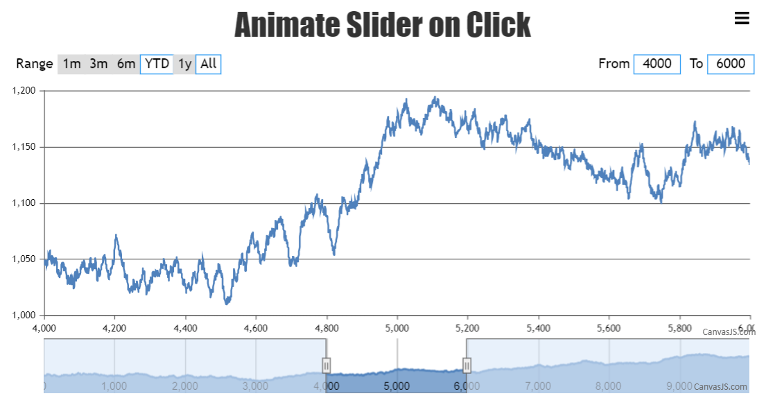
Team CanvasJSAnimating the shifting of slider can be achieved by updating minimum and maximum values of the slider using a timer. You can update the minimum and maximum values at a frequent interval inside the rangeChanged event handler with the help of a timer as shown in the code below.
rangeChanged: function(e) {
  clearInterval(animationTimer);
  if (flag === false && e.source === "navigator") {
    if (min < e.minimum) {
      animateSlider("right", e);
      animationTimer = setInterval(animateSlider, 50, "right", e);
    }

    if (max > e.maximum) {
      animateSlider("left", e);
      animationTimer = setInterval(animateSlider, 50, "left", e);
    }
  } else {
    min = e.stockChart.navigator.slider.get("minimum");
    max = e.stockChart.navigator.slider.get("maximum");
  }
},
In the above code snippet, animateSlider method updates the minimum and maximum values. Please refer to the code snippet below for the same.
function animateSlider(direction, e) {
    var range = (e.maximum - e.minimum);
    if(direction === "left")
      range = -(range);

    if(min < e.minimum || max > e.maximum) {
      e.stockChart.navigator.slider.set("minimum", (min + range / animationSpeed), false);
      e.stockChart.navigator.slider.set("maximum", (max + range / animationSpeed));

      min = min + range / animationSpeed;
      max = max + range / animationSpeed;
    }

    if ((min >= e.minimum && direction === "right") || (max <= e.maximum && direction === "left")) {
      clearInterval(animationTimer);
    }
  }
Also, kindly check this JSFiddle for complete code of an working example on the same.
___________
Indranil Deo
Team CanvasJSMouse events like click, mouseover, mouseout, etc. are not available on the stripline/axes labels as of now. Hence, it’s not possible to show toolTip on interaction with labels as of now.
___________
Indranil Deo
Team CanvasJSCan you kindly create a JSFiddle reproducing the issue you are facing along with sample JSON data – you can host the JSON data on some storage service like npoint.io and share it with us so that we can look into the code, understand the scenario better and help you out?
___________
Indranil Deo
Team CanvasJSAs of now, moving navigator slider with animation is not available as an inbuilt future. However, scrolling with the help of a timer might work but can have an impact on the performance. We will work further on it and get back to you at the earliest.
___________
Indranil Deo
Team CanvasJS