Login to Ask a Question or Reply
Forum Replies Created by Adithya Menon
-
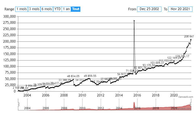
Since you are using the same dataPoints array on both the chart’s dataSeries and navigator’s dataSeries, any changes made to this array will be reflected on both the dataSeries. In order to remove the indexLabel from the navigator, you can clone an array of the dataPoints for the navigator’s dataSeries using jquery.extend() as shown in the code-snippet below,
navigator: {
    height: 50,
    data:[{
      dataPoints: cloneDPS(dps),
   }],
},

function cloneDPS(dps) {
	var tempDPS = [];
	for(var i = 0; i < dps.length; i++) {
  	tempDPS.push($.extend(true, {}, dps[i]));
  }
  return tempDPS;
}
Kindly take a look at this updated JSFiddle for an example on the same.
—
Adithya Menon
Team CanvasJSNovember 12, 2021 at 6:48 pm in reply to: Evaluating product- help with chart setting- crashes browser #36261Glad that you figured it out. Labels are shown at every interval of the axis. The interval property sets the distance between these labels. The interval property is automatically calculated, however, if you are setting it manually, you can provide a numerical value or combine it with intervalType property in case of date-time axis.
—
Adithya Menon
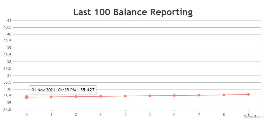
Team CanvasJSNovember 2, 2021 at 7:24 pm in reply to: want to display date with time when we hover over chart #36193It is possible to add some extra content (in your case timestamp) to the toolTip using contentFormatter property as shown in the code-snippet below,
contentFormatter: function (e) {
      var content = " ";
      for (var i = 0; i < e.entries.length; i++) {
        content += CanvasJS.formatDate(e.entries[i].dataPoint.extraContent, "DD MMM YYYY: hh:mm TT") + " : " + "<strong>" + e.entries[i].dataPoint.y + "</strong>"
        content += "<br/>";
      }
  return content;
}
You will also need to pass the necessary timestamps as a custom property to the dataPoints array as shown in the code-snippet below,
dataPoints: [
      { y: 35.427, extraContent: new Date(2021, 10, 01, 13, 35)},
      { y: 35.447, extraContent: new Date(2021, 10, 01, 14, 35)},
      { y: 35.467, extraContent: new Date(2021, 10, 01, 15, 35)},
      { y: 35.487, extraContent: new Date(2021, 10, 01, 16, 35)},
      ...
]
Kindly take a look at this updated JSFiddle for an example on rendering a chart with additional content on the toolTip.
—
Adithya Menon
Team CanvasJSIt is possible to use contentFormatter property to add some extra content to the toolTip on multi-series chart as well.
Kindly take a look at this updated JSFiddle for an example on rendering a multi-series chart with additional content on the toolTip.
—
Adithya Menon
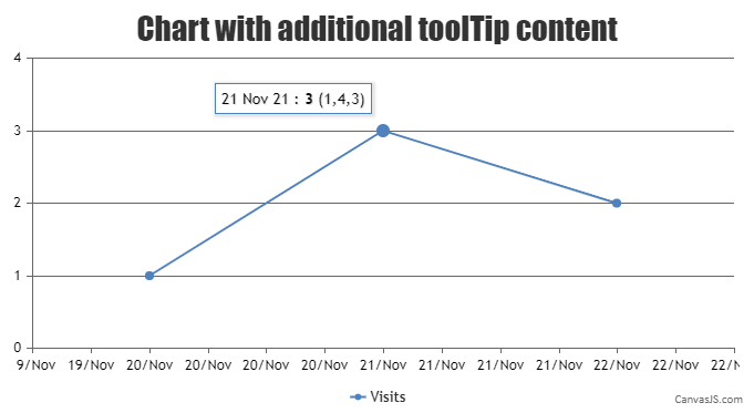
Team CanvasJSIt is possible to add some extra content to the toolTip using contentFormatter property as shown in the code-snippet below,
 contentFormatter: function (e) {
      var content = " ";
      for (var i = 0; i < e.entries.length; i++) {
        content += CanvasJS.formatDate(e.entries[i].dataPoint.x, "DD MMM YY") + " : " + "<strong>" + e.entries[i].dataPoint.y + "</strong>" + " " + e.entries[i].dataPoint.extraContent;
        content += "<br/>";
      }
  return content;
}
Kindly take a look at this JSFiddle for an example on rendering a chart with additional content on the toolTip.
—
Adithya Menon
Team CanvasJSDomnik,
The dataPoints must be parsed in a format accepted by CanvasJS. You can parse the dataPoints from an array and render the chart as shown in the code-snippet below,
function parseDataPoints () {
  for (var i = 0; i <= dataArray.length; i++)
    dps.push({y: dataArray[i]});
}

parseDataPoints();
chart.options.data[0].dataPoints = dps;
chart.render();
Kindly take a look at this JSFiddle for an example on parsing dataPoints from array and rendering the chart.
—
Adithya Menon
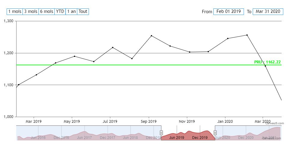
Team CanvasJSYou seem to have provided selectedRangeButtonIndex property along with startValue and endValue properties. In this case, the selectedRangeButtonIndex is overriding the other properties. You can remove the property to make it work as shown in this updated JSFiddle
—
Adithya Menon
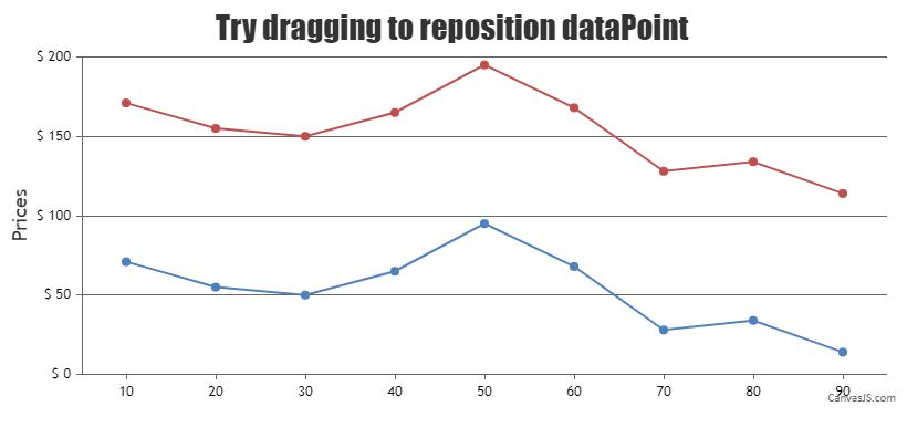
Team CanvasJSTo move the entire line by clicking on the dataPoint, you will have to change the position of dataPoint by adding / subtracting a value indicated by the mouse position with the dataPoint’s value, along with it, you will also have to add / subtract the same value to the entire dataSeries as shown in the code-snippet below,
for(var i = 0; i < chart.options.data[selectedDataSeries].dataPoints.length; i++) {
            if(chart.options.data[selectedDataSeries].dataPoints[i] !== chart.data[selectedDataSeries].dataPoints[selectedDataPoint]) {
              chart.options.data[selectedDataSeries].dataPoints[i].y = chart.options.data[selectedDataSeries].dataPoints[i].y + yValueDifference;
   }
}
Kindly take a look at this JSFiddle for an example on repositioning the entire dataSeries by dragging a single dataPoint.
—
Team CanvasJS
Adithya MenonIt is possible to change the position of a dataPoint by clicking on the marker and dragging as of now. But, moving the entire line by clicking on the dataPoint or on the line is not possible as of now.
—
Adithya Menon
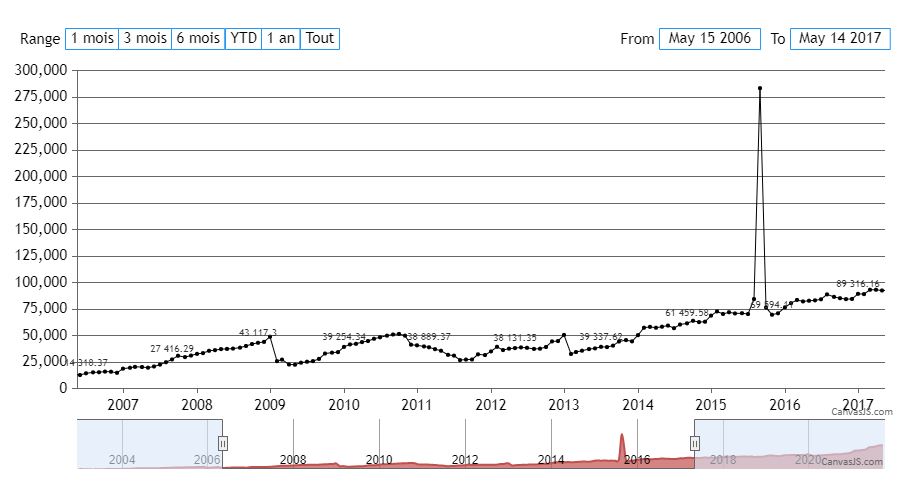
Team CanvasJSIt is possible to display the indexLabel on the last dataPoint by finding the index of the last dataPoint in the current viewport Range as shown in this code-snippet below,
for(var i = 0; i < stockChart.charts[0].data[0].dataPoints.length; i++) {
   if(stockChart.charts[0].data[0].dataPoints[i].x > stockChart.charts[0].axisX[0].viewportMinimum && stockChart.charts[0].data[0].dataPoints[i].x < stockChart.charts[0].axisX[0].viewportMaximum) {
      lastDataPointIndex = i;
      noOfDataPoints++;
   }
}
Kindly take a look at this updated JSFiddle for an example on the same.
—
Adithya Menon
Team CanvasJSIt’s possible to show indexlabels for selected datapoints based on number of datapoints present within the viewport of chart. You can also update them upon zooming / panning with the help of rangedChanged event. Please refer to the code-snippet below,
 function setIndexLabels(e) {
  var noOfDataPoints = 0;
  var stockChart = e.stockChart ? e.stockChart : e;
  for(var i = 0; i < stockChart.charts[0].data[0].dataPoints.length; i++) {
    if(stockChart.charts[0].data[0].dataPoints[i].x > stockChart.charts[0].axisX[0].viewportMinimum && stockChart.charts[0].data[0].dataPoints[i].x < stockChart.charts[0].axisX[0].viewportMaximum)
      noOfDataPoints++;
  }
  if(noOfDataPoints<15) {
    stockChart.options.charts[0].data[0].indexLabel = "{y}";
  }
  else {
    stockChart.options.charts[0].data[0].indexLabel = null;
    for(var i = 0; i < dps.length; i++) {
      stockChart.options.charts[0].data[0].dataPoints[i].indexLabel = null;
    }
    for(var i = 0; i < dps.length; i) {
      stockChart.options.charts[0].data[0].dataPoints[i].indexLabel = "{y}";
      i = i+Math.ceil(noOfDataPoints/10);
    }
  }
  if(stockChart != e) {
  	stockChart.options.rangeSelector.selectedRangeButtonIndex = e.index;
  }
  stockChart.render();
}
Kindly take a look at this updated JSFiddle for complete code on the same.
—
Adithya Menon
Team CanvasJSSeptember 15, 2021 at 6:50 pm in reply to: adding data fields to chart at initialization time #35739The get and set methods of chart are used to access and/or change the available chart properties present in the library once the chart is rendered. However, methods don’t support reading custom properties passed in the chart-options. You can access them using chart.options as shown in the code-snippet below.
chart.options.myField1;
chart.options.myField2;
Kindly take a look at this updated JSFiddle for an example on reading custom properties using chart.options.
—
Adithya Menon
Team CanvasJSSeptember 14, 2021 at 6:19 pm in reply to: adding data fields to chart at initialization time #35715Can you kindly create JSFiddle and share it with us (or a sample project and share it with us over Google-Drive or OneDrive) along with further briefing about the issue you are facing so that we can look into code / chart-options being used, understand the scenario better and help you out?
—
Adithya Menon
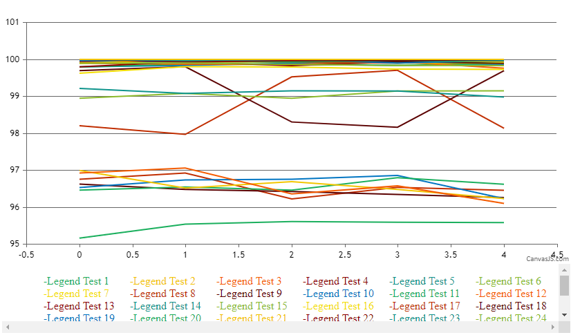
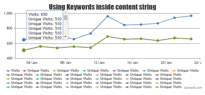
Team CanvasJSSeptember 10, 2021 at 4:58 pm in reply to: Scrollbar to chart canvas is increasing as tooltip height increases #35688It is possible to use a scrollbar when there are multiple dataSeries needed to be shown on the toolTip. You can do so by changing overflow-y, height and pointer-events CSS properties of ‘canvasjs-chart-tooltip’ class as shown in the code-snippet below,
.canvasjs-chart-tooltip{
  height: 100px !important;
  overflow-y: scroll !important;
  pointer-events: auto !important;
}
Kindly take a look at this updated JSFiddle for an example on scrollable toolTip.
—
Adithya Menon
Team CanvasJS
