Login to Ask a Question or Reply
Forum Replies Created by Adithya Menon
-
In order to render the chart with updated options (data), you need to use the render method after updating the chart options. To access ref attributes in react, you need to use chart.current.chart. Please take a look at this react documentation for more information.
Please take a look at this updated StackBlitz example.
—-
Adithya Menon
Team CanvasJSYou can use Area chart type or Range Area chart type to create polygon shapes on the chart. Since you are using arbitrary points which don’t have a range of values, you can use Area chart type as shown in this updated JSFiddle. Duplicating the first datapoint at the end of the datapoints array will close the area chart to create a shape that you can customize according to your requirement.
—
Adithya Menon
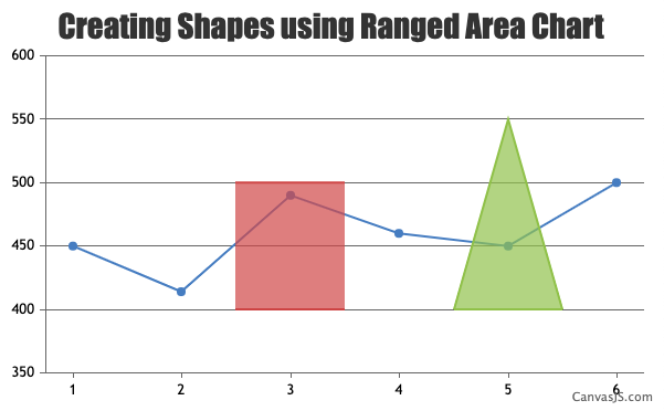
Team CanvasJSYou can use Range Area chart type and provide the datapoint values as x and y coordinates to create shapes like triangle, rectangle etc. Similarly, you can provide your own set of x and y coordinates as datapoints and draw polygons on the chart as shown in this updated JSFiddle example.
—
Adithya Menon
Team CanvasJSSeptember 13, 2022 at 7:20 pm in reply to: X and Y axis text of Graphs are not adapting text spacing on Graph Report page. #39116CanvasJS doesn’t have a property for text spacing as of now. In case you are setting text spacing via CSS, they will not be reflected in the charts.
If you have meant something else by “text spacing setting”, kindly create JSFiddle with your use-case and share it with us so that we can look into the code, understand the scenario better and help you out.
—
Adithya Menon
Team CanvasJSYou can use Range Area chart to create shapes in the chart & fill it with desired color by setting color property in dataseries level.
Please take a look at this JSFiddle for an example on the same.
—
Adithya Menon
Team CanvasJSSeptember 12, 2022 at 7:00 pm in reply to: Interactive Graph controls present on the page are not accessible using keyboard #39106Accessibility for individual datapoints using “Tab” key is not available as of now. However, you can provide a chart-description for a chart container by adding aria-label and tabindex, which can be read using the screen reader like windows narrator when the focus is kept on the chart. Please check the below code snippet for adding aria-label and tabindex –
var chartDescription = "A Funnel  Chart showing Company Recruitment Process where in which 63 percent of candidates cleared the aptitude test, 35 percent cleared the technical interview, 15 precent went through the HR interview and out of which 5 percent candidates were recruited";

chart.container.setAttribute("aria-label", chartDescription);
chart.container.setAttribute("tabindex", "0");
___________
Adithya Menon
Team CanvasJSTo zoom into a certain region, there should be a minimum of 3-4 dataPoints – behavior is designed such that zooming is limited upto a certain region, so the user doesn’t end up zooming into a blank-region (region with no dataPoints). It is not possible to change the restriction as of now. But we will reconsider this behavior for future versions.
___
Adithya Menon
Team CanvasJSYou can customize the position of zoom / pan button by changing the CSS of the ‘canvasjs-chart-toolbar’ class as shown in the code snippet below,
.canvasjs-chart-toolbar {
  display: none;
  position: absolute !important;
  top: -34px !important;
  left: 0 !important;
  right: auto !important;
  margin-left: 157px !important;
}
Please take a look at this JSFiddle for an example where zoom / pan buttons are positioned above the chart plot area (near the range selector buttons).
—
Adithya Menon
Team CanvasJSThe example shared seems to be working fine. Can you kindly create a sample project reproducing the issue you are facing and share it with us over Google-Drive or Onedrive along with the sample data and a brief description of your exact requirement so that we can look into the code, run it locally to understand the scenario better and help you resolve?
—-
Adithya Menon
Team CanvasJSYou can hide the zoom / reset toolbar by changing CSS display property to block or none based on some conditions as shown in the code snippet below,
if(e.trigger === "reset" || (e.source == "buttons" && e.index == 3) || (e.source === "navigator" && e.minimum <= minimum && e.maximum >= maximum)) { //condition check for reset button on toolbar
    document.getElementsByClassName("canvasjs-chart-toolbar")[2].style.display = "none";
  }
  else if((e.trigger ==="zoom" || e.trigger === "pan") || e.source === "buttons" || (e.source === "navigator" && e.minimum >= minimum && e.maximum <= maximum)) {
    document.getElementsByClassName("canvasjs-chart-toolbar")[2].style.display = "block";
  }
Kindly take a look at this updated JSFiddle for an example on the same.
—
Adithya Menon
Team CanvasJSYou can use a doughnut chart to create a gauge chart as shown in this StackBlitz example.
—
Adithya Menon
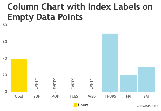
Team CanvasJSYou can add custom strings like “EMPTY” on all the datapoints where y-values are 0 using indexLabel property on the datapoint level as shown in the code-snippet below,
for(var i = 0; i < chart.options.data[0].dataPoints.length; i++) {
  	if(chart.options.data[0].dataPoints[i].y === 0) {
    	 chart.options.data[0].dataPoints[i].indexLabel = "EMPTY"
}
Kindly take a look at this JSFiddle for an example on your requirement.
—
Adithya Menon
Team CanvasJSThe x value that you are passing in the dataPoints is a string but it accepts only numeric or dateTime values. To display string values you can use the label property.
If this doesn’t solve your issue, kindly create a sample project reproducing the issue you are facing and share it over Google-Drive or Onedrive along with sample data so that we can look into your code, and understand it better and help you out.
__
Adithya Menon
Team CanvasJSMaik,
valueFormatString property is used to format the axis labels but you seem to be getting confused it with xValueFormatString. xValueFormatString is used to format the x-values shown in tooltip & indexlabel.
Also, labelFormatter overrides the valueFormatString property which might not work properly in your case. Setting just valueFormatString & removing labelFormatter should work fine in your case.
If you are still facing the issue, kindly share the sample project reproducing the issue over Google-Drive or Onedrive so that we can look into the code / chart-options being used, and run the project locally to understand the scenario better and help you out.
—
Adithya Menon
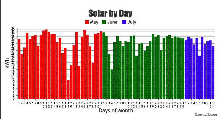
Team CanvasJSIn the case of multi-series column charts, space is allocated for all the datapoints having same x-values across all the dataseries. In your case, each X-axis label only had a single datapoint where space was left for the other 2 dataseries. In order to show the column appear in axis label, you need to add all the datapoints into a single dataseries and set the color property at the datapoint level as shown in the code snippet below,
for(var i = 0; i < dps.length; i++) {
  	if(dps[i].x <= 31) {
    	dps[i].color = "#ff0000";
    }
    else if(dps[i].x > 31 && dps[i].x <= 61) {
    	dps[i].color = "#006600";
    }
    else if(dps[i].x > 61 && dps[i].x <= 72){
    	dps[i].color = "#0000ff";
    }
  }
To show the legends for each month, you can use a dummy dataSeries. Kindly take a look at this updated JSFiddle for an example on the same.
—
Adithya Menon
Team CanvasJS