Login to Ask a Question or Reply
Forum Replies Created by Adithya Menon
-
Giant,
It looks like you are trying to use a condition to check if the income data is not null and then adding both the income and expense datapoints. The query provides the result as null, however, to show 0 on the chart, you can remove the if condition
if($resultRows['iamt']!=null) { ... }and use (int) to typecastnullvalue as0, as shown in the code-snippet below,foreach ($result as $resultRows) { array_push($dataPoints1, array("x" => strtotime(date($resultRows['exp_dt'])) * 1000, "y" => (int) $resultRows['iamt'])); array_push($dataPoints2, array("x" => strtotime(date($resultRows['exp_dt'])) * 1000, "y" => (int) $resultRows['eamt'])); }—
Adithya Menon
Team CanvasJSGiant,
Since you are using PHP date, you will have to convert the date to a JavaScript timestamp. To convert PHP date to JavaScript timestamp, first, you need to convert PHP date to PHP timestamp using strtotime and then convert PHP timestamp to JavaScript timestamp by multiplying PHP timestamp by 1000. Also, you will have to convert the y-values to numerical format using (int) since y property only accepts numbers.
Kindly refer to the code-snippet below for the changes that will have to be made to your code,
array_push($dataPoints1, array("x" => strtotime(date($resultRows['exp_dt'])) * 1000, "y" => (int) $resultRows['iamt']));
array_push($dataPoints2, array("x" => strtotime(date($resultRows['exp_dt'])) * 1000, "y" => (int) $resultRows['eamt']));
—
Adithya Menon
Team CanvasJSKindly fork/save the JSFiddle and share the link with us so that we can understand your scenario better and help you out.
__
Adithya Menon
Team CanvasJSGiant,
It looks like some of the tables needed to run your SQL Query are missing. Can you kindly create a sample project along with a sample database (adding the necessary tables to your database) reproducing the issue you are facing & share it with us so that we can help you out?
—
Adithya Menon
Team CanvasJSIt is not possible to add an image on the datapoint of the chart as of now. However, you can add Unicode characters to the indexLabel and place them inside the datapoint by setting indexLabelPlacement property as
inside.Kindly take a look at this updated JSFiddle for an example on adding Unicode characters to the indexLabel.
At the same time, you can show image on the tooltip. Please refer to this JSFiddle for an example on the same.
—
Adithya Menon
Team CanvasJSYou can position images in the middle of the doughnut chart by adding a few lines of code. Please check out the code snippet below for the same,
img.style.position = "absolute";
img.style.display = "block";
img.style.top =  chart.height/2 - img.offsetHeight/2 + "px";
img.style.left = chart.width/2 - img.offsetWidth/2.3 + "px";
Also, please take a look at this JSFiddle for a complete code. For further insight, please refer to this step-by-step guide for positioning images over chart.
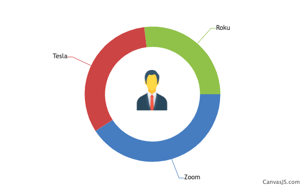
—
Adithya Menon
Team CanvasJSGiant,
It looks like the sample provided by you is restricted and requires permission. Can you please make the image / sample public so that we can access it?

If the Google Drive link shared contains an image, can you kindly create a sample project with a sample database reproducing the issue you are facing & share it with us so that we can look into the code / chart-options being used, understand the scenario better and help you out?
—
Adithya Menon
Team CanvasJSYou can create a table which shows data represented in the graph with a few lines of code. Please find the code-snippet below,
function addTable(chart){
	var tableData = "";
	for(var i = 0; i < chart.data.length; i++){
  		tableData += "<tr>" + "<td style='color:" + chart.data[i].color + "'>■" + chart.data[i].name + "</td>";
      for(var j = 0; j < chart.data[i].dataPoints.length; j++){
      	tableData += ("<td>" + chart.data[i].dataPoints[j].y +"%</td>")
      }
      tableData += "</tr>";
  }
  $("#chartData").append(tableData)
}
Kindly take a look at this JSFiddle for the complete code.
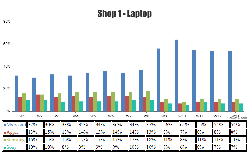
—
Adithya Menon
Team CanvasJSSince you are using chart options to access the datapoints, the code must be re-written to fit your scenario as shown in the code snippet below,
if (chart.options.data[0].dataPoints.length > 10 ) {
   chart.options.data[0].dataPoints.shift();
 }
If this doesn’t solve your requirement, kindly share a sample project over Google Drive or Onedrive reproducing the issue you are facing, so that we can look into the code, run it locally to understand the scenario better, and help you out.
—
Adithya Menon
Team CanvasJSPlease refer to this article for an example on visualizing an audio waveform using CanvasJS.
—
Adithya Menon
Team CanvasJSWhen you are moving your mouse over the datapoints, the tooltip is shown and the datapoints are highlighted. If you are looking to disable the highlighting of the datapoint when the tooltip is shown, you can set the highlightEnabled property to “false”.
—
Adithya Menon
Team CanvasJSJuan,
You can set indexLabelOrientation property to “vertical” or “horizontal” depending on the number of datapoints and update the chart options. Please find the code snippet below,
if(chart.options.data[0].dataPoints.length > 15)
    chart.options.data[0].indexLabelOrientation = "vertical";
  else
    chart.options.data[0].indexLabelOrientation = "horizontal";
  chart.render();
Please take a look at this JSFiddle for working example.
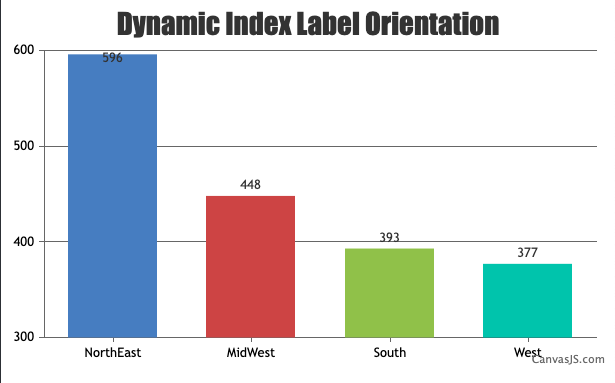
—
Adithya Menon
Team CanvasJSYou can set datapoint color based on the datapoint value, whether it’s rising or falling as shown in the code-snippet below.
function changeBorderColor(chart){
  var dataSeries;
  for( var i = 0; i < chart.options.data.length; i++){
    dataSeries = chart.options.data[i];
    for(var j = 0; j < dataSeries.dataPoints.length; j++){
      dataSeries.dataPoints[j].color = (dataSeries.dataPoints[j].y[0] <= dataSeries.dataPoints[j].y[3]) ? ("green"? "green" : dataSeries.color) : ("red" ? "red" : dataSeries.color);
    }
  }
}
Please take a look at this JSFiddle for working example.
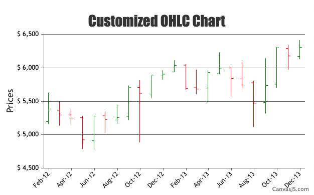
—
Adithya Menon
Team CanvasJSThe memory for canvas buffer memory is limited to 25% of the RAM of the device. We have further optimized the memory consumption in CanvasJS Chart v2.3.1 and v3.6. Kindly download the latest version of CanvasJS Charts from our download page.
Based on your scenario, it should work fine without any issues. If you are performing an AJAX request to populate data to the chart, I suggest you create the chart outside the AJAX, just update datapoints & call chart.render() within the AJAX.
To optimize the performance further, you can try lazy loading the charts. We have tested the same using jquery.inview & it seems to perform better compared to the regular way of rendering charts / stockcharts.
Kindly take a look at this JSFiddle for a working example on the same.
—
Adithya Menon
Team CanvasJSBart,
You can use stripLines on the X-axis to create lines between the different categories.
Kindly refer to this JSFiddle for an example on the same.
Also, based on the screenshot that you have shared, we suggest you to set labelAngle property to 0 and labelTextAlign property to
centerto make the chart look better.—
Adithya Menon
Team CanvasJS