@swebs,
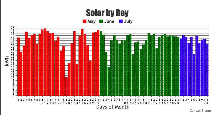
In the case of multi-series column charts, space is allocated for all the datapoints having same x-values across all the dataseries. In your case, each X-axis label only had a single datapoint where space was left for the other 2 dataseries. In order to show the column appear in axis label, you need to add all the datapoints into a single dataseries and set the color property at the datapoint level as shown in the code snippet below,
for(var i = 0; i < dps.length; i++) {
  	if(dps[i].x <= 31) {
    	dps[i].color = "#ff0000";
    }
    else if(dps[i].x > 31 && dps[i].x <= 61) {
    	dps[i].color = "#006600";
    }
    else if(dps[i].x > 61 && dps[i].x <= 72){
    	dps[i].color = "#0000ff";
    }
  }
To show the legends for each month, you can use a dummy dataSeries. Kindly take a look at this updated JSFiddle for an example on the same.
—
Adithya Menon
Team CanvasJS
.