Home Forums Chart Support Multi-Series with different X axis values

Multi-Series with different X axis values

Viewing 4 posts - 1 through 4 (of 4 total)
  • #34462

    This is an odd case, I know. But…
    I would like to have a chart with multiple series, but, the X axis for each series is a different set of values. In my example: Series1 is ‘May, June, July, Aug’, and Series 2 is ‘Jan, Feb, Mar, April’. The chart displays fine with both series, but the X axis only shows the first series in the array (may-aug).

    Believe me, due to the nature of the data I want to compare, the timeframes are different. I have thought about doing 2 charts, one for each series, stacked on top of each other. But, in the real world that won’t work as my data is dynamic, and I may have 1 series the first time, 5 series the next, etc.

    Here is a simple example:
    https://jsfiddle.net/canvasjs/QwZuf/#&togetherjs=DS5E2OUTkx

    Not sure if this is a bug, a feature add ask, or just plain impossible with the way the chart code works.
    Thanks
    JE
    #34477

    @jeffe,

    It seems like you have provided us with the JSFiddle link which contains the template code.

    Please fork/save the JSFiddle reproducing the issue and then share the link with us so that we can look into your code, understand the scenario better and help you out.


    Adithya Menon
    Team CanvasJS

    #34488

    Actually, it looks like what I want to do works, as long as the X axis is a Date or numeric value. It seems that the chart will sort that data accordingly so it’s in order. So, I Can work with that.

    The next issue is that my data series is not a continuous range of dates. For example:
    05/23/2021 – 200
    05/24/2021 – 250
    –I.e. weekend —
    05/27/2021 – 225
    05/28/2021 – 300

    The chart automatically puts in the missing dates (05/25, 05/26) and then plots a 0 in those locations. I want the series to ignore the missing data and not draw the series as 200 –> 250 –> 0 –> 0 –> 225 –>300. I want it to be 200–>250–>225–>300 and ignore the missing dates.

    Is there a way to do this?

    #34503

    @jeffe,

    When the x-values passed are date-time, labels will be rendered at every interval based on the value of intervalType (For example: if interval is 1, intervalType is ‘month’ – labels will be shown at every 1 month).

    In your case, where you want to show only working days, you can use label instead of x.

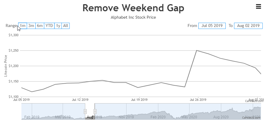
    Alternatively, you can use scaleBreaks to remove the gap of the weekend as shown in the code-snippet below,

    function removeWeekendGap(stockChart) {
      var scaleBreaks = [], dps = stockChart.charts[0].data[0].dataPoints;
      for(var i = 1; i < dps.length; i++) {
        if(dps[i].x.getDate() - 1 != dps[i-1].x.getDate())
          scaleBreaks.push({startValue: new Date(dps[i - 1].x.getTime() + (12 * 60 * 60 * 1000)), endValue: new Date(dps[i].x.getTime() - (12 * 60 * 60 * 1000))});
      }
    
      stockChart.options.charts[0].axisX.scaleBreaks.customBreaks = scaleBreaks;
      stockChart.render();
    } 

    Please take a look at this JSFiddle for an example on removing the weekend gap.

    removing weekend gap using ScaleBreaks


    Adithya Menon
    Team CanvasJS

Viewing 4 posts - 1 through 4 (of 4 total)

You must be logged in to reply to this topic.