Angular Financial & Advanced Charts
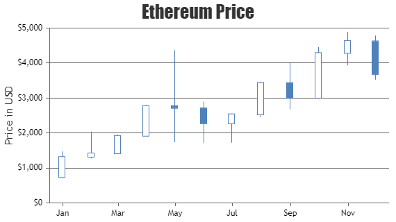
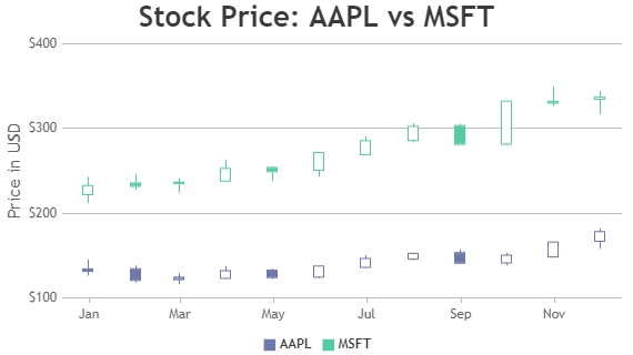
Angular Financial Charts include Candlestick & OHLC Charts. Candlestick Chart forms a column with vertical line to represent open, high, low and closing values of a datapoint. In Candlestick Chart the body is filled with white color when closing price is greater than opening price. Library supports customizing this fill color using risingColor property. Like other charts, candlestick can also have one or more dataseries where each series is automatically assigned a color based on the selected theme.
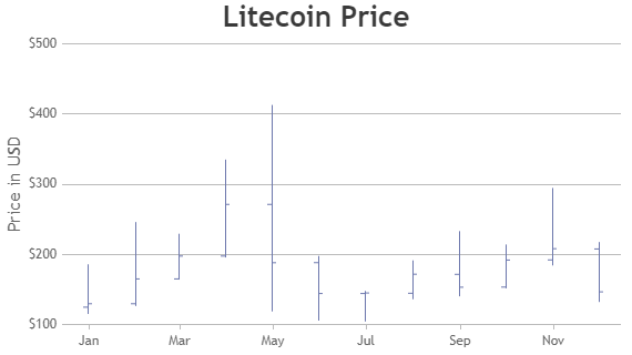
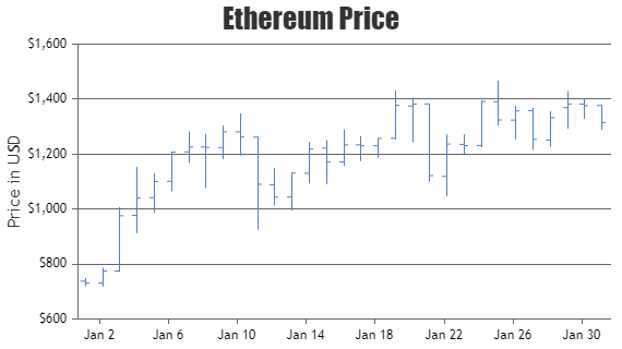
Angular OHLC / Stock Chart is similar to Candlestick Chart except that tick marks to the left and right of vertical line are used to show opening and closing prices. Candlestick & OHLC Charts are financial charts used to describe price movements of a security, derivative, or currency. These charts are generally used in stock markets to represent the open, high, low & close values of the stock.
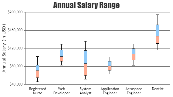
Angular Box & Whisker Chart uses boxes and lines to depict the distributions of one or more groups of numeric data.
Angular Candlestick Charts
Candlestick Charts are generally used by traders to determine possible price movement based on past patterns.
Angular OHLC Charts
OHLC Charts is a style of financial chart describing open, high, low & closing price of the stock.
Angular Box & Whisker Charts
Box & Whisker Chart are also referred as Box Plot.
Features used Commonly in Angular Financial & Advanced Charts
Most commonly used features in Angular Candlestick & OHLC Charts include risingColor, fallingColor, color, etc.
- Rising color & falling color can be changed by setting risingColor & fallingColor properties.
- The color of the datapoint can be changed by setting color property.
Angular Financial & Advanced Chart Types
General Tips for Angular Financial & Advanced Charts
- Use risingColor & fallingColor to showcase rise & fall in the trends.
- You can use Line Chart or Column Chart along with Financial Charts to show technical indicators
