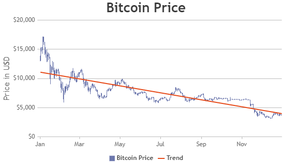
Angular Combination Charts
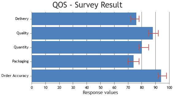
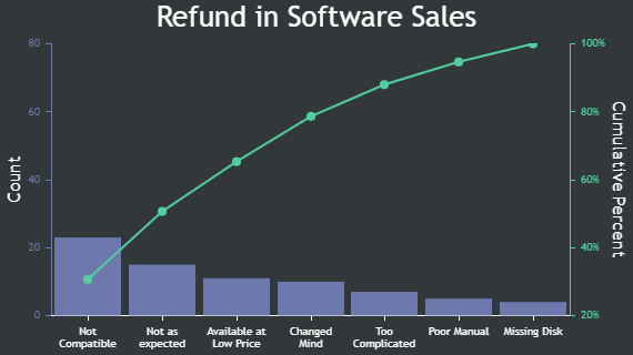
Angular Combination Charts are made by combining multiple chart types that supports axis like line, column, area, etc. They are also referred as Combo Charts or Mixed Charts.
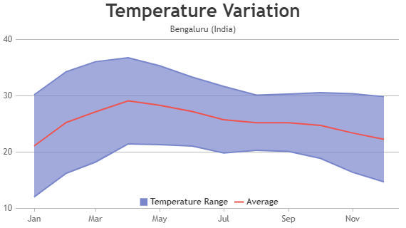
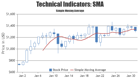
Combination of Range & Line Charts are generally used to show the range (high & low values) along with it's average values. For example high & low temperature can be shown using Range Area Chart & it's average using Line Chart. Similarly, Line Charts are also used to show technical indicators when they are combined with Candlestick / OHLC Charts.
Angular Combination Charts
Combination Charts (Combo / Mixed Charts) are formed by combining multiple chart types in one chart.
Features used Commonly in Angular Combination Charts
Most commonly used features in Angular combination charts include color, showing series name in legend, hiding / unhiding dataseries on clicking legend, etc.
- The color of the datapoint can be changed by setting color property.
- You can show dataseries name in legend by setting showInLegend property to true.
- You can hide / unhide dataseries on clicking the legend items. This is done by toggling visible property of dataseries.
General Tips for Angular Combination Charts
- Most of the technical indicators can be added to chart using line chart.
- Enable hiding / unhiding dataseries when you are using multi-series charts.
