Angular Column Charts & Graphs
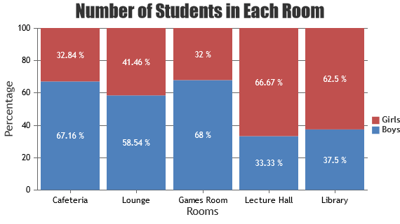
Angular Column Charts are represented by rectangles where height of the rectangle is proportionate to the datapoint y-value. Column Charts are also known as Vertical Bar Charts. Generally positive values are plotted upward in column chart, whereas negative are plotted downward unless y-axis is reversed. CanvasJS Angular Component supports rendering varieties of column charts like Column, Stacked Column, Stacked Column 100%. In case of more than one series, Data Points from different Series are placed next to one another and are differentiated by their color. However in Stacked Column Chart, datapoints from different series are stacked one on top of the other instead of placing them side-by-side like in standard multi-series chart.
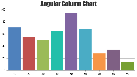
Angular Column Charts
Column Chart, also called as Vertical Bar Chart are useful to compare value between different categories / series.
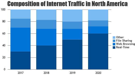
Angular Stacked Column Charts
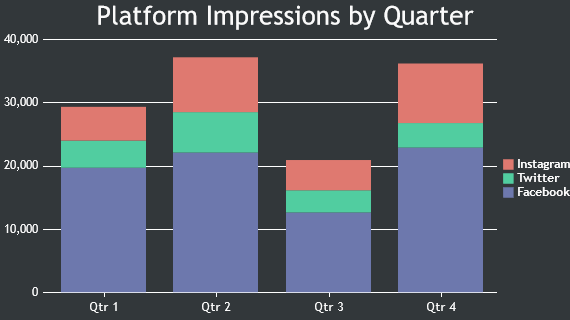
Stacked Column Charts – columns from each dataseries are stacked vertically on top of each other and are used to show relation between individual value to the total sum.
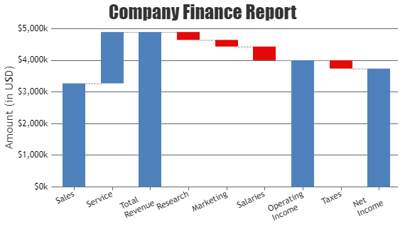
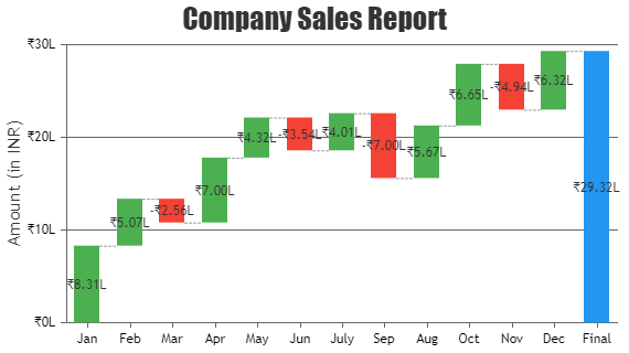
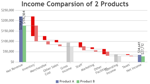
Angular Waterfall Charts
A waterfall chart is used for visualizing financial statements, comparing earnings and analyzing sales or product value over a period of time.
Features used Commonly in Angular Column Chart
Most commonly used features in Angular Column Chart includes animation, beveling the column, index-labels, color, etc.
- Animation can be enabled by setting animationEnabled property to true.
- Beveling / Chisel effect on each column can be enabled by setting bevelEnabled property to true.
- Indexlabel can be shown on top of particular column by setting indexLabel property of datapoint.
- Indexlabel can be shown for all the column by setting indexLabel property in dataseries level.
- Color of the column can be changed by setting color property.
How to Improve Performance of Angular Column Chart?
In most of the cases Angular Column Chart renders faster with default options provided by the library. But in case you still want to optimize for specific cases, these are the tweaks to be done to make chart render faster.
- Avoid beveling the column charts when there are more datapoints
- In case of Dynamic Charts, don’t re-create chart each time you have to add a new datapoint. Instead, update the datapoints array & call render() method of chart.
Angular Column Chart Types
General Tips for Angular Column Charts
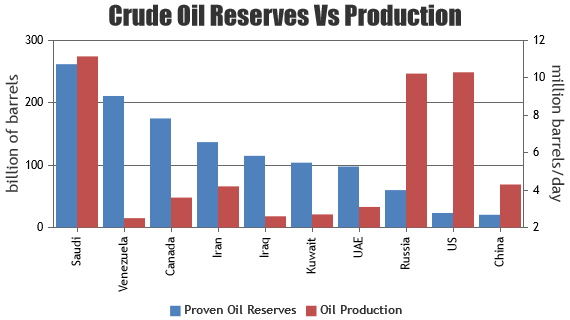
- Use multiple axes when two dataseries have different units / scale ranges.
- Having too many series in a chart makes it look cluttered. Experts suggest to have not more than 4 series in a chart.
- When you have more than 4 series, allow users to hide/unhide any series by clicking the legend
- It is recommended to sort datapoints in ascending order of x values.
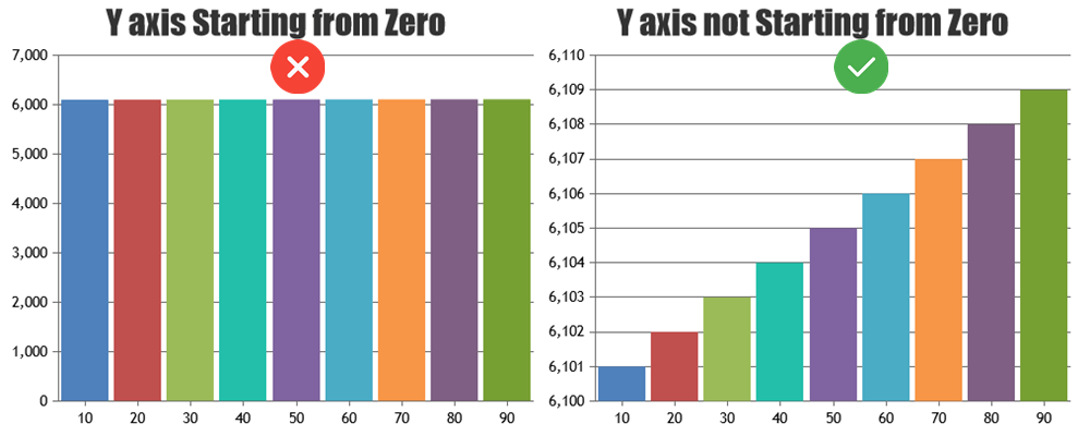
- Show zero baseline in vertical axis if and only if it’s required. Column charts should ideally show changes / variations in value clearly. Including zero in y-axis might not make the variations obvious when the variation in y values are small compared to their values.