Login to Ask a Question or Reply
Forum Replies Created by Thangaraj Raman
-
Thanks for reporting the use case. We will revisit this in future releases.
—
Thangaraj Raman
Team CanvasJSGradient is there in our roadmap but no definite timeline yet.
—
Thangaraj Raman
Team CanvasJSThe samples from our website have been built using Eclipse and we suggest you to run it in Tomcat server(<=v9) within Eclipse. However, if you want to run it in IntelliJ IDEA, you will have to configure Tomcat server(<=v9) within IntelliJ IDEA. Please refer to this article for a tutorial on the same.
—
Thangaraj Raman
Team CanvasJSDate-time values can be displayed on a chart by week, month, or year based on the data being passed to it. Please take a look at this gallery page for an example of creating a chart using month-wise data.
—
Thangaraj Raman
Team CanvasJSYou can download the commercial version package from the My Account page and the steps to integrate have been addressed in the instruction.html file which is present inside each package under the @canvasjs folder.
For example, if you are integrating CanvasJS charts with Angular, download the commercial version and navigate to @canvasjs > angular-charts > instruction.html
—
Thangaraj Raman
Team CanvasJSXavier,
Thanks for your valuable feedback. As of now, the commercial version of the package is available to download from My Account page only.
—
Thangaraj Raman
Team CanvasJSYou can download the commercial version of CanvasJS from My Account page and follow the instructions in the readme file to integrate it into your project.
—
Thangaraj Raman
Team CanvasJSPlease take a look at this gallery example where exporting is enabled. Setting the exportEnabled property to true in chart option seems to work fine. Please refer to documentation for more chart options & customizations available.
—
Thangaraj Raman
Team CanvasJSYou can enable the chart toolbar for printing and saving charts as an image in CanvasJS Angular Charts by setting exportEnabled to true.
—
Thangaraj Raman
Team CanvasJSThe interval at which axis labels are shown is auto-calculated based on the axis range. You can set the x-axis interval to 1 to show the x-axis labels at whole numbers.
Please check this updated StackBlitz for a working example of the same.
—
Thangaraj Raman
Team CanvasJSIn the case of Stacked Charts, datapoints across multiple dataseries are aligned based on x-values and not labels. Passing x-value along with the label should work fine in this case.
Please take a look at this JSFiddle for a working example on the same.
—
Thangaraj Raman
Team CanvasJSBy default, the chart width is 100% and height is 400px. To scale the chart, you can set the width and height of the container in which the chart will be rendered based on your requirement as shown in the code snippet below.
<div id="chartContainer" style="height: 500px; width: 800px;">—
Thangaraj Raman
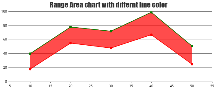
Team CanvasJS1. Is it possible in range area chart to have top and bottome lines in different color?
It is not possible to set different colors for the top and bottom lines of a range area chart as of now. However, you can add a line dataseries with the y-values same as one of the range values in the range area chart to fulfill your requirement. Please take a look at this JSFiddle for a working example on the same.
2. Is it possible to set a different area color between points in the range area chart?
The range area chart can only have one fill color as of now. However, by splitting your datapoints into multiple range area dataseries, you can achieve your requirement. Please take a look at this JSFiddle for a working example on the same.
3. Is it possible to set a different chart background color between points in the range area chart?
Could you please elaborate on what you mean by “set a different chart background color between points” or share a pictorial representation of this requirement so that we can understand your scenario better and help you out with an appropriate solution?
—
Thangaraj Raman
Team CanvasJSEvents are bound to the Stockchart only once during instantiation and not when the StockChart is re-rendered.
—
Thangaraj Raman
Team CanvasJS