Login to Ask a Question or Reply
Forum Replies Created by Thangaraj Raman
-
February 27, 2025 at 6:19 pm in reply to: CanvasJS crashed with JS script running in PhantomJS to build chart PNG image. #60624
You can use dataPointWidth to set a custom fixed width for the data points.
Alternatively, you can also set dataPointMaxWidth to automatically limit the width of columns when the number of datapoints increases.
—
Thangaraj Raman
Team CanvasJSTo prevent axis labels from overlapping when interval is set, you can rotate the labels using labelAngle.
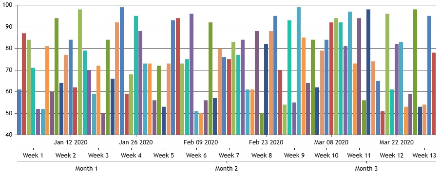
To make the chart horizontally scrollable, you can use the code snippet below:
<div class="wrapper" style="width: 100%; overflow-x: auto">
  <div id="chartContainer" style="height: 360px; width: 200%;"></div>
</div>
—
Thangaraj Raman
Team CanvasJSYou can create a chart with multiple x-axes and use striplines to show labels on these axes based on your requirement as shown in this JSFiddle.
—
Thangaraj Raman
Team CanvasJSPlease take a look at this StackBlitz for the same example in React.
—
Thangaraj Raman
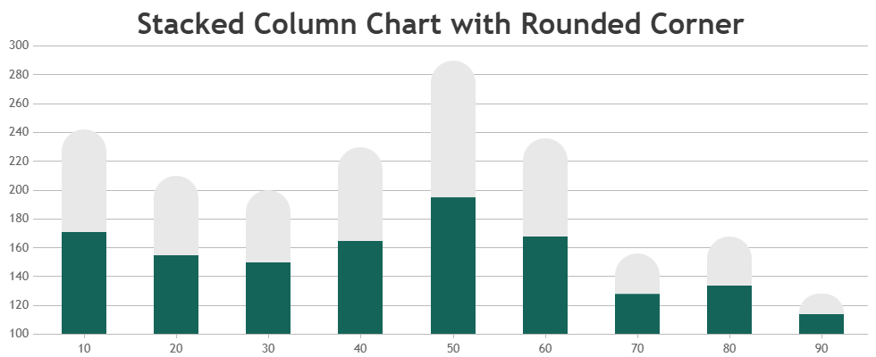
Team CanvasJSRounded corners are currently not supported in column charts as of now, but it’s on our wishlist for future updates. In the meantime, adding border-radius in the example shared in this article will help in achieving your requirement as shown in this JSFiddle.
—
Thangaraj Raman
Team CanvasJSOctober 25, 2024 at 6:08 pm in reply to: Customizing the Zoom functionality in the Mouse wheel event. #59994The example that I shared earlier was created for a numeric axis, however your example has a date-time axis. Please check this updated JSFiddle for an example on zooming using mouse wheel for a date-time axis.
—
Thangaraj Raman
Team CanvasJSOctober 10, 2024 at 6:00 pm in reply to: Questions after update @canvasjs/charts in @canvasjs/angular-charts #59922You are setting the x-axis interval to 1 minute due to which the chart might freeze as it is unable to render such a large dataset at a 1 minute interval. Setting a larger interval will fix this.
Please check the StackBlitz for an example.
—
Thangaraj Raman
Team CanvasJS.October 8, 2024 at 2:52 pm in reply to: Points are displayed with a delay rather than immediately. Part 2 #59912We have released Chart v3.10.11 with a few bug fixes related to axis. Please refer to the release blog for more information. Do download the latest version from our download page and let us know your feedback.
—
Thangaraj Raman
Team CanvasJSOctober 1, 2024 at 11:48 pm in reply to: Questions after update @canvasjs/charts in @canvasjs/angular-charts #59881The example that you shared is working fine in Angular with the latest version. Can you please create a sample project reproducing the issue that you are facing and share it over OneDrive / Google Drive, so that we can run it locally at our end, understand the scenario better, and help you resolve that?
—
Thangaraj Raman
Team CanvasJSIn a spline chart, the curve/smoothness of the line is based on the consecutive datapoints. In your example, the curve is not observable due to the datapoint values.
—
Thangaraj Raman
Team CanvasJSSeptember 23, 2024 at 6:54 pm in reply to: Points are displayed with a delay rather than immediately. Part 2 #59847The first few datapoints are not displayed initially because you are setting the x-axis interval to 1 minute, however, there is insufficient data to show a 1-minute interval. Setting the interval to 1 minute after there is data for more than a minute will fix this as shown in the code snippet below:
if(this.options.data[0].dataPoints.length > 30) {
	 this.options.axisX.interval = 1;
   this.options.axisX.intervalType = 'minute';
}
Please check this updated JSFiddle for a working example.
—
Thangaraj Raman
Team CanvasJSAdding a click event to axis labels is not possible as of now.
—
Thangaraj Raman
Team CanvasJSSeptember 20, 2024 at 7:17 pm in reply to: Why does a colored axis line remain on the other side when changing axisYType? #59834Although there are no dataseries attached to a particular y-axis, the axis line will still be shown on the chart since its properties have been defined in the axisY/axisY2 array of objects. Removing these objects from axisY/axisY2 should work fine in your case.
Please check this updated JSFiddle for a working example.
—
Thangaraj Raman
Team CanvasJS