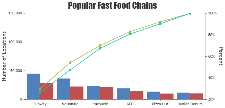
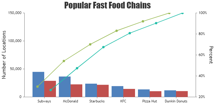
You must be logged in to post your query.
Home › Forums › Chart Support › Multi series pareto chart
Tagged: pareto
Hi…
I would like to use CanvasJS charts. Is it possible to have a multi series pareto chart?
https://canvasjs.com/angular-charts/pareto-chart/
In need to display a dataset with pairs of columns and two lines.
A combination of
https://canvasjs.com/angular-charts/multi-series-column-chart/
and
https://canvasjs.com/angular-charts/multi-series-spline-chart/
@lujakob,
You can add another column dataseries to the chart, and apply the same logic as in the Angular Pareto Chart gallery example to create another line series.
Please take a look at this StackBlitz for a working example.
— Thangaraj Raman Team CanvasJS
Thanks Thangaraj,
that’s already pretty close. But is it possible to adjust the x-position of the line dots for them to be horizontale aligned with the columns. As seen in your example it’s not possible to identify which line corresponds to which bar. So the dots of the first line should be centerd on the blue bar, the dots of the second line centerd on the red bar. Do you know what I mean?
You can add an offset to the x-values in the line chart in order to align them to their respective columns as shown in the code snippet below:
dps1.push({label: chart.data[0].dataPoints[i].label, x: chart.data[0].dataPoints[i].x - 0.25, y: yPercent1}); dps2.push({label: chart.data[0].dataPoints[i].label, x: chart.data[0].dataPoints[i].x + 0.25, y: yPercent2});
Please check this updated StackBlitz for a working example.
This helped me immensly. Thanks a lot.
You must be logged in to reply to this topic. Login/Register