Login to Ask a Question or Reply
Forum Replies Created by Thangaraj Raman
-
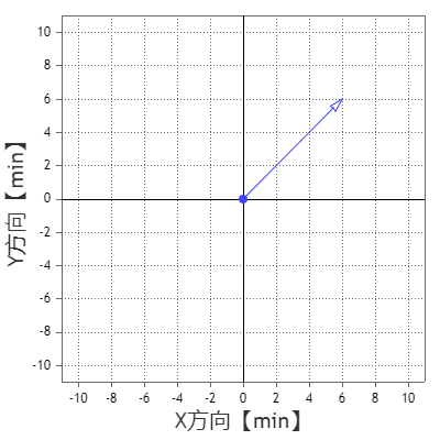
Reducing your destination point to 95% of its actual value seems to be working fine with the current line thickness that you have set. Please check this updated JSFiddle for working code.
—
Thangaraj Raman
Team CanvasJSUsing canvas properties like lineCap and lineJoin with CanvasJS charts is not possible as of now. In your example, the arrow exceeds the plot point because of the line thickness. Reducing the line thickness will fix this.
Please check this updated JSFiddle for a working example.
—
Thangaraj Raman
Team CanvasJSMarcel,
You can use the toUTCString() method to convert Javascript timestamp values into UTC format. Please refer to this stack overflow thread for more information.
Also, you can use the toLocaleString() method in labelFormatter and tooltip contentFormatter to format date-time values displayed in the axis labels and tooltip. You can output dates that are in UTC or local time to a specific timezone by passing
timeZoneoption totoLocaleString().—
Thangaraj Raman
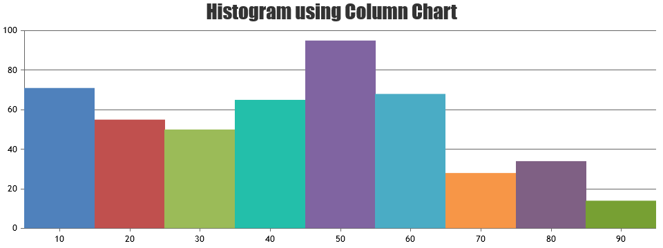
Team CanvasJSHistogram chart can be rendered by setting dataPointWidth based on axis width and the number of dataPoints in a column chart. Please check this JSFiddle for an example.
—
Thangaraj Raman
Team CanvasJSSeptember 6, 2024 at 2:38 pm in reply to: Points are displayed with a delay rather than immediately #45840CanvasJS chart seems to be working fine on the initial render itself. Can you kindly create a JSFiddle or a sample project reproducing the issue and share it with us over Google Drive or OneDrive so that we can look into the code, run it locally to understand the scenario better, and help you out?
—
Thangaraj Raman
Team CanvasJSAugust 2, 2024 at 5:37 pm in reply to: Strange margin at right on charts when working with a lot of data and rangebars #45646Jose,
In your first example, the last axisX label(350,000) is automatically pushed inside the chart to ensure best fit, hence there will be some padding to the right of the chart. You can set labelAutoFit to false to override this default behavior which will remove any padding to the right, however the last label may get clipped.
Please check this JSFiddle for a working example.
—
Thangaraj Raman
Team CanvasJSIt is not possible to add intermediate divisions on the axes, as of now. However, you can set the interval at which intermediate ticks will be displayed and use the labelFormatter function to display labels selectively based on a custom property called majorInterval. Please check the code snippet below:
 axisX: {
    interval: 1,
    gridThickness: 0,
    majorInterval: 10,
    labelFormatter: function (e) {
      if(e.value % e.axis.majorInterval == 0)
        return e.value
      else
        return "";
    },
    stripLines: xGridLines
  },
You can use stripLines to show gridlines wherever an axis label is shown. Please check this JSFiddle for a working example.
—
Thangaraj Raman
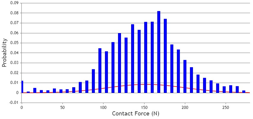
Team CanvasJSIn the example you shared, the chart displays a line dataseries and a column dataseries with reduced width. This is happening because of the large difference in the number of datapoints between the line and column dataseries. The chart automatically reduces the width of the columns to accommodate datapoints from both series in the plot area.
You can use the dataPointWidth property to set a fixed width for the column chart. Please check this updated JSFiddle for a working example.
—
Thangaraj Raman
Team CanvasJSTo fetch custom data by clicking on a datapoint, you can use the click event handler and access all chart properties(custom and predefined) using the event object.
—
Thangaraj Raman
Team CanvasJSCanvasJS Charts seems to be working fine across all the browsers except Chromium-based browsers in certain use cases. This is due to a HTML canvas-related bug in one of Chrome’s updates. Please check this link for more information. Please try updating to the latest version of Chrome where this issue might be fixed.
—
Thangaraj Raman
Team CanvasJSThe chart container has to be a
div, not acanvas, as shown in the code snippet below:<div id="myChart" style="border:1px solid #000000; margin-right: auto; margin-left: auto; display: block;"></div>Please take a look at this docs page for a step-by-step tutorial on creating a chart.
—
Thangaraj Raman
Team CanvasJSThe interval at which axis labels are displayed is automatically calculated based on multiple factors like chart height / width, axis minimum & maximum, etc.
—
Thangaraj Raman
Team CanvasJSYou can use the convertValueToPixel method to get the pixel coordinate for a given value along the axis. Similarly, you can use the convertPixelToValue method to get the value along the axis for a particular pixel coordinate.
—
Thangaraj Raman
Team CanvasJSApril 8, 2024 at 6:18 pm in reply to: Why in “Candle Stick Chart With …” the surrounding color is red? #44921You can set the datapoint color based on the datapoint value, whether it’s rising or falling as shown in the code snippet below:
function changeBorderColor(chart){
  var dataSeries;
  for( var i = 0; i < chart.options.data.length; i++){
    dataSeries = chart.options.data[i];
    for(var j = 0; j < dataSeries.dataPoints.length; j++){
      dataSeries.dataPoints[j].color = (dataSeries.dataPoints[j].y[0] <= dataSeries.dataPoints[j].y[3]) ? (dataSeries.risingColor ? dataSeries.risingColor : dataSeries.color) : (dataSeries.fallingColor ? dataSeries.fallingColor : dataSeries.color);
    }
  }
}
Please check this JSFiddle for a working example.
—
Thangaraj Raman
Team CanvasJS