@alexg00,
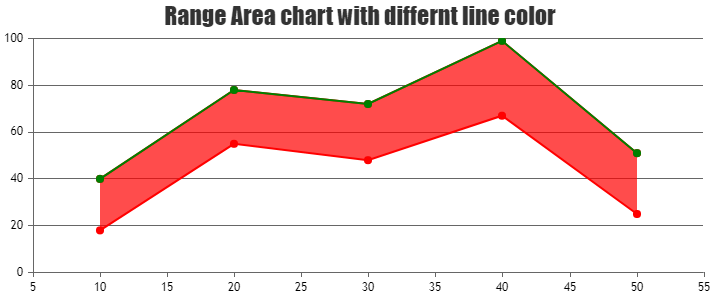
1. Is it possible in range area chart to have top and bottome lines in different color?
It is not possible to set different colors for the top and bottom lines of a range area chart as of now. However, you can add a line dataseries with the y-values same as one of the range values in the range area chart to fulfill your requirement. Please take a look at this JSFiddle for a working example on the same.
2. Is it possible to set a different area color between points in the range area chart?
The range area chart can only have one fill color as of now. However, by splitting your datapoints into multiple range area dataseries, you can achieve your requirement. Please take a look at this JSFiddle for a working example on the same.
3. Is it possible to set a different chart background color between points in the range area chart?
Could you please elaborate on what you mean by “set a different chart background color between points” or share a pictorial representation of this requirement so that we can understand your scenario better and help you out with an appropriate solution?
—
Thangaraj Raman
Team CanvasJS
.