Login to Ask a Question or Reply
Forum Replies Created by Thangaraj Raman
-
[Update]
We have released v3.5 GA with support for CSP. Please refer to the release blog for more information.
We have just released Chart v3.5 Beta-1 with a few improvements related to CSP. Please refer to the release blog for more information. Do download the latest version from download page & let us know your feedback.
—
Thangaraj Raman
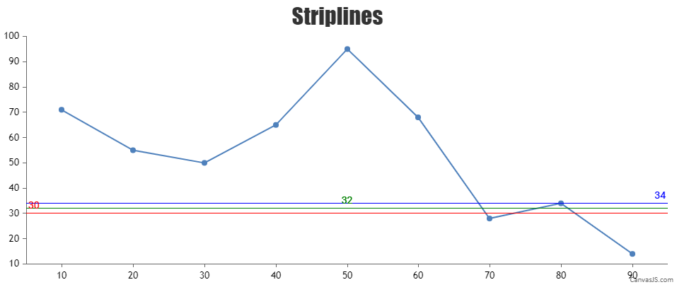
Team CanvasJSStripline labels are positioned on top of the respective stripline and not on the line itself. In your case, the labels are getting overlapped due to the closeness of stripline values.
You can avoid the overlapping by showing some of the labels near to the axis and other labels either at the center or far from the axis using the labelAlign property. When stripline values are very close, you can set a different color for each stripline and also set the corresponding labelFontColor to differentiate each stripline and its label.
Please check this JSFiddle for a working example.
—
Thangaraj Raman
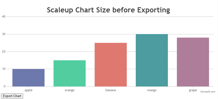
Team CanvasJSYou can scale-up or scale-down the chart before exporting using exportChart method and reset it back soon after exporting. Please take a look at this JSFiddle for a working example.
If the solution suggested doesn’t fulfill your requirement, kindly create a sample project reproducing the issue you are facing and share it with us over Google-Drive or Onedrive so that we can look into the code, understand the scenario better and help you out.
—
Thangaraj Raman
Team CanvasJSYou can customize a DIV using CSS to visualize the needle as shown in the code snippet below –
HTML
<div class="speedometer__needle js-needle"></div>CSS
.speedometer__needle {
  position: absolute;
  width: 30px;
  height: 30px;
  border-radius: 50%;
  background: transparent;
  top: 72%;
  left: 50%;
  transition: .3s ease-in-out;
To position the needle at a specific point you can use CSS transform property. Please check the code snippet below –
$( '.js-needle' ).css({
  'transform' : 'translate(-50%, -50%) rotate('+  (tickValue * 18.0) + 'deg)'
});
Please check this JSFiddle for a working example which meets your requirement.

—
Thangaraj Raman
Team CanvasJS-
This reply was modified 4 years, 2 months ago by
Thangaraj Raman.
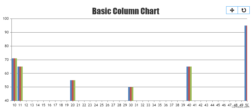
The dataPointWidth is auto calculated such that no column is overlapped in case of a single series or multi-series chart. In your case, you are setting the dataPointWidth manually which makes the columns overlap with each other.
Please take a look at this updated JSFiddle for a working example.
Considering this thread as a duplicate of Bar Chart Overlapping Issue and hence closing the same.
—
Thangaraj Raman
Team CanvasJSThe dataPointWidth is auto calculated such that no column is overlapped in case of a single series or multi-series chart. In your case, you are setting the dataPointWidth manually which makes the columns overlap with each other.
Please take a look at this updated JSFiddle for a working example.

—
Thangaraj Raman
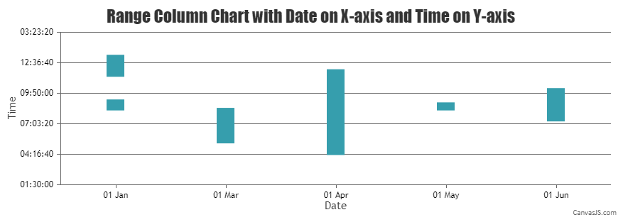
Team CanvasJSYou can convert the x-values to labels and combine dataPoints with the same date using similar x-values. Please find the code snippet for the same below.
function setXValue(data) {
  var xValue = 0;
  for(var i = 0; i < data.length; i++) {
    if(data[i+1] && data[i].x.getTime() === data[i+1].x.getTime()) {
      data[i].label = data[i].x;
      data[i].x = xValue;
    }
    else {
      data[i].label = data[i].x;
      data[i].x = xValue;
      xValue++
    }
  }
  return data
}
Please take a look at this JSFiddle for a working example.
—
Thangaraj Raman
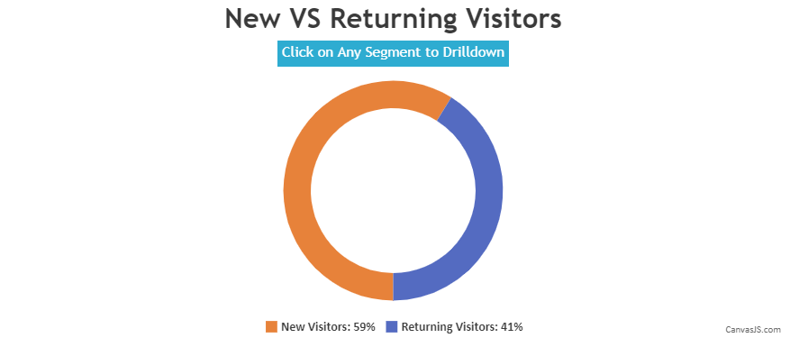
Team CanvasJSFebruary 7, 2022 at 7:32 pm in reply to: Creating waterfall chart by selecting point in linechart #36889You can create a drilldown chart to achieve your requirement. Please take a look at this gallery page for an example on the same.
—
Thangaraj Raman
Team CanvasJSCan you kindly brief us further about your requirement along with a pictorial representation and also create a sample project reproducing the issue you are facing and share it with us over Google-Drive or Onedrive along with sample data so that we can look into your code, run it locally at our end to understand the scenario better, and help you out?
—
Thangaraj Raman
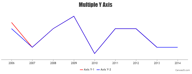
Team CanvasJSChart renders dataseries in the same sequence in which they are passed to the chart-options. Passing the dataseries with red color before the dataseries with blue color should work fine in your case. Please take a look at this updated JSFiddle for a working example.
—
Thangaraj Raman
Team CanvasJSTo achieve your requirement, you can loop through the dataPoints and convert each y-value from millimeter to pixel as the chart is rendered based on pixels. Please take a look at this updated JSFiddle for a working example on the same.
—
Thangaraj Raman
Team CanvasJSThe dataPoints in a chart are plotted based on pixel coordinates. You can convert millimeter to pixel value by multiplying it by 3.7795. Please find the code snippet below.
function convertMillimeterToPixel(mm) {
	return (mm * 3.7795);
}
Please take a look at this JSFiddle for an example on setting chart width & height in millimeters. You can use legendText to display the scale-ratio.
—
Thangaraj Raman
Team CanvasJSThanks for your interest in CanvasJS and we appreciate you for bringing this to our notice.
As we are busy implementing some other important features at this point of time, we will re-look into this concern in future versions to improve our library further.
—
Thangaraj Raman
Team CanvasJSStrip Lines are used to highlight a certain region in the plot area across the full width/height of the chart and hence cannot have breakpoints. However, in your case, you can use a multi-series line chart with 2 dataPoints each to represent the start and end coordinates of the line.
Kindly take a look at this JSFiddle for a working example.
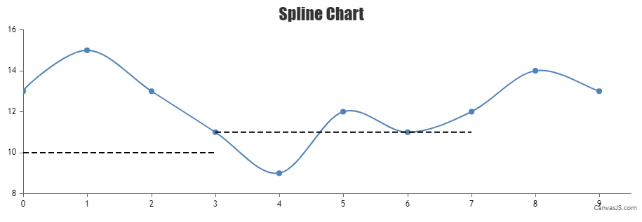
If the solution suggested doesn’t fulfill your requirement, kindly brief us further about your use case so that we can understand your scenario better and help you out with an appropriate solution.
—
Thangaraj Raman
Team CanvasJS -
This reply was modified 4 years, 2 months ago by