Login to Ask a Question or Reply
Forum Replies Created by Manoj Mohan
-
Thanks, I guess the same applies for the x axis right?
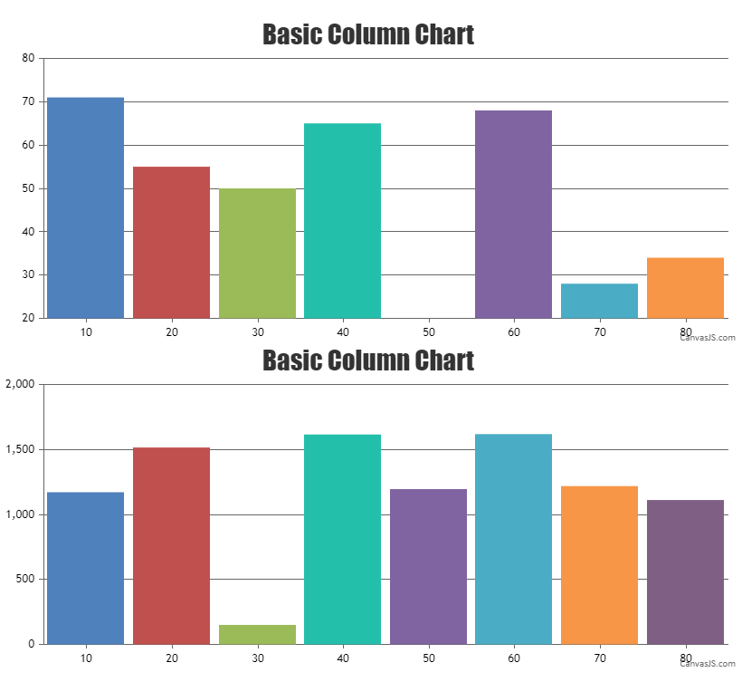
Yes, you can align x-axis across multiple chart using same logic as mentioned above.
Hi there, this dont work on chart updates. I let you the example
Try to hide and show Series multiple timesYou can reset the margin of y-axis to 0 before aligning the y-axis across multiple charts as shown in the code snippet below.
for(var i = 0; i < charts.length; i++) {
   charts[i].axisY[0].set("margin", 0);
}
Also, please take a look at this updated JSFiddle for complete code.
—-
Manoj Mohan
Team CanvasJS@chemoinformaticsm,
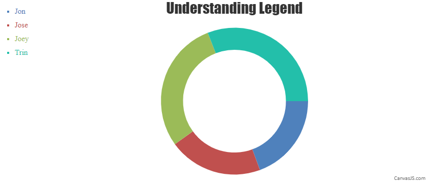
It is not possible to reduce the gap between doughnut and legend using chart properties as of now. However, you can reduce the width of chart to reduce the gap between doughnut and legend.
—-
Manoj Mohan
Team CanvasJSMay 25, 2021 at 8:30 pm in reply to: Typescript TS7016: Could not find a declaration file for module ‘./canvasjs.min’ #34452Glad that you figured it out. Adding
"noImplicitAny": false,inside thecompilerOptionsin TypeScript Config file(tsconfig.json) seems to be working fine.—-
Manoj Mohan
Team CanvasJSMay 25, 2021 at 8:29 pm in reply to: Could not find a declaration file for module ‘./canvasjs.min’. #34451Glad that you figured it out. Adding
"noImplicitAny": false,inside thecompilerOptionsin TypeScript Config file(tsconfig.json) seems to be working fine.—-
Manoj Mohan
Team CanvasJSYou can align y-axis across multiple charts by setting the margin property. The margin value has to be calculated based on the bounds of y-axis as shown in the code below –
var axisYBoundMax = 0;
for (var i=0; i<charts.length; i++) {
  axisYBoundMax = Math.max(axisYBoundMax, charts[i].axisY[0].bounds.x2);
}

for(var i = 0; i < charts.length; i++) {
  charts[i].axisY[0].set("margin", axisYBoundMax - (charts[i].axisY[0].bounds.x2 - charts[i].axisY[0].bounds.x1));
}
Please take a look at this JSFiddle for complete working code.
—-
Manoj Mohan
Team CanvasJSYou can use list-style-type property of css to customize the bullets as per your requirement. Please take a look at this MDN documentation for more details.
—-
Manoj Mohan
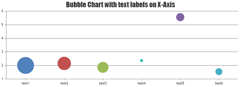
Team CanvasJSYou can pass label in dataPoints to display text in x-axis labels like ‘test1’, ‘test2’, etc. in the above case. Please check out this code snippet for the same.
.
.
dataPoints: [
   { label: "test1", y: 2.00, z:306.77 },
   { label: "test2", y: 2.15, z: 237.414 },
   { label: "test3", y: 1.86, z: 193.24 },
   { label: "test4", y: 2.36, z: 112.24 },
   { label: "test5", y: 5.56, z: 154.48 },
   { label: "test6", y: 1.54, z:141.91 }
]}
.
.
Also, kindly take a look at this JSFiddle for complete working code.
—-
Manoj Mohan
Team CanvasJSThe logic mentioned in the above shared example seems to be working fine even in Angular. In angular, you can create an array of legend items and loop it using ngFor in the app.component.html file to display legend items as shown in the code snippet below.
app.component.html
<div class="container">
  <div id="legends" class="col col-2">
    <ul id="legendList">
      <li *ngFor="let legend of legendList" [style.color]=legend.color>{{legend.text}}</li>
    </ul>
  </div>
  <div id="chartContainer" class="col col-10" style="height: 360px;"></div>
</div>
app.component.ts
.
.
customLegends(chart: any) {
    var colorSetArray = chart.get('selectedColorSet');
    for (var i = 0; i < chart.options.data[0].dataPoints.length; i++) {
      var dp = chart.options.data[0].dataPoints[i];
      this.legendList.push({
        text: dp.name,
        color: colorSetArray[i % colorSetArray.length]
      });
    }
}
.
.
Also, check out this Stackblitz example for complete working code.
—-
Manoj Mohan
Team CanvasJSYou can add spacing between legend marker and legend text using markerMargin, but adding spacing between legends is not possible as of now. However, you can create custom legends using DOM element and use css property to add padding between legends as shown in this updated JSFiddle.
—-
Manoj Mohan
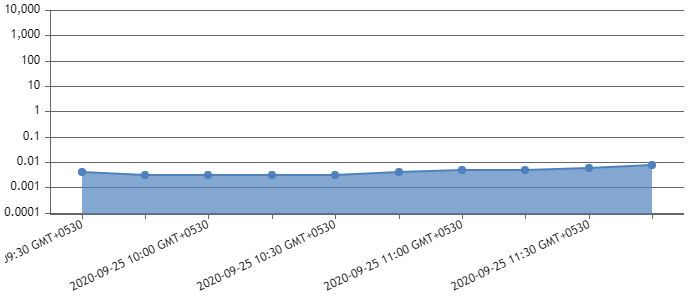
Team CanvasJSSorry, controlling the first label to display on the axes is not available as of now. However to display axis label for 0.0001, you can set the minimum value of y-axis to
0.00009in this case.axisY: { logarithmic: true, minimum: 0.00009, maximum: 10000, includeZero: true, interval: 1 }Also, check out this updated JSFiddle for complete working code.
—-
Manoj Mohan
Team CanvasJSStripline values doesn’t get updated even if it gets outside the viewport region upon zooming / panning.
If you could brief us more about your requirements, we can understand the scenario better and try to help you fulfill the same.
—
Manoj Mohan
Team CanvasJSAmoN,
You are passing
valuesinstead ofywithin $dataPoints. Replacing$dataPoints[0] = array("value" => $row["values"], "label"=> $row["date(timestamp)"])with$dataPoints[0] = array("y" => $row["values"], "label"=> $row["date(timestamp)"])should work fine in this case.—-
Manoj Mohan
Team CanvasJSIn order to wrap the tooltip content after a certain width, you need to first check the width of the tooltip content by creating a dummy DOM element. To get the tooltip content, you can use updated event of tooltip. If the width exceeds max-width i.e. 200px in your case, you can add css property to tooltip and it’s child elements to control the width of it. Please refer to below code snippet.
.
.
toolTip: {
    updated: function(e) {
      var width = getToolTipWidth(e.content);
      if(width > 199) {
      	jQuery(".canvasjs-chart-tooltip").addClass("custom-tooltip-width");
        jQuery(".canvasjs-chart-tooltip .content").addClass("wordwrap");
      } else {
      	jQuery(".canvasjs-chart-tooltip").removeClass("custom-tooltip-width");
        jQuery(".canvasjs-chart-tooltip .content").removeClass("wordwrap");
      }
    }
}
.
.
function getToolTipWidth(content) {
  var validationDom = document.createElement("div");   // Create a <button> element
  validationDom.innerHTML = content;
  validationDom.style.display = "inline-block";// Insert text
  validationDom.style.maxWidth = "200px";// Insert text
  document.body.appendChild(validationDom);
  toolTipWidth = jQuery(validationDom).width();
  validationDom.remove();
  return toolTipWidth;
}
Also, please refer to this JSFiddle for complete working code.
—-
Manoj Mohan
Team CanvasJSWhat you observe on the chart:
1) The color of the data point is red which is series 1.
2) The color of the line is blue which is series 2.I need to understand why is that so, and how do we make datapoint also have color blue which is of series 2?
In the JSFiddle you have shared, you are using lineColor which changes the color of line not the marker(dataPoint). To change the marker color as well, you can set the markerColor. In your case, you can use color property to set the color of both line and marker. Whenever there are multiple series overlapping each other, the last series will be shown and on hovering the marker will be shown for first dataSeries.
Also what I want to achieve is:
1) When i hover over the data point, since it is series 1 how do we make other series (in our example series 2) with less opacity and series 1 with more opacity.
2) The example has only 2 series, but we can have multiple series and only the highlighted series should have a greater opacity as compared to others.I suggest you to use legend to hide and unhide the dataSeries whenever there are series overlapping each other.
—-
Manoj Mohan
Team CanvasJS