Login to Ask a Question or Reply
Forum Replies Created by Manoj Mohan
-
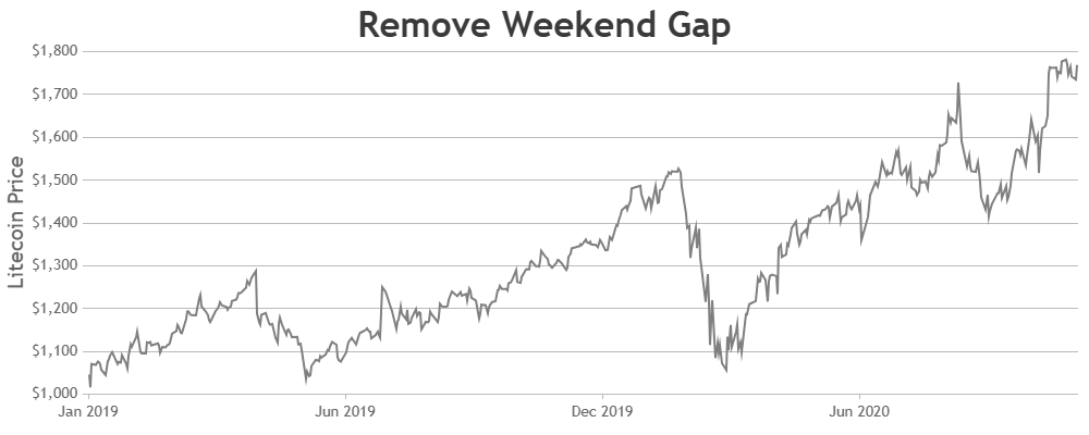
December 19, 2024 at 6:19 pm in reply to: It does not allow me to hide weekend dates in a line graph. #60301
To remove the weekend gap from the chart, you can use customBreaks as shown in this code snippet.
function removeWeekendGap(chart) {
  var scaleBreaks = [],
      dps = chart.data[0].dataPoints;
  for (var i = 1; i < dps.length; i++) {
    if (dps[i].x.getDate() - 1 != dps[i - 1].x.getDate())
      scaleBreaks.push({
        startValue: new Date(
          dps[i - 1].x.getTime() + 12 * 60 * 60 * 1000
        ),
        endValue: new Date(dps[i].x.getTime() - 12 * 60 * 60 * 1000),
      });
  }

  chart.axisX[0].scaleBreaks.customBreaks = scaleBreaks;
  chart.render();
}
Please check out this Stackblitz for complete working code.
—-
Manoj Mohan
Team CanvasJSDecember 9, 2024 at 5:44 pm in reply to: Disable minimum chart point amount requirement for zoom #60267Marco,
To zoom into a certain region, there should be a minimum of 3-4 dataPoints – behavior is designed such that zooming is limited upto a certain region, so the user doesn’t end up zooming into a blank-region (region with no dataPoints). It is not possible to change the restriction as of now.
—-
Manoj Mohan
Team CanvasJSOne of our representatives from the sales team will get in touch with you regarding license query.
For any other license related queries feel free to contact us at sales@canvasjs.com.
—-
Manoj Mohan
Team CanvasJSYou can host the commercial version of the CanvasJS chart package (@canvasjs/charts) on your own server by following these steps:
- Compress the package into a .tar.gz file.
- Upload the compressed file to your server.
- In your package.json, reference the package using the URL of your server, like this:
@canvasjs/charts": "https://your-server.com/packages/canvasjs-charts-v3.10.16.tar.gzThis approach avoids conflicts with public npm versions and integrates smoothly into your CI system. Please refer to this article for more information.
—-
Manoj Mohan
Team CanvasJSNovember 20, 2024 at 6:24 pm in reply to: Stacked column charts experienced flickering of datapoints #60162@arj,
You can reset dataPointWidth to auto-calculated value by setting it to
nullafter rendering the chart with desired dataPointWidth.chart.set("dataPointWidth", null)—
Manoj Mohan
Team CanvasJSNovember 12, 2024 at 6:04 pm in reply to: Time bar chart column with thickness uneven at times #60059@arj,
Thank you for your feedback on the column gaps in the chart. The varying space between the columns occur to make them look crisp & avoid a blurry appearance, especially with a larger number of datapoints. We’ll revisit this behavior to improve it in future versions. In the meantime, you can try setting dataPointWidth to a smaller value if that helps in your case.
—-
Manoj Mohan
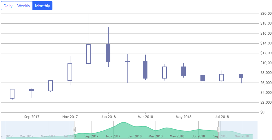
Team CanvasJSYou can easily load the data from your API endpoint on the click of the button and display loader while requesting data to smoothen the experience. You could also store the data in local variable so that you don’t request same data repeatedly on clicking of button. Please take a look at this JSFiddle for an example on loading daily, weekly, and monthly on click of bootstrap buttons.
—-
Manoj Mohan
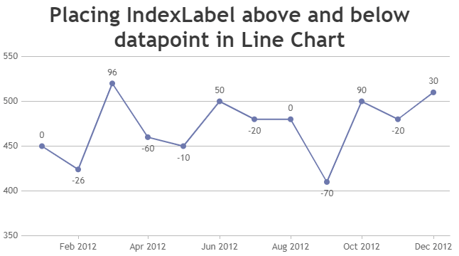
Team CanvasJSYou can use scatter chart to display indexLabel above and below the datapoint marker as shown in the code snippet below.
 var indexLabelSeries = {
    type: "scatter",
    markerSize: 0,
    highlightEnabled: false,
    toolTipContent: null,
    dataPoints: []
  };

  for(var i=0; i<chart.data[0].dataPoints.length; i++) {
    var dp = chart.data[0].dataPoints[i];
    lastDp = i > 0 ? chart.data[0].dataPoints[i-1].y : chart.data[0].dataPoints[i].y;
    labelPlacement = lastDp > chart.data[0].dataPoints[i].y ? "below": "above";
    indexLabelSeries.dataPoints.push({
      x: dp.x,
      y: chart.axisY[0].convertPixelToValue(chart.axisY[0].convertValueToPixel(dp.y) + (chart.data[0].markerSize + (labelPlacement == "below" ? -42 : -16 )) * (labelPlacement == "below" ? -1 : 1) ),
      indexLabel: "" + (chart.data[0].dataPoints[i].y - lastDp)
    });
  }

  chart.options.data.push(indexLabelSeries)
  chart.render();
Also, check out this JSFiddle for complete code.
—-
Manoj Mohan
Team CanvasJSIndexlabels for line charts are placed to top of the marker, unless there is insufficient space towards the boundary of the plotarea. Hence, it’s not possible to place indexlabel to above or below markers as per the conditions in line chart.
—-
Manoj Mohan
Team CanvasJSSeptember 3, 2024 at 6:02 pm in reply to: Creation file .jpg or .png from directly from the chart #45821Can you please brief us further about your requirement along with an example so that we can understand your scenario better and help you out?
—-
Manoj Mohan
Team CanvasJS[UPDATE]
We have released chart v3.10.4 with the above fix. Please refer to the release blog for more information. Do download the latest version from our download page and let us know your feedback.
—-
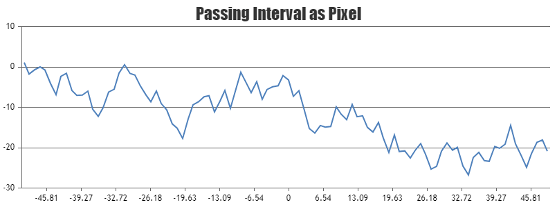
Manoj Mohan
Team CanvasJSPassing axis interval as pixel is not possible as of now. However, you can calculate the interval in pixel based on axis bounds and axis range (viewportMinimum and viewportMaximum) as shown in the code snippet below.
chart.axisX[0].set("interval", (chart.axisX[0].viewportMaximum-chart.axisX[0].viewportMinimum)/(chart.axisX[0].bounds.x2-chart.axisX[0].bounds.x1) * intervalInPixel)Please take a look at this JSFiddle for an example on the same.
—-
Manoj Mohan
Team CanvasJS