Login to Ask a Question or Reply
Forum Replies Created by Adithya Menon
-
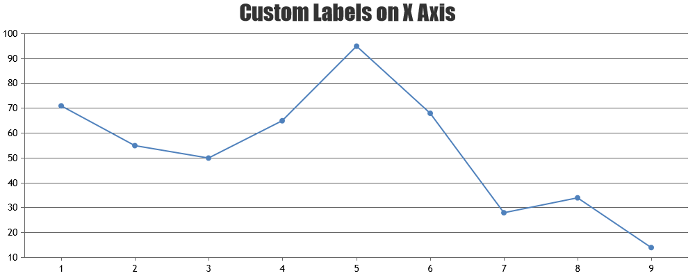
You can take a look at this documentation page for a step-by-step guide on creating charts with data from XML. To show the label of each week for each column, you can use the label property.
If the solution suggested doesn’t fulfill your requirement, kindly brief us further about your use case along with sample data so that we can understand your scenario better and help you out with an appropriate solution.
—
Adithya Menon
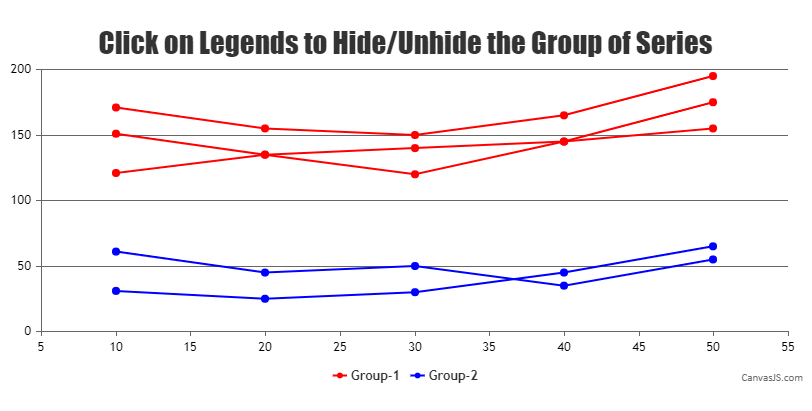
Team CanvasJSBased on your requirement, it seems like you are trying to hide/unhide a group of dataSeries using itemclick property. If so, please take a look at this forum page for an example with complete code.
In case this doesn’t fulfill your requirement, kindly brief us further about your requirements so that we can understand the scenario better and help you out.
—-
Adithya Menon
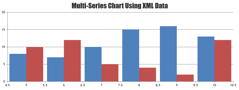
Team CanvasJSIt is possible to create a multi-series chart with data from an XML file by looping through the XML data as shown in the code-snippet below,
$(data).find("point").each(function () {
    var $dataPoint = $(this);
    var x = $dataPoint.find("x").text();
    var y1 = $dataPoint.find("y1").text();
    var y2 = $dataPoint.find("y2").text();
    dps1.push({x: parseFloat(x), y: parseFloat(y1)});
    dps2.push({x: parseFloat(x), y: parseFloat(y2)});
  });
The format of the dataPoints in the XML file (e.g. data.xml) should be:
<point>
	<x>5</x>
	<y1>8</y1>
	<y2>10</y2>
</point>
Kindly take a look at this CodeSandbox for a working example.
—
Adithya Menon
Team CanvasJSTo display the legend for a group of data series, you can use the showInLegend property in any one of the data series in a group. You can also pass a custom property
groupto each data series and use this property to hide/unhide the data series using itemclick property of legend as shown in the code-snippet below,function onLegendClick(e) { var groupSelected = e.dataSeries.group; for(var i = 0; i < e.chart.data.length; i++) { if(e.chart.options.data[i].group === groupSelected) { if (typeof (e.chart.options.data[i].visible) === "undefined" || e.chart.options.data[i].visible) { e.chart.options.data[i].visible = false; } else { e.chart.options.data[i].visible = true; } } } }Kindly take a look at this JSFiddle for an example with complete code.
—
Adithya Menon
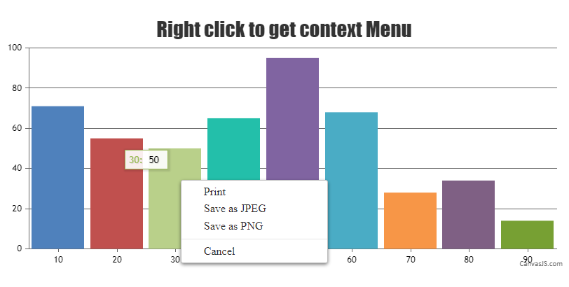
Team CanvasJSThe chart contains multiple Canvas elements, in which the topmost Canvas element is being exported while saving/copying the image using the browser’s right-click. However, you can create a custom contextual menu and add exportChart method to export the chart as an image using right-click.
Kindly take a look at this JSFiddle for an example on the same.
—
Adithya Menon
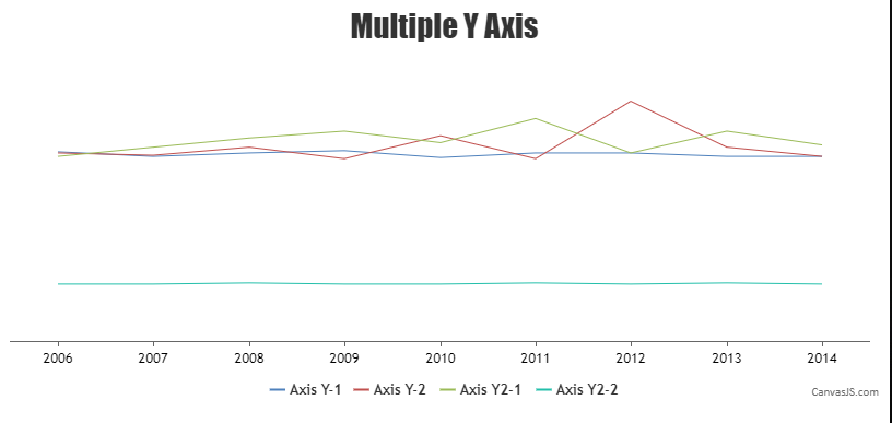
Team CanvasJSBased on the minimum y-value among all the data series, you can set the minimum for Y-axis to add some space beneath the line chart as shown in the code-snippet below,
function setYMin() {
  var yMinValue = 0;
  for(var i = 0; i < chart.options.data.length; i++) {
    for(var j = 0; j < chart.options.data[i].dataPoints.length; j++) {
      yValues.push(chart.options.data[i].dataPoints[j].y)
    }
  }
  yMinValue = Math.min(...yValues);
  chart.axisY[0].set("minimum", yMinValue - chart.axisY[0].get("interval"))
}
Kindly take a look at this updated JSFiddle for an example on the same.
—
Adithya Menon
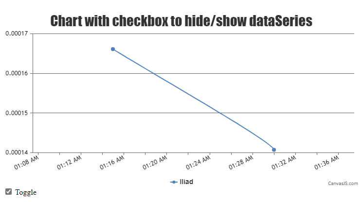
Team CanvasJSIn order to update a chart, you need to first change the options object and then call chart.render(). Kindly take a look at this documentation page for more info on updating Chart Options.
You can access the options via chart.options as shown in the code-snippet below,
function toggle() {
  if(chart.options.data[0].visible === true || chart.options.data[0].visible === undefined) {
    chart.options.data[0].visible = false;
    alert('Turn it off');
  } else {
    alert('Turn it on');
    chart.options.data[0].visible = true;
  }
  chart.render();
}
You can take a look at this updated JSFiddle for an example on using a checkbox to hide/show data series with complete code.
—
Adithya Menon
Team CanvasJS@r-w,
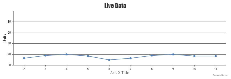
You can use viewportMinimum and viewportMaximum properties of axisY and set it to 0 and 99 respectively so that any value above 99 or below 0 are not visualized. Kindly take a look at this code-snippet for an example on your requirement,
axisY: {
  viewportMinimum: 0,
  viewportMaximum: 99
}
You can take a look at this JSFiddle for an example with complete code on the same.
If the solution suggested doesn’t fulfill your requirement, kindly brief us further about your use case with a pictorial representation or an example so that we can understand your scenario better and help you out with an appropriate solution.
—
Adithya Menon
Team CanvasJSDecember 16, 2021 at 6:54 pm in reply to: Can I push Chart Options using JSON in ASP.NET Core Razor Pages App? #36503You can use the set method to update the chart title with the value from the input field as shown in the code-snippet below,
$('#load').on('click', function (evt) {
	evt.preventDefault();

	var title = $('#Title').val();
	chart.title.set("text", title);
});
Kindly take a look at this updated sample project for an example on the same.
—
Adithya Menon
Team CanvasJSDecember 14, 2021 at 7:54 pm in reply to: I Want Capture a Screenshots of Whole Canvas Chart. #36485exportChart method exports the entire chart irrespective of the scrollbar. In cases where you zoom into a region of the chart (either by zooming using mouse or zooming programmatically by setting viewportMinimum and/or viewportMaximum) & try to export, it exports the entire chart with the axis-range that you have zoomed into.
In order to show the entire viewport Range on the image while exporting, you can reset the viewportMinimum and viewportMaximum property before exporting as shown in the code-snippet below,
document.getElementById("exportChart").addEventListener("click",function(){
  var tempViewportMinimum = chart.axisX[0].get("viewportMinimum");
  var tempViewportMaximum = chart.axisX[0].get("viewportMaximum");

  chart.axisX[0].set("viewportMaximum", null, false);
  chart.axisX[0].set("viewportMinimum", null);

  chart.exportChart({format: "jpg"});

  chart.axisX[0].set("viewportMinimum", tempViewportMinimum, false);
  chart.axisX[0].set("viewportMaximum", tempViewportMaximum);
});
Kindly take a look at this JSFiddle for an example on the same.
—
Adithya Menon
Team CanvasJSDecember 9, 2021 at 8:58 pm in reply to: Unable to load 5 graph at a time on iOS. Only 2-3 graph load properly. #36455It seems the sample provided by you is restricted and requires permission. Can you please make the sample public so that we can access / download it, run it locally at our end to understand the scenario & help you out?

—
Adithya Menon
Team CanvasJS[UPDATE]
We have just released CanvasJS StockCharts v1.12.12GA with this bug fix. Please refer to the release blog for more information.
Thanks for reporting the use case. It seems like the issue occurs only when setting zoomType to “xy”.
We will look into it further & fix it in future versions.
—
Adithya Menon
Team CanvasJS-
This reply was modified 10 months, 3 weeks ago by
Vishwas R.
Dominik,
The minimum and maximum properties are used to set the range of the X-Axis. In the code shared by you, there are no datapoints present within the axis range that you are setting. Removing the same should work fine in this case.
Kindly take a look at this updated JSFiddle for working code.
—
Adithya Menon
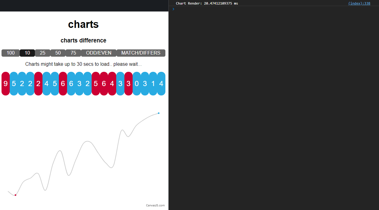
Team CanvasJSAccording to the code shared by you, it seems like the Chart is being rendered within 20-30 milliseconds. However, the API call & the response seems to be taking 3-5 seconds. Please find the code-snippet showcasing the time taken:
console.time("Chart Render");
chart.render();
console.time("Chart Render");
Kindly take a look at this updated JSfiddle for an example on the same.
—
Adithya Menon
Team CanvasJSCan you please share some examples or a pictorial representation showcasing your requirement so that we can understand it better & help you out?
—
Adithya Menon
Team CanvasJS -
This reply was modified 10 months, 3 weeks ago by