Login to Ask a Question or Reply

Forum Replies Created by Vishwas R
-
Sandonet,
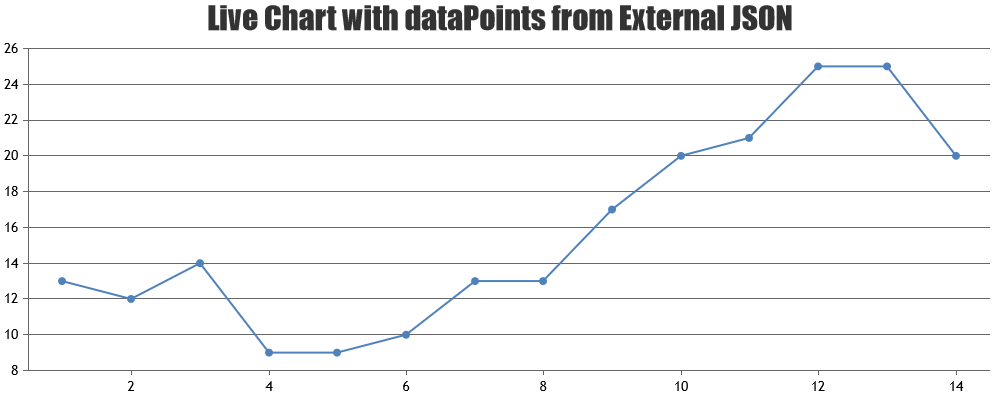
Please refer to this documentation page for step-to-step tutorial on rendering live / dynamic chart with data from JSON.
—
Vishwas R
Team CanvasJSEesger,
Thanks for the posting the solution. It would help others who will be searching for the similar.
Eesger,
As of now we don’t have this feature. But you can work around by setting fillOpacity to 0.7 or 0.8 to make gridlines visible through dataPoints. Check this jsfiddle.
Another option is to place stripLines with showOnTop set to true, so that lines are shown on top of data. Check this jsfiddle.
Navinder,
As of now we don’t have 3D support in charts
August 29, 2016 at 1:32 pm in reply to: How to plot the graph based on equation using canvasjs spline? #12096Prasanth,
You can use JavaScript eval() function to evaluate an expression. According to user input expression generate dataPoints and render chart. Here is an example.
August 29, 2016 at 11:23 am in reply to: How to plot the graph based on equation using canvasjs spline? #12094Prasanth,
You can store all generated dataPoints, according to equation, in an array and assign it to chart dataPoints. Here is an example.
Eshwar,
toolTip, click events are applied even to dataPoint with zero y-value. Here is the updated fiddle.

—
Vishwas R
Team CanvasJSAugust 29, 2016 at 10:41 am in reply to: Highlight the 0 value x axis value for stacked column chart #12092Jenilkanani,
If y-value is zero, when you mouse-hover the axisX line at the corresponding x-value toolTip will be shown. Check the screenshot below. If the y-value (zero) is not present in first dataSeries, you can set toolTip.shared to true to show the zero value in toolTip.

If this doesn’t solve your requirement, kindly create a jsfiddle, so that we can look into your requirement properly and help you out.
Wazabe,
You can use stripLines to achieve this. Check this example.
Stefanaki,
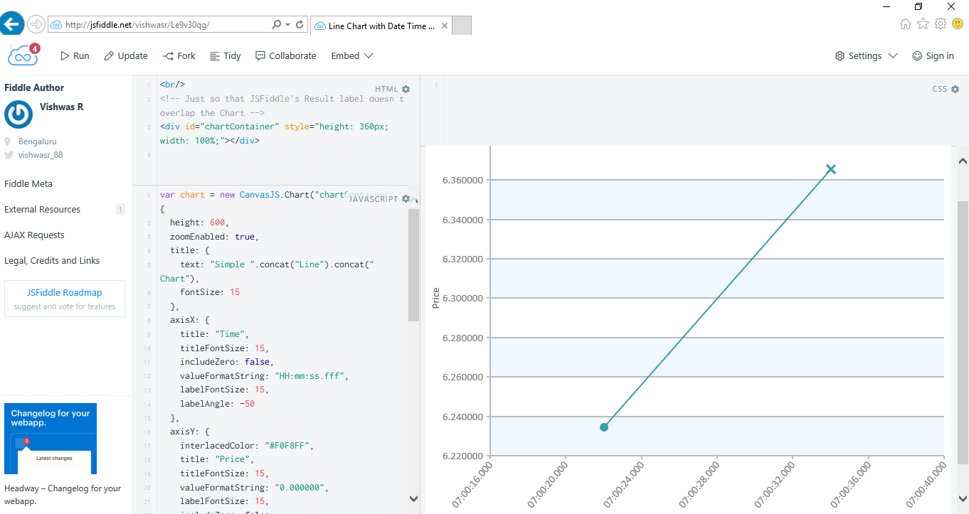
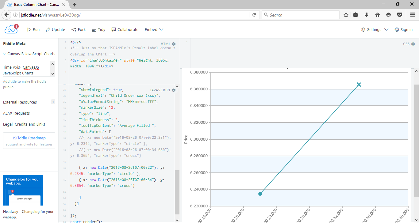
Its not bug, we observed that the x-value you are providing is not in JavaScript Date-Time string format. Please refer to this link for JavaScript Date-Time String Formats. And here is the working fiddle.
Check the screenshots of working fiddle browsed in IE and Firefox.
—-
Vishwas R
Team CanvasJSXiaosongzou,
Thanks for reporting. We will look into the issue and get back to you at the earliest.
August 20, 2016 at 6:48 pm in reply to: Problems with shift function to delete array: dataPoints.shift #11838
