You must be logged in to post your query.
Home › Forums › Chart Support › 
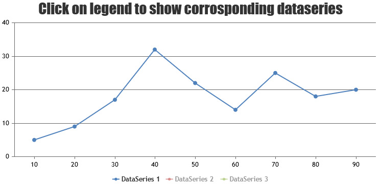
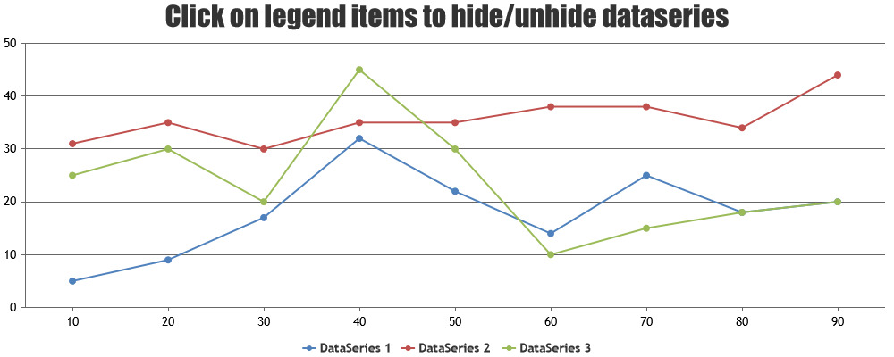
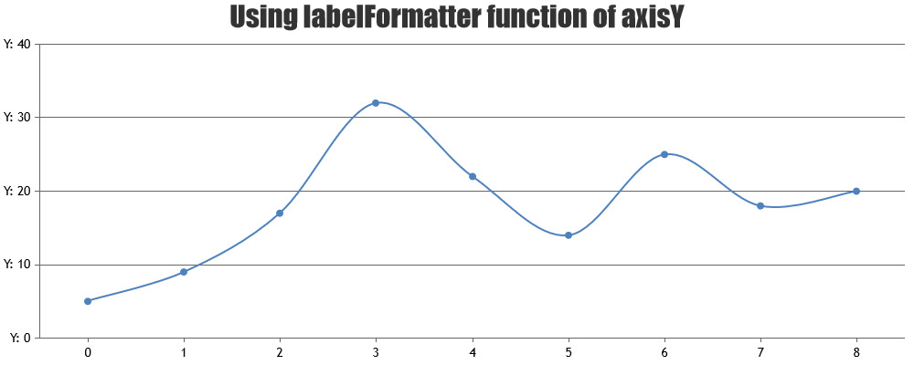
How to add buttons or labels on Chart?
Hi,
This time, I wanna add some interactions to my chart. And I want to make a chart that when you click some button or click the legend of the line, and it will shows the corresponding data, not display all the datapoints array in the same chart, so what should I do?Or do you guys have any examples?
Thanks!
Are you looking for this?
— Sanjoy
Hi, That’s exactly what I need, but how can I make it animated that each time I click the legend and switch to another chart?
I like this, if i want to show all legend again, so what should I do?Or do you guys have any examples?
@quocnamvnn-vnn,
You can hide / unhide dataSeries based on click of legends. Please refer to this documentation page for step-to-step tutorial on the same. .
— Vishwas R Team CanvasJS
Hi, i am making chart with x and y axes. Both axes are arrays, but the y-axis string that occurs after calculating function in which the user enters parameters After that calculation I do not know how to use that array. If someone could help I’d be very grateful ?? Sorry for my bad english.
Thank you!
If i understood your requirement properly, you can use the labelFormatter for axisY as shown in the given fiddle. In case this is not what you are looking for, could you please try to elaborate a little more and create a jsfiddle so that we can get better understanding of your requirement.
Hi, Here is my code https://jsfiddle.net/milan1889/o3gu3rex/. First I have to calculate the value of a array of y-axis, and then draw graf. If anyone can help, please help, I need this code.
We have copied and modified your fiddle. Here is the updated fiddle. In the updated fiddle, after pressing the calculate button, you get the famname array for the values of Y-axis and vrijed array for the value of x-axis. Using vrijed and famname arrays, you can store and pass these values to the dataPoints property of the CanvasJS object, in the format required by CanvasJS.
Hi again, at the beginning of the first thanks to the last project. Now I need help with a new project. Here is the problem, but I do not know where.Here is the link http://jsfiddle.net/3qy9beq1/4/
Hi Sanjoy,
Is there any idea that we can make these buttons for bar charts, i mean dots in the line graph in the fiddle you have provided . I’ve a requirement to highlight if we have zero value on the axis it was completely hiding but still i need to click on that.
Eshwar,
toolTip, click events are applied even to dataPoint with zero y-value. Here is the updated fiddle.
You must be logged in to reply to this topic. Login/Register