Login to Ask a Question or Reply
Forum Replies Created by Vishwas R
-
Peter,
You can download the commercial version package from the My Account page and the steps to integrate have been addressed in the instruction.html file which is present inside each package under the @canvasjs folder. For example, if you are integrating CanvasJS charts with Angular, download the commercial version and navigate to @canvasjs > angular-charts > instruction.html
Additionally, you can even host the commercial version of the CanvasJS chart package (@canvasjs/charts) on your own server by following these steps:
- Compress the package into a .tar.gz file.
- Upload the compressed file to your server.
- In your package.json, reference the package using the URL of your server, like this:
@canvasjs/charts": "https://your-domain.com/packages/canvasjs-charts-v3.11.0.tar.gzThis approach avoids conflicts with public npm versions and integrates smoothly into your app. Please refer to this article for more information.
—
Vishwas R
Team CanvasJSJanuary 13, 2025 at 10:58 am in reply to: suddenly only get black screen when showing a chart #60437Gitte Kynde,
Can you kindly create a JSFiddle reproducing the issue you are facing and share it with us so that we can look into the code, understand the scenario better, and help you out?
From what we have observed, sometimes things get delayed mostly when we are unable to reproduce the issue or not able to understand the exact requirements or the solution that we provide may not work properly due to the variation in chart-options being used by you and us.
Having a JSFiddle helps us in figuring out the issue and many a time we can just edit your code on JSFiddle to fix the issue right away.
—
Vishwas R
Team CanvasJSFor security reasons, browsers restrict reading local CSV files and cross-origin requests. Serving CSV file from a local web server and making an AJAX call to it or serving it from CORS enabled CSV hosting should work fine in this case. Please refer to this StackOverflow post for more information.
—
Vishwas R
Team CanvasJSDecember 24, 2024 at 3:03 pm in reply to: How to sync multiple charts if charts are rendered with a condition #60332Zooming across charts is not working after switching the dashboard as you are resetting the chart-references on switching the charts. Instead setting the selectedDashboard only if the value has changed & adding chart-references only once should work fine for you. Please find the updated code-snippet below.
Change selectedDashboard only if the value has changed.
const handleDashboardChange = (event) => {
  if (event.target.value !== selectedDashboard) {
    setSelectedDashboard(event.target.value);
  }
};
Add chart-ref only once.
<CanvasJSChart
  key={index}
  options={options}
  onRef={(ref) => {
    if (ref && !chartsRef.current.includes(ref)) {
      chartsRef.current.push(ref);
    }
  }}
/>
Please take a look at this updated Stackblitz for working example.
—
Vishwas R
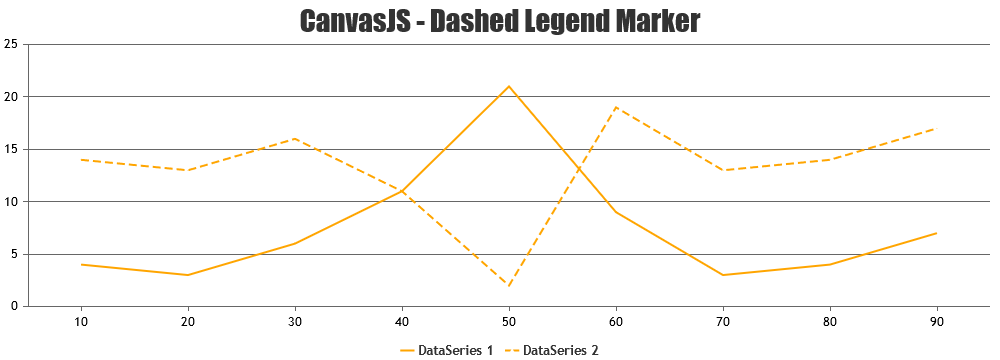
Team CanvasJSChanging legend line dash type is not possible as of now. However, you can achieve rendering broken line in legend by setting the legendMarkerColor to white (same as chart background) and legendMarkerType to triangle. Please take a look at this JSFiddle for an example of the same.
—
Vishwas R
Team CanvasJSchart.container / chart.get(“container”) is accessible & seems to be working fine. Can you kindly share a JSFiddle (or Sample project over Google Drive / Onedrive) reproducing the issue so that we can run it at our end to understand the scenario better and help you out?
—
Vishwas R
Team CanvasJSTo ensure that the chart adjusts to the updated height, you can use a key prop on the CanvasJSChart component. When the height state changes, updating the key prop will force React to treat the component as a new one, which will apply the updated height. Please find the updated code-snippet below.
return (
  <div>
    <CanvasJSChart
      options={options}
      containerProps={{ width: "100%", height }}
      key={height}  // This forces re-mount when the height changes
    />
  </div>
);
Another option is to directly update the chart’s height using the set method –
chart.set("height", 100). Please refer to this Codesandbox link for updated code.—
Vishwas R
Team CanvasJSThank you for reporting the issue and providing the use-case. We will investigate this further and work on a fix for future versions. Your feedback is greatly appreciated!
—
Vishwas R
Team CanvasJSOctober 25, 2024 at 3:12 pm in reply to: How can I remove the Hyphen associated with my axisY values? #59990Are you referring to the axis ticks? If so, you can remove the hyphen next to the axis labels by setting the tickLength to 0. This will hide the ticks completely. If you’re referring to something else, could you please share a pictorial representation so that we can understand the scenario better and help you out?
—
Vishwas R
Team CanvasJSAdam Evans,
Updating legendText on hovering over the datapoint should work fine as per your requirements. Please find the code-snippet below.
mouseover: onMouseover(e){
    e.dataSeries.legendText = (e.dataSeries.dataPoints[e.dataPointIndex].x + ": " + e.dataSeries.dataPoints[e.dataPointIndex].y).toString();
    e.chart.render();
}
Please take a look at this JSFiddle for an example of the same.
—
Vishwas R
Team CanvasJSOctober 23, 2024 at 9:33 am in reply to: Chart does not occupy the entire width of the parent container #59983The chart is currently taking 100% of the container’s width and seems to be working fine. Could you please create a JSFiddle (or Stackblitz for React/Angular apps) that reproduces the issue & share it with us so that we can look into the code, understand the scenario better and help you out?
—
Vishwas R
Team CanvasJSIn a logarithmic scale, the axis labels represent powers of logarithmBase – defaults to 10 (1, 10, 100, etc.) instead of linear increments due to how logarithmic values work. Using a linear scale may better suit your needs if you prefer different label increments like 1, 2, 3,…
—
Vishwas R
Team CanvasJSIn case of React Charts, you can set the height and width of the chart-container by passing it as containerProps as shown in the code-snippet below.
<CanvasJSChart options={options} containerProps={{ width: '100%', height: '300px' }} />Please refer to React Charts documentation for more information.
—
Vishwas R
Team CanvasJSYou can change the thickness of the line by updating endValue within rangeChanged event as shown in code-snippet below.
rangeData[1].endValue = new Date(rangeData[1].startValue.getTime() + (e.chart.axisX[0].viewportMaximum - e.chart.axisX[0].viewportMinimum) / e.chart.axisX[0].bounds.width * 3);Please take a look at this updated JSFiddle for a working example of the same.
—
Vishwas R
Team CanvasJSYou seem to have missed out updating your code, code related to accepting stripline bounds from chart is missing in the Stackblitz you have shared. Updating it seems to be working fine. Please take a look at this updated Stackblitz for working example.
Also, in case of range-area chart adding range-area series with 2 datapoints with minor difference in the time component should work fine for single value as-well. Please take a look at this updated JSFiddle.
—
Vishwas R
Team CanvasJS