Login to Ask a Question or Reply
Forum Replies Created by Vishwas R
-
@arj,
Thank you for your valuable feedback and feature request. This is not supported at the moment, but we have noted your request and will look into it for future releases.
—
Vishwas R
Team CanvasJSMarch 9, 2026 at 6:08 pm in reply to: Chart is not taking up the entire height and leaving some padding #62005@arj,
There isn’t a specific property in CanvasJS to completely remove the padding/margin around the chart area as of now. However, you can reduce or remove the extra space by setting a negative margin on the axis (depending on whether you’re using axisX & axisY, axisX2 & axisY2, or all of them). This usually helps to eliminate the visual gap on the sides. Please take a look at this JSFiddle for an example.
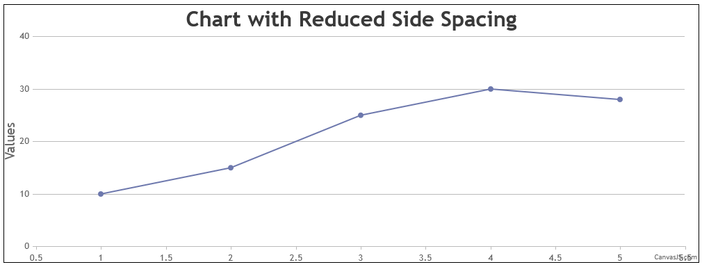
If that still doesn’t meet your requirement, you would need to modify the source code (included with every Developer License), as you have pointed out. For example:
this.layoutManager = new LayoutManager(0, 0, this.width, this.height, 0);Modifying this value in the source is the solution if adjusting the axis margins does not solve the issue.
—
Vishwas R
Team CanvasJSWe have just released v3.15.5 with the above bug fix. Please refer the release blog for more information. Do download the latest version from our download page and let us know your feedback.
—
Vishwas R
Team CanvasJSThanks for sharing the use case with us. This appears to be a bug, and we’ll fix it in an upcoming version.
—
Vishwas R
Team CanvasJSAjay Kumar,
It appears there might be a slight confusion regarding the charge on your statement. The entry, Canva*, suggests this transaction is related to Canva, which is a graphic design platform, and not CanvasJS, JavaScript charting library. We suggest you verify the charge details once again.
However, I have forwarded your request and the details provided to our Sales team. They will look into this matter to see if there is any potential confusion regarding CanvasJS licensing and will get back to you directly via email for further clarification.
Feel free to drop a mail at sales@canvasjs.com, for more sales related queries.
—
Vishwas R
Team CanvasJSYou can use a scatter chart to display only the markers without lines.
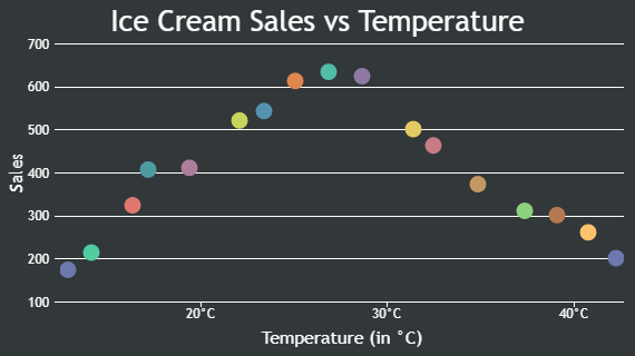
If you’re using a line chart, set lineThickness: 0 to hide the line while keeping the markers visible. In case of a line chart, you may need to adjust the markerSize as it can become 0 when the number of datapoints increases.
—
Vishwas R
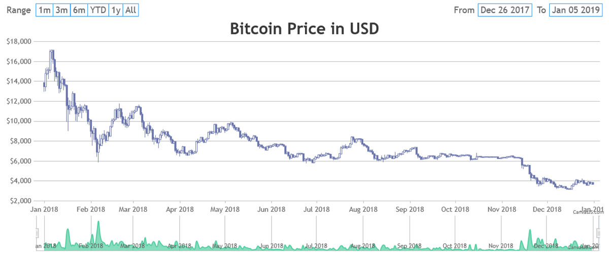
Team CanvasJSIn CanvasJS StockChart, the navigator range takes priority over the chart’s range, meaning the chart’s range can’t extend beyond the navigator’s range. As a result, adding padding using viewportMaximum doesn’t work directly. To add padding, you can extend the navigator’s range by inserting null data points before the first and after the last data point. This way, you can simulate padding and ensure the chart has some space around the visible data.
Please take a look at this CodePen example for a working example of the same.
—
Vishwas R
Team CanvasJSCanvasJS tooltip is a HTML <div> element & lets you use any HTML content, such as <b>, <i>, <br>, <span>, <table>, <img>, and more, with the help of contentFormatter property. You can style these elements using inline CSS for formatting and layout control.
Are tables supported?
Yes, tables (<table>, <tr>, <td>) are fully supported. You can use contentFormatter to create a table dynamically, such as a three-column layout for series name, x-value, and y-value:
toolTip: {
  shared: true,
  contentFormatter: function(e) {
    var content = "<table style='border-collapse: collapse; font-family: Arial; font-size: 12px;'>";
    content += "<tr><th style='border: 1px solid #ccc; padding: 5px;'>Series</th>" +
               "<th style='border: 1px solid #ccc; padding: 5px;'>Quarter</th>" +
               "<th style='border: 1px solid #ccc; padding: 5px;'>Sales</th></tr>";
    for (var i = 0; i < e.entries.length; i++) {
      content += "<tr><td style='border: 1px solid #ccc; padding: 5px;'>" + e.entries[i].dataSeries.name + "</td>" +
                 "<td style='border: 1px solid #ccc; padding: 5px;'>" + e.entries[i].dataPoint.x + "</td>" +
                 "<td style='border: 1px solid #ccc; padding: 5px;'>" + e.entries[i].dataPoint.y + "</td></tr>";
    }
    content += "</table>";
    return content;
  }
}
Please refer to this Codepen for a working example of the same.
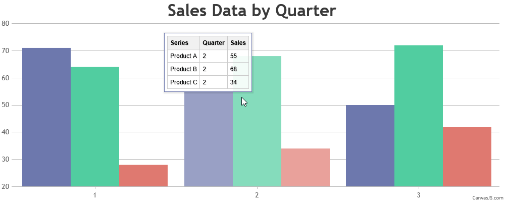
For more customization tips, see Customizing CanvasJS Chart Tooltips with Simple CSS Tweaks.
—
Vishwas R
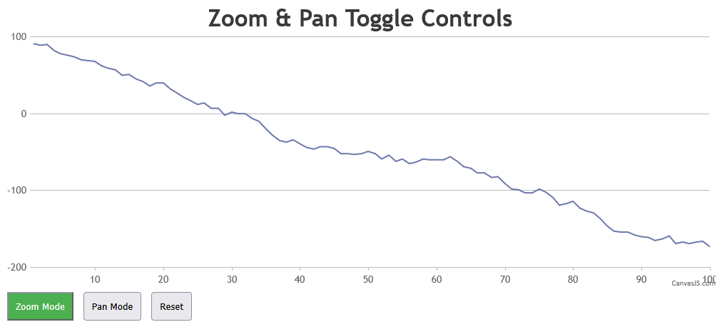
Team CanvasJSBy design, our zoom and pan functionalities are integrated under zoomEnabled to ensure a streamlined user experience, as only one action—zooming or panning—can be performed at a time. This approach simplifies interaction, particularly for large datasets. While we appreciate your suggestion, we believe the current mode-switching design meets most use cases effectively. For an example of implementing separate buttons to toggle zooming and panning, please take a look at this CodePen
—
Vishwas R
Team CanvasJSThank you for your feedback regarding separate zoom and pan controls in CanvasJS. By design, our zoom and pan functionalities are integrated under zoomEnabled to ensure a streamlined user experience, as only one action—zooming or panning—can be performed at a time. This approach simplifies interaction, particularly for large datasets. While we appreciate your suggestion, we believe the current mode-switching design meets most use cases effectively. For an example of implementing separate buttons to toggle zooming and panning, please take a look at this CodePen
—
Vishwas R
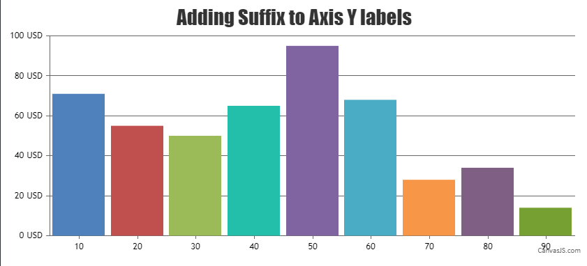
Team CanvasJSSeptember 5, 2025 at 12:53 pm in reply to: Question Regarding String Values on Y-Axis in CanvasJS #61402Khurram,
You can set the suffix property of axisY to “QMB” to display labels as 10QMB, 20QMB, etc. If you’d like to show something before the numbers, use the prefix property. For more details and live examples, please refer to the documentation.
—
Vishwas R
Team CanvasJSAugust 28, 2025 at 2:51 pm in reply to: horizontal bar chart the bar length not proportionate to the value #61378There are three different charts with datapoint values of 1000, 500, and 900. The reason 900 looks shorter than 500 in another chart is that the axis doesn’t start from 0. Setting includeZero to true across all the charts should work fine in this case, making the values display consistently.
—
Vishwas RAugust 28, 2025 at 10:22 am in reply to: horizontal bar chart the bar length not proportionate to the value #61375The datapoint with the y-value of 900 should appear longer than the one with 500, and it seems to be working as expected in this case. Can you kindly create JSFiddle reproducing the issue you are facing & share it with us? Sharing the link with us will help us analyze the chart options and code in detail, so we can provide a more precise solution.
—
Vishwas R
Team CanvasJSThe gap between the y-axis title and labels is caused by the stripLines with
labelPlacement: "outside"and a transparent label reserving space in the problematic dataset (y-values ~124–233), as the stripline’s value (150) is within the axis range, affecting the layout. In the commented dataset (y-values ~43–63), the stripline’s value is outside the axis range, making it invisible and eliminating the gap. You can remove stripLines from axisY or setlabelPlacement: "inside"to fix this issue.—
Vishwas R
Team CanvasJSChris,
We have just released StockChart v1.13.0GA with this improvement. Please refer to this release blog for more information. Kindly download the latest version from Download Page & let us know your feedback.
—
Vishwas R
Team CanvasJS