Login to Ask a Question or Reply
Forum Replies Created by Thangaraj Raman
-
You can bind mouse events to the chart container and get mouse coordinates in pixels, which can be converted to corresponding values along the axis using convertPixelToValue as shown in this documentation page. Please take a look at the code snippet below:
jQuery(".canvasjs-chart-canvas").last().on("click",
    function(e){
	var parentOffset = $(this).parent().offset();
	var relX = e.pageX - parentOffset.left;
	var xValue = Math.round(chart.axisX[0].convertPixelToValue(relX));
	console.log(xValue);
});
—
Thangaraj Raman
Team CanvasJSSorting datapoints by x values using the below code snippet seems to be working fine for data-time values as well. Please check this JSFiddle for a working example.
function compareDataPointX(dataPoint1, dataPoint2) {
  return dataPoint1.x - dataPoint2.x;
}
If you are still facing issues, kindly create a sample project reproducing the issue and share it with us over Google Drive or OneDrive so that we can look into the code, run it locally to understand the scenario better, and help you out.
—
Thangaraj Raman
Team CanvaSJSGlad you were able to figure it out. As of now, AJAX call has to be performed separately, and chart options can be updated based on the data fetched from it.
—
Thangaraj Raman
Team CanvasJSCan you kindly brief us further about your requirement, and share an example or a pictorial representation so that we can understand your scenario better and help you out?
—
Thangaraj Raman
Team CanvasJSCan you kindly brief us further about your requirement, and share an example or a pictorial representation so that we can understand your scenario better and help you out?
—
Thangaraj Raman
Team CanvasJSJanuary 31, 2023 at 7:35 pm in reply to: How to remove the dependence of the axis on the scaling of the graph ? #42092You can set the minimum and maximum properties for axis-y after rendering the chart using the set() method to achieve your requirement.
Please take a look at this updated JSFiddle for a working example.
—
Thangaraj Raman
Team CanvasJSIndex labels cannot be positioned outside the plot area as of now. Based on your requirement using striplines and their labels is a possible solution.
—
Thangaraj Raman
Team CanvasJSYou can set the showInLegend property to true to display a legend item for a particular dataseries.
—
Thangaraj Raman
Team CanvasJSJanuary 27, 2023 at 7:52 pm in reply to: How to remove the dependence of the axis on the scaling of the graph ? #42050Auto-calculated axis range depends on multiple factors which include values of entire dataseries as well. From the screenshots shared, we are unable to predict the exact use-case / scenario properly. Hence, can you kindly create JSFiddle reproducing the issue you are facing & share it with us so that we can look into the code / chart-options being used, understand the scenario better and help you out?
—
Thangaraj Raman
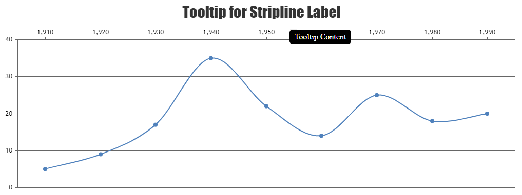
Team CanvasJSAs mentioned earlier, it is not possible to display tooltip for stripline labels as of now. However, you can position a hidden div on top of a stripline label based on its bound and display a custom tooltip for that div with a few lines of code. Please take a look at the code snippet below.
function addStriplineLabelTooltip() {
    var stripLine = chart.axisX2[0].stripLines[0];
    var tooltip = $("<div class='tooltip'><span class='tooltiptext'>Tooltip Content</span></div>");
    $(tooltip).css({"height": "12px", "width": stripLine.get("label").width() + "px", "left": stripLine.get("bounds").x1 + "px", "top": stripLine.get("bounds").y1 - 11 + "px"})
    $(chart.container).append(tooltip);
}
Please check this updated JSFiddle for a working example.
—
Thangaraj Raman
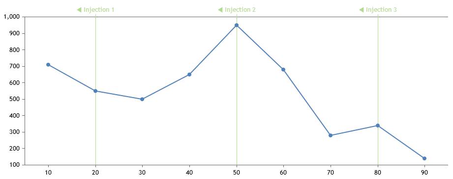
Team CanvasJSIt looks like you are using a multi-series line chart to render the lines and scatter chart for the labels. Instead, you can use axisX2 stripLines and set labelPlacement to outside to achieve your requirement.
Please check this JSFiddle for a working example.
—
Thangaraj Raman
Team CanvasJSJim,
As previously addressed in this forum thread, setting y-axis minimum & maximum properties should work fine in this case.
—
Thangaraj Raman
Team CanvasJS1. How to make the navigator follow the new data if the navigator is in the far right corner?
Please check this gallery page for an example of a dynamic/live stockchart where the position of the slider is updated as new data is added to the chart.
2. How to make a gap at the beginning as shown in the picture?
You can set the x-axis viewPortMaximum to a value greater than the last datapoint to add gap towards the right side of the chart as per your requirement from the screenshot.
—
Thangaraj Raman
Team CanvasJS