Login to Ask a Question or Reply
Forum Replies Created by Thangaraj Raman
-
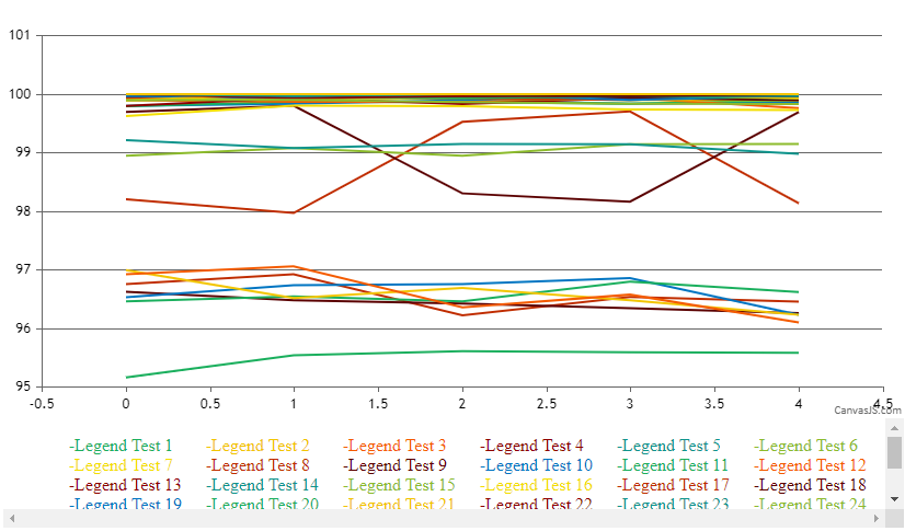
You can update lineColor and markerColor based on change in the dropdown(or after button click in your case) to achieve your requirement.
Please check this JSFiddle for a working example.
—
Thangaraj Raman
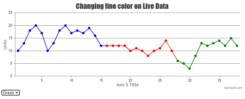
Team CanvasJSIt is possible to create ripple animation for just a single dataPoint by updating the markerBorderColor at the dataPoint level instead of the dataSeries level.
Please check this updated JSFiddle for a working example.
—
Thangaraj Raman
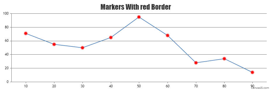
Team CanvasJSIt is not possible to create a ripple effect with the marker as of now, however, you can set markerBorderThickness and markerBorderColor to create a similar effect.
Please check this JSFiddle for a working example.
—
Thangaraj Raman
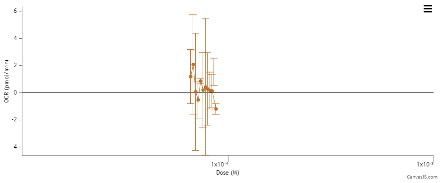
Team CanvasJSz value sets the size of the bubble which is used for visualizing the difference in value between the dataPoints. The size of the bubble depends on the difference in the z value of dataPoints and has a max limit(which depends on multiple factors like minimum z value, maximum z value, etc.) on the size after which it won’t increase any further. You can control the size of the bubble by increasing or decreasing the z value as per your requirement.
—
Thangaraj Raman
Team CanvasJS.Whisker length depends on multiple factors like dataPointWidth, dataPointMaxWidth, axis range, etc. In your case, the whisker length gets limited because you are setting x-axis range(I noticed you are setting axisX minimum and maximum). Removing these properties should work fine.
However, if you would like to override this behavior, you can set whiskerLength as well as increase the default dataPointWidth.
Please check this JSFiddle for a working example.
—
Thangaraj Raman
Team CanvasJSJune 1, 2022 at 7:20 pm in reply to: How can increase x and y axis numbers increase by given x and v value #37954You can render a chart similar to the one you have shared by creating a dynamic chart and setting labelAutoFit to false as well as updating the y-axis maximum.
Please check this JSFiddle for a working example.
—
Thangaraj Raman
Team CanvasJSYou can use the CanvasJS script from our website and fork the JSFiddle to reproduce the issue.
—
Thangaraj Raman
Team CanvasJSYou can render stripLines on x-axis for every 5 minutes in a dynamic chart with a few extra lines of code as shown in the code snippet below:
function updateChart() {
    var deltaY ;
    time.setTime(time.getTime()+60*updateInterval);
    deltaY = 0.5 + Math.random() *(-0.5-0.5);
    yValue = Math.round((yValue + deltaY)*100)/100;
    dataPoints.push({
      x: time.getTime(),
      y: yValue
    });

    if(stripLineCounter%5 == 0) {
    	stripLineArray.push({value:time.getTime(), label: CanvasJS.formatDate(time.getTime(), "hh:mm")});
    }
    stripLineCounter++;

    if (dataPoints.length >  100 ) {
      dataPoints.shift();
    }
    chart.render();
    setTimeout(updateChart, updateInterval);
  }
  updateChart();
}
Please check this JSFiddle for a working example.
—
Thangaraj Raman
Team CanvasJSAs viewportMinimum and viewportMaximum are set programmatically while hiding all the dataSeries, the reset button will basically set the viewport range back to the state it was in after clicking on the hide button.
You can set the viewportMinimum and viewportMaximum to null to reset the axis range in rangeChanged event when reset button is clicked.
—
Thangaraj Raman
Team CanvasJSCan you kindly create JSFiddle reproducing the issue you are facing & share it with us so that we can look into the code / chart-options being used, understand the scenario better and help you out?
From what we have observed, sometimes things get delayed mostly when we are not able to reproduce the issue or not able to understand the exact scenario, or the solution that we provide may not work properly due to the variation in chart options being used by you and us.
Having a JSFiddle helps us in figuring out the issue and suggesting an appropriate solution accordingly.
—
Thangaraj Raman
Team CanvasJSYou can retain the viewportMinimum and viewportMaximum for both axisX and axisY before hiding all the dataseries (by setting visible of each dataseries to false). Please find the code snippet for the same below.
document.getElementById("hide").addEventListener("click", function(){
    for(var i = 0; i < chart.options.data.length; i++) {
      chart.options.data[i].showInLegend = false;
      chart.options.data[i].visible = false;
    }
    chart.axisX[0].set("viewportMinimum", chart.axisX[0].get("viewportMinimum"), false);
    chart.axisX[0].set("viewportMaximum", chart.axisX[0].get("viewportMaximum"), false);
    chart.axisY[0].set("viewportMinimum", chart.axisY[0].get("viewportMinimum"), false);
    chart.axisY[0].set("viewportMaximum", chart.axisY[0].get("viewportMaximum"), false);
    chart.render();
  });
Please take a look at this updated JSFiddle for complete code.
—
Thangaraj Raman
Team CanvasJSYou can add a dummy line dataSeries with x-values based on stripLines values and use indexLabel to show the length between the stripLines. Please find the code snippet for the same below.
chart.addTo("data", {
    type: "line",
    toolTipContent: null,
    highlightEnabled: false,
    markerSize: 0,
    dataPoints: [
      { x: striplines[0].get("value"), y: (chart.axisY[0].viewportMaximum + chart.axisY[0].viewportMinimum) / 2 },
      { x: (striplines[1].get("value") + striplines[0].get("value")) / 2, y: (chart.axisY[0].viewportMaximum - chart.axisY[0].viewportMinimum) / 2, indexLabel:  (striplines[1].get("value") - striplines[0].get("value")).toString()},
      { x: striplines[1].get("value"), y: (chart.axisY[0].viewportMaximum - chart.axisY[0].viewportMinimum) / 2 }
    ]
});
Please check this JSFiddle for a working example.
—
Thangaraj Raman
Team CanvasJS