Home Forums Chart Support 1 Spline Chart with two lines

1 Spline Chart with two lines

Viewing 4 posts - 1 through 4 (of 4 total)
  • #37521

    Hi all,

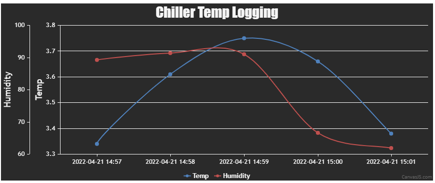
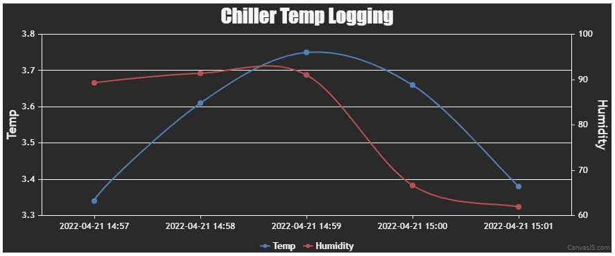
    I’m importing data from a CSV containing 3 columns (5 row sample below)

    Date,           Temp,Humidity
    2022-04-21 14:57,3.34,89.27 
    2022-04-21 14:58,3.61,91.39 
    2022-04-21 14:59,3.75,91.03 
    2022-04-21 15:00,3.66,66.64 
    2022-04-21 15:01,3.38,61.91 

    However i can only get the temp to display.

    I’ve followed the instructions here (https://canvasjs.com/docs/charts/how-to/create-charts-from-csv/) to create a working spline chart for the temp data, but i would also like to display the humididy as another spline line on the same graph.

    I’ve tried to follow the tutorial for multiple y-axis here (https://canvasjs.com/docs/charts/how-to/multiple-y-axis/) but i cant get the data points working.

    MY currently HTML code is here: https://jsfiddle.net/q8g075Lx/

    If anyone is able to help i’d really appreciate getting the 3rd item in the CSV displaying.

    I think i’ve defined dataHumidPoints collection correctly, i just cant get anything past this point to render.

    Many thanks

    #37529

    @phillips321,

    It is possible to create a multi-series chart with data from a CSV file. Please find the code snippet for the same below.

    function getDataPointsFromCSV(csv) {
      var dataPoints, csvLines, points;
      dataPoints = csvLines = points = [];
      csvLines = csv.split(/[\r?\n|\r|\n]+/);
      for (var i = 1; i < csvLines.length; i++)
        if (csvLines[i].length > 0) {
          points = csvLines[i].split(",");
          chart.options.data[0].dataPoints.push({label: points[0], y: parseFloat(points[1])});
          chart.options.data[1].dataPoints.push({label: points[0], y: parseFloat(points[2])});
        }
    }

    Kindly take a look at this updated JSFiddle for a working example.

    Multi-series chart from CSV


    Thangaraj Raman
    Team CanvasJS

    #37531

    @thangaraj-raman many thanks for this, ive managed to now get it working. Much appreciated.

    Is there a way i can align the humidy y axis scale on the right instead?

    I’ve tried using

      axisY:[
        {
          title: "Temp",
        },
      ],
      axisY2:[
        {
          title: "Humidity",
        }
      ],

    But it only shows the left hand temp axis

    #37574

    @phillips321,

    You can set axisYType property as “secondary” for the humidity dataSeries to plot it against the secondary y-axis.

    Kindly take a look at this updated JSFiddle for a working example.

    Chart with Secondary Y-Axis


    Thangaraj Raman
    Team CanvasJS

Viewing 4 posts - 1 through 4 (of 4 total)

You must be logged in to reply to this topic.