Login to Ask a Question or Reply
Forum Replies Created by Thangaraj Raman
-
The memory for canvas buffer memory is limited to 25% of the RAM of the device. However, we have optimized memory consumption in CanvasJS v2.3.1 and v3.6. Kindly download the latest version of CanvasJS Charts from our download page.
If the issue still persists, kindly create a sample project reproducing the issue you are facing and share it with us over Google Drive or OneDrive so that we can look into your code, run it locally at our end to understand the scenario better, and help you out?
—
Thangaraj Raman
Team CanvasJSYou can sort the datapoints before rendering the chart to achieve your requirement. Please refer to this forum thread for more information.
—
Thangaraj Raman
Team CanvasJSSeptember 14, 2022 at 6:37 pm in reply to: on selecting dropdown values graph gets stuck with unresponsive page. #39123Can you kindly create a sample project reproducing the issue you are facing and share it with us over Google Drive or OneDrive so that we can look into your code, run it locally at our end to understand the scenario better, and help you out?
—
Thangaraj Raman
Team CanvasJSAll the elements of the chart and the size of the image is based on the number of pixels. DPI is a measurement of “Dots per Inch” however, images are measured in pixels. Please refer to this Stackoverflow thread for more information.
If you are looking to export charts at higher resolution, you can increase the size of the chart before exporting. Please take a look at this JSFiddle for an example.
—
Thangaraj Raman
Team CanvasJSCan you kindly share a pictorial representation or create a JSFiddle reproducing the issue you are facing & share it with us so that we can look into the code/chart options being used, understand the scenario better and help you out?
—
Thangaraj Raman
Team CanvasJSBy default, the height of the container depends on its content. When setting the height of child elements in percentage, the parent element’s height must be set explicitly since the child element’s height is calculated as a percentage of the defined parent element’s height. (In your case, you are setting the height of both parent and child elements in percentage). Setting the height of the body element explicitly to 100vh seems to be working fine.
Please take a look at this Stackblitz for an example.
—
Thangaraj Raman
Team CanvasJSYou can pass the color within single quote to set the font-color of the text shown in tooltip as shown in the code-snippet below:
contentFormatter: function (e) {
    var content = " ";
    for (var i = 0; i < e.entries.length; i++) {
       content += e.entries[i].dataSeries.name + " " + "<strong style='color: red;'>" + e.entries[i].dataPoint.y + "</strong>";
       content += "<br/>";
    }
    return content;
}
—
Thangaraj Raman
Team CanvasJSYou can use stripLines to shade the portion of the chart which displays evening data as shown in the code snippet below:
stripLines: [
  {
    startValue: new Date(2012,1,1,0,0,0),
    endValue: new Date(2012,1,1,7,0,0),
    color: "lightblue"
  },
  {
    startValue: new Date(2012,1,1,19,0,0),
    endValue: new Date(2012,1,2,7,0,0),
    color: "lightblue"
  },
  {
    startValue: new Date(2012,1,2,19,0,0),
    endValue: new Date(2012,1,3,7,0,0),
    color: "lightblue"
  },
]
Please take a look at this updated JSFiddle for a working example.
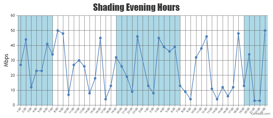
—
Thangaraj Raman
Team CanvasJSIt is not possible to add a spinner for individual charts within a stockchart as of now, however, you can add it at the stockchart level.
Please check this updated JSFiddle for a working example.
—
Thangaraj Raman
Team CanvasJSPlease check this JSFiddle for an example on adding a spinner icon before chart is rendered.
Also please refer to this forum thread for more information on the same.
—
Thangaraj Raman
Team CanvasJSGlad that you were able to make it work. If you have any further queries or facing any other issues, kindly create a JSFiddle with your use case and share it with us so that we can look into the code / chart-options being used, understand the scenario better and help you out?.
—
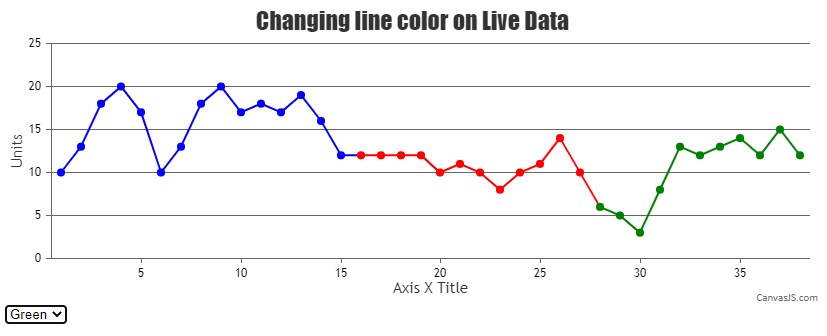
Thangaraj Raman
Team CanvasJSYou can update lineColor and markerColor based on change in the dropdown(or after button click in your case) to achieve your requirement.
Please check this JSFiddle for a working example.
—
Thangaraj Raman
Team CanvasJSIt is possible to create ripple animation for just a single dataPoint by updating the markerBorderColor at the dataPoint level instead of the dataSeries level.
Please check this updated JSFiddle for a working example.
—
Thangaraj Raman
Team CanvasJS