Login to Ask a Question or Reply
Forum Replies Created by Thangaraj Raman
-
You can pass x-value in date-time format and use valueFormatString to define how axis labels must be formatted before they appear on the x-axis.
—
Thangaraj Raman
Team CanvasJSPlease refer to this page for step by step tutorial on Creating Chart with data from JSON. The data from the JSON has to be parsed in the format accepted by CanvasJS.
—
Thangaraj Raman
Team CanvasJSIt looks like the sample provided by you is restricted and requires permission. Can you please make the image / sample public so that we can access it?
If the Google Drive link shared contains an image, can you kindly create JSFiddle reproducing the issue you are facing & share it with us so that we can look into the code / chart-options being used, understand the scenario better and help you out?
—
Thangaraj Raman
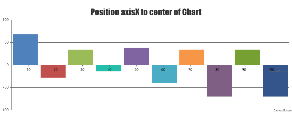
Team CanvasJSIt is not possible to position the axis to the center of the chart as of now. However, you can work around this by using multiple charts to achieve your requirement.
Please check this JSFiddle for a working example.
—
Thangaraj Raman
Team CanvasJSYou can use the indexLabelFormatter function to display custom index labels as per your requirement. Please take a look at the code-snippet given below.
indexLabelFormatter: function(e) {
    var s = e.dataPoint.y % 1; s *= 60;
    var m = e.dataPoint.y % 60;
    var h = (e.dataPoint.y - m) / 60;
    return (h < 10 ? "0" : "") + h.toString() + ":" + (m < 10 ? "0" : "") + Math.trunc(m).toString() + ":" + (s < 10 ? "0" : "") + s.toString();
},
—
Thangaraj Raman
Team CanvasJSThe trial version is meant for evaluation purposes for 30 days. You will need a license to use it in commercial applications, please check out License page for more information. One of our sales representatives will get in touch with you soon for further assistance on licensing. For further queries related to sales please contact sales[at]canvasjs[dot]com.
—
Thangaraj Raman
Team CanvasJSThe chart’s X-axis and Y-axis lines and labels will be positioned to the bottom and left in the case of primary axis and to the top and right in the case of secondary axis. If you are looking to draw a horizontal or vertical line in the middle of the chart, you can use stripLines.
—
Thangaraj Raman
Team CanvasJSTo check the minimum or maximum value of the chart’s X-axis, you can use the axis get method. Please take a look at the code-snippet given below.
chart.axisX[0].get("minimum");
chart.axisX[0].get("maximum");
—
Thangaraj Raman
Team CanvasJSOctober 14, 2022 at 6:15 pm in reply to: Date picker button present on dialog box is not accessible with keyboard. #39350CanvasJS stockcharts plots all the chart elements on HTML5 canvas element, which is considered as an image by the narrator. Hence it’s not possible to have accessibility for input fields as of now. However, you can pass aria-label field to the entire chart to achieve accessibility. Please take a look at this JSFiddle for an example on the same.
Also, please refer to this forum thread for more information.
—-
Manoj Mohan
Team CanvasJSIn the JSFiddle that you have shared, you are not setting the X-axis minimum or maximum. Setting the minimum and maximum value for X-axis seems to be working fine for both date-time and numerical values.
If you are still facing issues, kindly update the JSFiddle with your use case and share it with us so that we can look into the code / chart-options being used, understand the scenario better and help you out.
—
Thangaraj Raman
Team CanvasJSCan you kindly create JSFiddle reproducing the issue you are facing & share it with us so that we can look into the code / chart-options being used, understand the scenario better and help you out?
From what we have observed, sometimes things get delayed mostly when we are not able to reproduce the issue or not able to understand the exact scenario, or the solution that we provide may not work properly due to the variation in chart options being used by you and us.
Having a JSFiddle helps us in figuring out the issue and suggesting an appropriate solution accordingly.
—
Thangaraj Raman
Team CanvasJSGlad that you were able to make it work. If you have any further queries or facing any other issues, kindly create a JSFiddle with your use case and share it with us so that we can look into the code / chart-options being used, understand the scenario better and help you out.
—
Thangaraj Raman
Team CanvasJSYou can scale-up or scale-down the chart before exporting using exportChart method and reset it back soon after exporting. Please refer to this forum thread for more information.
Please check this JSFiddle for a working example.
—
Thangaraj Raman
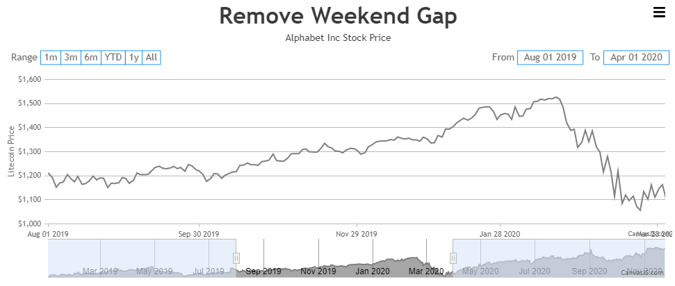
Team CanvasJSYou can use customBreaks for removing weekend gap from the chart. With the use of scale breaks, there are possibilities that the axis labels may appear at an unequal interval and they may overlap with each other. You can overcome this by using stripLines for labels.
Please take a look at this JSFiddle for an example on the same.
—
Thangaraj Raman
Team CanvasJSYou can try lazy loading the charts. We have tested the same using jquery.inview & it seems to perform better compared to the regular way of rendering charts / stockcharts.
Please check this JSFiddle for a working example.
—
Thangaraj Raman
Team CanvasJS