Login to Ask a Question or Reply
Forum Replies Created by Sunil Urs
-
Theo,
Most browsers have a limit on the size of Canvas Element. Chrome and Firefox have a limit of 32767 Pixels. May I know why you are trying to render such a large Chart?
—
SunilHi,
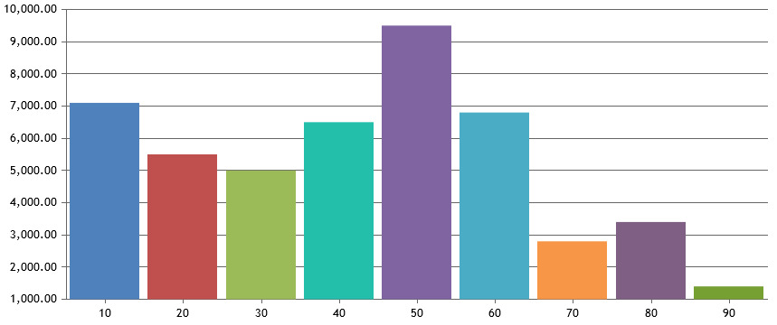
I did not exactly understand what you meant by “put value mask to REAL”. But if you just trying to format numbers with two decimal values, you can use Format String “#,##0.00”.
Here is an example https://jsfiddle.net/canvasjs/ovhLqdr2/1/ – you can see Y Labels formatted with two decimal points.

If this doesn’t answer your question, please explain in detail with few example values and how you want it to be formatted.
—
Sunil UrsJune 11, 2018 at 10:46 am in reply to: how to use with Jquery to dynamic show dynamic number of dynamic graph #21044Martin,
Can you please explain the issue you are facing? It would also be useful if you can create a jsFiddle demonstrating the issue with minimal code.
If you are just looking for an example using jQuery, here is one.
—
Sunil UrsAarti,
From your other post I can see that you were able to make it work at your end. So am closing this post
—
Sunil UrsMichael,
Is this issue happening only in certain situations or always? Can you see charts on our website when you browse using Android P Chrome Browser?
—
Sunil ursAkshay,
Chart doesn’t automatically group dataPoints by its label. In fact whenever only label is given (without x), internally it assigns x values to dataPoints in an order. So, there can be different dataPoints with same x value but different label.
So, only way to achieve this is to set x value to each dataPoint as required.
—
Sunil UrsSubhra,
In order to render chart on the server side you would require a headless browser like PhantomJS. Here is an article which might help.
—
Sunil UrsCarlo,
Can you please check if there is any error being shown in Chrome Developer Console??
—
Sunil UrsRyan,
You can use stripLines to set different background color for different range of values. Here is an example.
Charts don’t have a Zoom Bar yet. But it allows you to switch between Zooming & Panning mode via a Toolbar at the top right.
—
Sunil UrsOctober 17, 2016 at 10:18 pm in reply to: Showing #total inside a regular label or just on hover #12819Jansen,
Sorry, but #total is not available in Format Strings because they are meant to specify formatting x/y values only. Also, #total is only available in Stacked, Pie and Doughnut Charts. But you can customise toolTip and indexLabel via a custom formatter of your own – you’ll have to write some additional code to find the total. Please refer to following links on the same.
—
Sunil UrsOctober 13, 2016 at 12:51 pm in reply to: Using StackedArea100 % chart not covering full background #12724Akshada,
We can surely help you with this. Can you please create a jsfiddle which reproduces the issue so that we can understand it better?
—
Sunil UrsEmily,
Thanks for reporting. We’ll look into the issue and get back at the earliest.
—
Sunil UrsMiroslav,
We are exposing some new APIs in couple of weeks which will provide co-ordinates of Title and other Chart elements. Using this along with a couple of lines of jQuery code, you should be able to detect if the user clicked on Title.
—
Sunil UrsPooja,
Can you please explain what you mean by outline? Do you mean to say a border around the Chart??
—
Sunil UrsJagadesan,
Can you please share your code via Google Drive / One Drive so that we can download and have a look??
—
Sunil Urs