Login to Ask a Question or Reply
Forum Replies Created by Shashi Ranjan
-
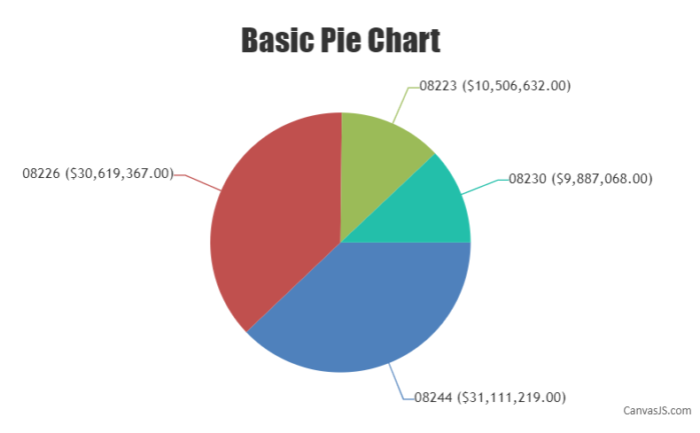
Since you are trying to use two values(y-value & label) in indexLabel, using indexLabelFormatter and formatNumber method to customize each of the values before displaying them as indexLabel should work fine. The code snippet below shows how you can achieve the same:
indexLabelFormatter: function(e){
      return CanvasJS.formatNumber(e.dataPoint.label, "0####") + " (" + CanvasJS.formatNumber(e.dataPoint.y, "$#,##0.00\"\"") + ") " ;
    }
Please take a look at this JSFiddle for a working example with sample code.
—
Shashi Ranjan
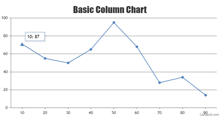
Team CanvasJSLine chart accepts only one y-value but in the JSFiddle shared above you are looking to plot a range of y-value(two y-value) for on the same x-value. In such cases where y-values have a range, you can try using the Range Area Chart or Range Spline Area Chart.
However, as your requirement is to plot a dataPoint at y-value 71 and want to display it as 87 in toolTip you can use toolTipContent property instead of passing two y-values as shown in the code snippet below:
{ x: 10, y: 71, toolTipContent: "{x}: 87", markerType:"triangle" }Please take a look at this updated JSFiddle for a working example with sample code.
—
Shashi Ranjan
Team CanvasJSGlad you figured it out :)
Axis minimum and maximum values are auto-calculated and are based on multiple factors like the number of dataPoints, range of dataPoint values, height and width of the chart, etc. You can override easily override these values by setting a custom minimum and maximum value for the axis.
—
Shashi Ranjan
Team CanvasJSAs of now, we do not support multiple ToolTips on a chart. However, you can use the toolTip shared property to display all the values of y from each series next to their name for the corresponding x-value in a common bubble.
—
Shashi Ranjan
Team CanvasJSCan you kindly create a sample project reproducing the issue you are facing and share it with us over Google-Drive or Onedrive along with the sample data so that we can run the code locally at our end, understand the scenario better and help you out?
Unless we run your code locally it’s difficult to reproduce the issue or understand your exact requirements or the solution that we provide may not work properly due to the variation in chart-options being used by you and us.
A sample project helps us in figuring out the issue and suggesting an appropriate solution accordingly.
—
Shashi Ranjan
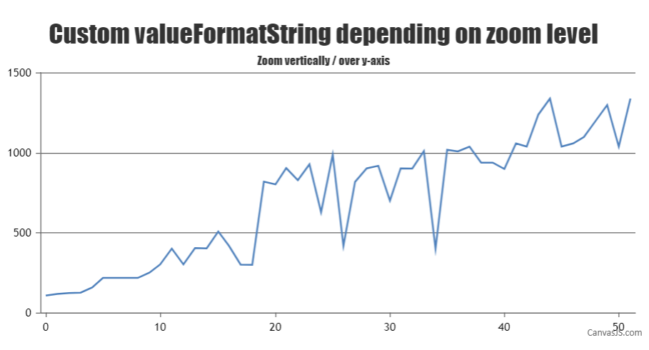
Team CanvasJSThe precision level of Axis-Y labels depends on multiple factors such as range of axis(minimum and maximum), interval and the dataSeries, etc.
You can change axis label’s decimal value precision by setting valueFormatString as shown below:
axisY:{
	valueFormatString: "###0.00", //axisY labels with values upto two decimal places
}
While zooming, you can further increase or decrease the precision of axis labels based on the zoom level by updating valueFormatString when the rangeChanged event is triggered. The code snippet below shows how you can achieve the same:
function customAxisLabel(e) {

  var viewportRange = e.chart.axisY[0].viewportMaximum - e.chart.axisY[0].viewportMinimum;

  if(!e.chart.options.axisY)
    e.chart.options.axisY = {};

  if(e.trigger === "reset") {
    e.chart.options.axisY.interval  = null;
    e.chart.options.axisY.valueFormatString = "####0"
  }
  else {
    if(viewportRange > 1000) {
      e.chart.options.axisY.valueFormatString = "###0";
    }
    else if(viewportRange <= 1000 && viewportRange > 100) {
      e.chart.options.axisY.valueFormatString = "###0.00";
    }
    else {
      e.chart.options.axisY.valueFormatString = "###0.0000";
    }
  }

  chart.render();

}
Please take a look at this JSFiddle for a working example with a sample code.
—
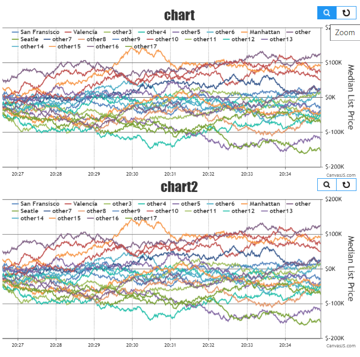
Shashi Ranjan
Team CanvasJSYes, it is possible to sync zoom / pan button across multiple charts. You can achieve this by triggering the click event on the zoom / pan button on all charts when a user clicks on it in one of the charts as shown below:
function syncZoomPanButtonClick() {
  var toolbars = document.getElementsByClassName("canvasjs-chart-toolbar");
  for(var j = 0; j < toolbars.length; j++) {
    toolbars[j].firstChild.addEventListener("click", function(e) {
      for(var j = 0; j < toolbars.length; j++){
        if(this != toolbars[j].firstChild && e.isTrusted === true) {
          toolbars[j].firstChild.click();
        }
      }
    });
  }
}
Please take a look at this JSFiddle for a working example with sample code.
—
Shashi Ranjan
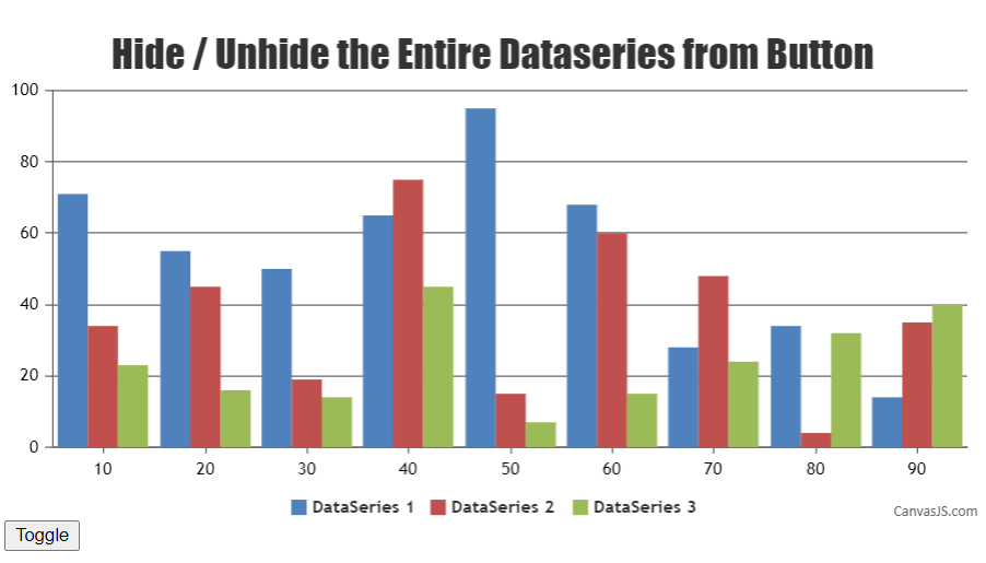
Team CanvasJSYou can toggle the visibility of a dataSeries by setting visible property. Updating visible property programmatically on clicking legend or button should work fine in this case. Please find the code-snippet for toggling dataSeries below.
var button = document.getElementById( "toggleDataSeries" );
button.addEventListener( "click",  toggleDataSeries);

function toggleDataSeries(e) {
  var data = chart.data;

  for(var i = 0; i < data.length; i++) {
    chart.options.data[i].visible = !data[i].visible;
  }

  chart.render();
}
Please take a look at this JSFiddle for a working example with sample code.
—
Shashi Ranjan
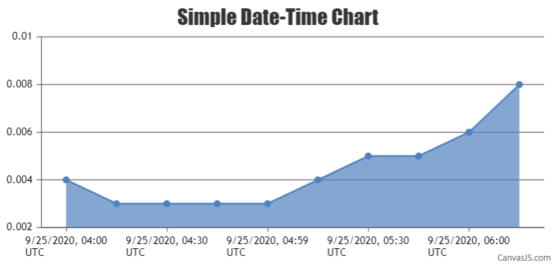
Team CanvasJSWhen we use the x-values for dataPoint, axis Labels are not shown for dataPoint but at every interval of the axis. As you are looking to display axis label at specified dataPoint value using label property in dataPoint along with the x-value should work fine.
To achieve this, you can pass a custom attribute(for example,
"time") that will store timestamp values to each dataPoint object. The initial options to dataPoints array will be like:[ { "time": 1601006400003, "y": 0.004 }, { "time": 1601007299997, "y": 0.003 }, { "time": 1601008200000, "y": 0.003 } ]Just before rendering the chart, we will add the label property with timestamp value converted to UTC and x-value with average offset value between subsequent timestamps(x-values are used here for setting interval). Below is the code snippet for achieving the same:
let date = new Date(dataPoints[i].time);
dataPoints[i].label = date.toLocaleDateString("en-US", localeOptions);
dataPoints[i].x = i * 15; //15 minutes is average difference between timestamp values
You can also refer to this update JSFiddle for a working example with sample code.
—
Shashi Ranjan
Team CanvasJSGlad that you figured it out :)
You can also follow the below guidelines for more optimization:
1. If your page has dynamic charts, update chart options and re-render and don’t instantiate / create new chart on every update.
2. If you are populating data from JSON or CSV using AJAX, instantiate chart once and update data within AJAX request and do not instantiate / create new chart within every AJAX request.—
Shashi Ranjan
Team CanvasJSJavaScript’s Date object tracks time in UTC internally, but typically accepts input and produces output in the local time of the system it’s running on. As you are looking to display time in a particular timezone, you can use the toLocaleString() method to convert a Date object to a string, using locale settings. You can output dates that are in UTC or local time to a specific timezone by passing timeZone option to toLocaleString() and its variations. For example:
var dateTime = new Date("2021-03-09T00:00:00.000+08:00");
dateTime.toLocaleString('en-US', { timeZone: 'America/New_York' })
//=> "3/8/2021, 11:00:00 AM"
// (midnight in China on March 9th is 11:00 AM in New York on March 8th)
You can also refer to this Stack Overflow thread for more information on initializing JavaScript date object to a particular timezone.
—
Shashi Ranjan
Team CanvasJSCanvasJS library is based on JavaScript and can be integrated with any framework or library that supports JavaScript. Below I have mentioned the steps for creating a Lightning App and integrating CanvasJS with it.
Please refer to the step below for creating a Lightning App:
- Open the Developer Console.
- Open the New Lightning Bundle panel for an Aura component(Select File > New > Lightning Component).
- Specify Name and Description of the component, click Submit and Implement the application
- For Saving the file: click File > Save(to save the file) or, press Ctrl + S
- To get preview of the application in the browser: click Preview(upper right corner)
Now that the app is created, you can use the below code in your app, js and cmp files for completing the integration.
CanvasJSLightningApp.app:
<aura:application >
	 <c:CanvasJSLightningComponent />
</aura:application>
CanvasJSLightningComponent.cmp:
<aura:component implements="flexipage:availableForAllPageTypes" access="global">
    <ltng:require scripts="/resource/jquery,/resource/canvasjs" afterScriptsLoaded="{!c.renderChart}"/>
    <div aura:id="chartContainer" style="width: 100%; height: 360px;"></div>
</aura:component>
CanvasJSLightningComponentController.js:
({
  renderChart : function(component, event, helper) {
    new CanvasJS.Chart(component.find("chartContainer").getElement(), {
      title: {
        text: "CanvasJS Chart - Salesforce Lightning App"
      },
      data: [{
        type: "funnel",
        dataPoints: [
          { y: 100, label: "Apple" },
          { y: 63, label: "Orange" },
          { y: 35, label: "Banana" },
          { y: 15, label: "Mango" },
          { y: 5, label: "Grape" }
        ]
      }]
    }).render();
  }
})
You can also refer to this Github Repo for the working code that can be used for integration of CanvasJS with Lightning App.
—
Shashi Ranjan
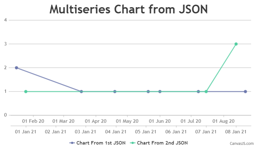
Team CanvasJSFebruary 22, 2021 at 11:20 pm in reply to: How to dynamically display two differents dates in the X axis? #32845Creating a chart with two dataSeries(of type line) is definitely possible with CanvasJS and this concept is known as multiseries chart. In this scenario, you just have to make two AJAX call in an order(one after the other), parse the data in the format accepted by CanvasJS for the respective dataSeries and call render method. To make sure that both the APIs are called in an order, you can perform jQuery.getJSON() method inside jQuery.when() and .then() method. Code snippet below shows how this can be achieved:
$.when($.getJSON("https://api.npoint.io/eef1138dc72b4ac725d2", function(data){
  for (var i = 0; i < data.length; i++) {
    dataPoints1.push({
      x: new Date(data[i].partialDate),
      y: data[i].partialCount
    });
  }
})).then(function(){
  $.getJSON("https://api.npoint.io/4eba2d1dbcc0c16e5bcc", function(data){
    for (var i = 0; i < data.length; i++) {
      dataPoints2.push({
        x: new Date(data[i].partialDate),
        y: data[i].partialCount
      });
    }
    chart.render();
  })
})
You can also set axisXIndex for a respective dataSeries in order to have a seperate X-Axis for it. Please take a look at this JSFiddle for an example on the same.
—
Shashi Ranjan
Team CanvasJSFebruary 15, 2021 at 7:22 pm in reply to: Start animation on reaching viewport or scrolling down the page #32793The JSFiddle that you have shared above seems to be not working. Please take a look at this updated JSFiddle which is created based on the code that you have shared and rendering chart upon scroll seems to be working fine.
—
Shashi Ranjan
Team CanvasJSYou can search for any content related to CanvasJS API or forum topics in the search form provided in the top-right corner of the page. In the screenshot below, I have highlighted the search form towards the top-right corner.

—
Shashi Ranjan
Team CanvasJS