Login to Ask a Question or Reply
Forum Replies Created by Indranil
-
April 19, 2021 at 6:40 pm in reply to: Time showing issue in Combination of Range and line chart #34013
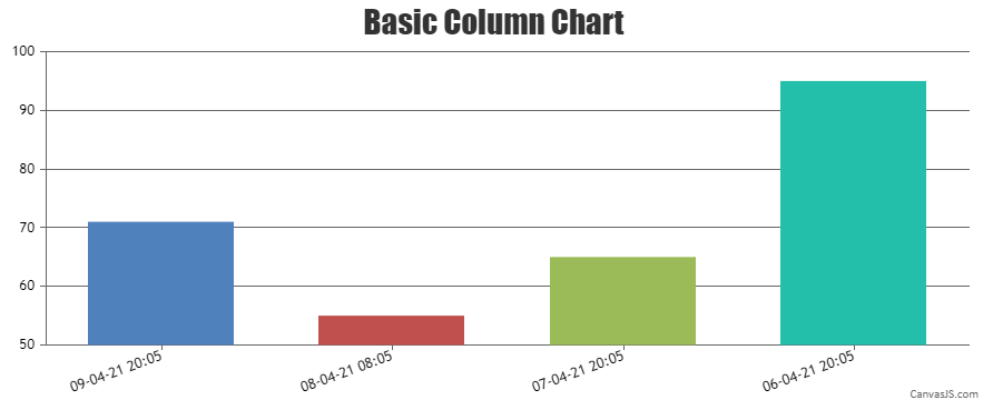
Labels are rendered at every interval on the axis and not to every dataPoint. However, if you like to show labels to dataPoint, you can use label property instead of x-value as shown in the code snippet below –
data: [{
  dataPoints: [
    { label: CanvasJS.formatDate(new Date('2021-04-09T20:05:25.000+05:30'), "DD-MM-YY HH:mm"), y: 71 },
    { label: CanvasJS.formatDate(new Date('2021-04-08T08:05:25.000+05:30'), "DD-MM-YY HH:mm"), y: 55 },
    { label: CanvasJS.formatDate(new Date('2021-04-07T20:05:25.000+05:30'), "DD-MM-YY HH:mm"), y: 65 },
    { label: CanvasJS.formatDate(new Date('2021-04-06T20:05:25.000+05:30'), "DD-MM-YY HH:mm"), y: 95 },
  ]
}]
Also, please take a look at this JSFiddle for complete working code.
___________
Indranil Deo
Team CanvasJSCan you kindly create a sample project reproducing the issue you are facing and share it with us over Google-Drive or Onedrive along with sample data so that we can look into your code, run it locally at our end to understand the scenario better, and help you out?
From what we have observed, sometimes things get delayed mostly when we are not able to reproduce the issue at our end or not able to understand the exact requirements or due to the variation in chart-options being used by you and us. Because of these reasons we expect you to share sample project along with sample data(dummy data) which helps us run it locally at our end to understand the use case and help you resolve it.
___________
Indranil Deo
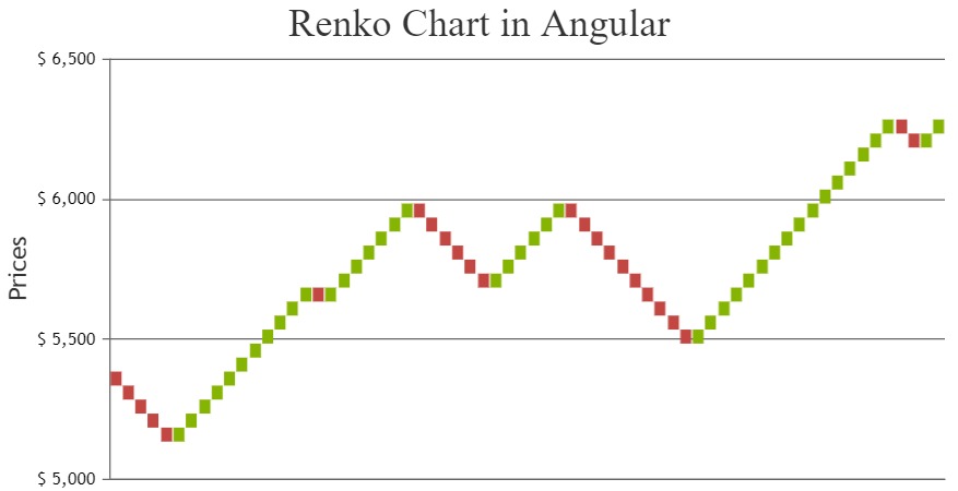
Team CanvasJSYou can define a function to perform the manipulation to create dataPoints for Renko chart and call the same function inside the class before rendering the chart as shown below –
renderRenko(brickSize, data) {
    var newDataPoints = [];
    var oldValue = data[0].dataPoints[0].y[3];
    var difference = 0;
    var newValue, dataPoint, xValue;
    for (var i = 1; i < data[0].dataPoints.length; i++) {
      dataPoint = data[0].dataPoints[i].y[3];
      xValue = CanvasJS.formatDate(data[0].dataPoints[i].x, "MMM-YYYY");
      difference = dataPoint - oldValue;
      if(difference > 0 && difference > brickSize) {
        for(var j = 0; j < Math.floor(difference / brickSize); j++) {
          newValue = oldValue + brickSize;
          newDataPoints.push({content: xValue, y: [oldValue, newValue], color: "#86B402"});
          oldValue = newValue;
        }
      }
      else if(difference < 0 && Math.abs(difference) > brickSize) {
        for(var j = 0; j < Math.floor(Math.abs(difference) / brickSize); j++) {
          newValue = oldValue - brickSize;
          newDataPoints.push({content: xValue, y: [oldValue, newValue], color: "#C24642"});
          oldValue = newValue;
        }
      }
    }
    var newData = [{
      type: "rangeColumn",
      toolTipContent: "<b>{content}</b> <br> {y[0]} - {y[1]}",
      dataPoints: newDataPoints
    }];
    return newData;
}
export class AppComponent { ngOnInit() { . . . . chart.options.data = this.renderRenko(50, data); chart.render(); }Please take a look at this StackBlitz for a working example.
___________
Indranil Deo
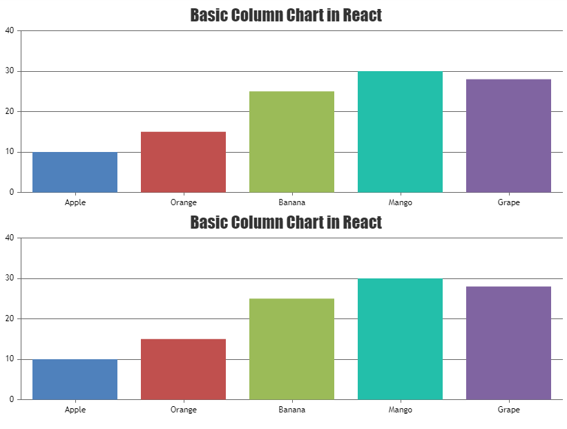
Team CanvasJSIn the code shared by you, there is a syntax error while pushing the chart-options to the options array. Pushing the chart-options as shown in the code snippet below should work fine –
options.push({
  title: {
    text: "Basic Column Chart in React"
  },
  data: [{
    type: "column",
    dataPoints: [
      { label: "Apple",  y: 10  },
      { label: "Orange", y: 15  },
      { label: "Banana", y: 25  },
      { label: "Mango",  y: 30  },
      { label: "Grape",  y: 28  }
    ]
  }]
})
Please take a look at this StackBlitz example for a working code.
___________
Indranil Deo
Team CanvasJSPlease follow the below steps to import CanvasJS in your Angular project.
1. Download the trial version of CanvasJS library package from the download page – https://canvasjs.com/download-html5-charting-graphing-library/?f=chart
2. Extract the files, and copy canvasjs.min.js.
3. Paste canvasjs.min.js in your angular_project/src/assets file.In case you are still facing the issue please create a sample project reproducing the issue you are facing and share it with us over Google-Drive or Onedrive along with sample data so that we can look into your code, run it locally at our end, and help you out.
___________
Indranil Deo
Team CanvasJSApril 2, 2021 at 6:35 pm in reply to: Chart not visible until screen size is changed in React #33828Can you kindly create a sample project reproducing the issue you are facing and share it with us over Google-Drive or Onedrive along with sample data so that we can look into your code, run it locally at our end to understand the scenario better, and help you out?
___________
Indranil Deo
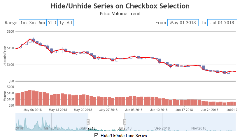
Team CanvasJSYes, you can show a line series when a checkbox is checked and hide it when the checkbox is unchecked by toggling the visible property.
Please take a look at this StackBlitz for an example.
___________
Indranil Deo
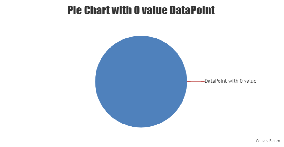
Team CanvasJSIt is not possible to show dataPoint with 0 value on pie chart as of now. However, indexLabel for dataPoints with 0 value is displayed. In your case, you can pass dataPoints with negligible values along with 0 value dataPoint and indexLabel.
Please take a look at this JSFiddle for an example.
___________
Indranil Deo
Team CanvasJSCan you kindly create a sample project reproducing the issue you are facing and share it with us over Google-Drive or Onedrive along with sample database so that we can look into your code, run it locally at our end to understand the scenario better, and help you out?
___________
Indranil Deo
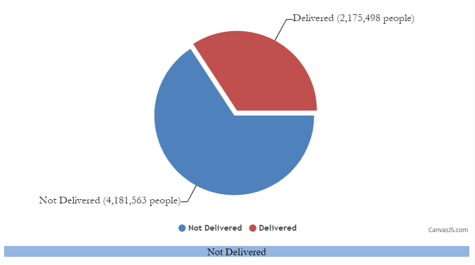
Team CanvasJSYou can create DIV containers corresponding to each dataPoint as shown below –
<div id="DevJan" style="height: 17px; width: 100%;"> Delivered </div>
<div id="NotDevJan" style="height: 17px; width: 100%;"> Not Delivered</div>
Then, hide/unhide the specific DIV container using jQuery as shown in the below code snippet –
click: function (e){
  if( e.dataPoint.dataPoints === "Delivered"){
    $("#DevJan").show();
    $("#NotDevJan").hide();
  }else{
    $("#DevJan").hide();
    $("#NotDevJan").show();
  }
},
Please take a look at this JSFiddle for a working example.
___________
Indranil Deo
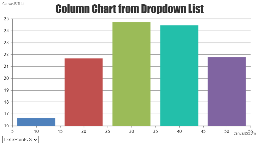
Team CanvasJSTo modify a chart based on dropdown selection you need to update the chart options / data according to the options selected from the dropdown list using the ngModelChange event. Please check the code snippet below –
HTML
<select [(ngModel)]="selectedValue" (ngModelChange)='onChange($event)'>
  <option *ngFor="let option of options" [value]="option.id">
    {{option.name}}
  </option>
</select>
TS
onChange(val:any){
  let dps = this.jsonData[val];
  this.chart.options.data[0].dataPoints = dps;
  this.chart.render();
}
Also, kindly take a look at this StackBlitz for a working example.
___________
Indranil Deo
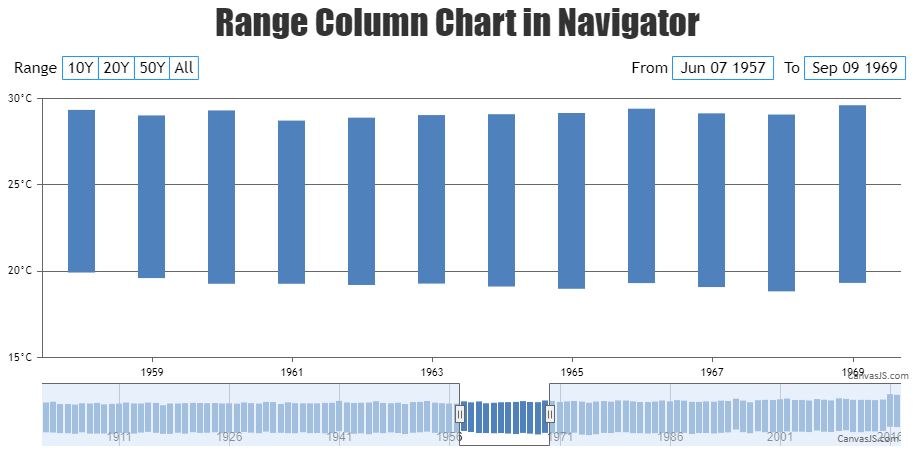
Team CanvasJSYes, rangeColumn chart is supported within the navigator of StockChart. Please take a look at this JSFiddle for a working example.
Also, please refer StockChart Gallery for more examples with plenty of use-cases in StockChart.
___________
Indranil Deo
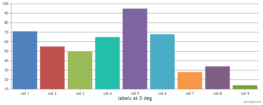
Team CanvasJSGlad that you figured it out. Based on the JSFiddle provided by you the axis labels are not in italic font style, instead, the axis labels are rotated. You can rotate the labels to your desired angle by setting the labelAngle property as shown in the code snippet below –
axisX:{
   labelAngle: 0
}
___________
Indranil Deo
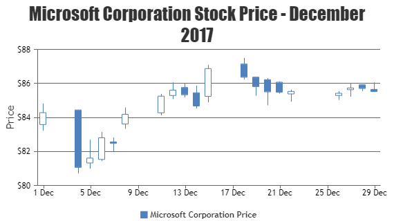
Team CanvasJSYou can set the minimum and maximum of x-axis as a Date object or a timestamp and use valueFormatString to format the axis labels as shown in the code snippet below –
With Date object –
axisX:{
  interval: 30,
  intervalType: "minute",
  minimum: new Date(2012, 01, 03, 09, 00),
  maximum: new Date(2012, 01, 03, 17, 00),
  valueFormatString: "hh:mm tt"
},
With Timestamp –
axisX:{
  interval: 30,
  intervalType: "minute",
  minimum: 1328239800000,
  maximum: 1328268600000,
  valueFormatString: "hh:mm tt"
},
Please take a look at this gallery example to render chart with timestamp in React. Also, kindly check this documentation page for information on rendering chart with date-time axis.
___________
Indranil Deo
Team CanvasJSFrom the error shown above, it seems the HTML DOM container with id
chartContainerLis not loaded when the chart is created. Can you kindly create a sample project reproducing the issue you are facing and share it with us over Google-Drive or Onedrive along with the JSON/sample data so that we can run it locally to understand the scenario better and help you out?___________
Indranil Deo
Team CanvasJS