Login to Ask a Question or Reply
Forum Replies Created by Indranil
-
June 13, 2021 at 2:39 pm in reply to: React stockchart auto range changing on yaxis not working.not working #34605
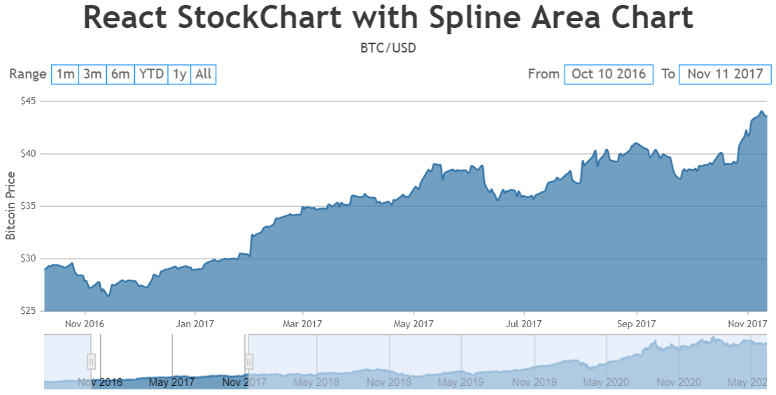
Based on the data provided by you we observed that the x-values(dates) are not sorted. Hence, sorting the data in ascending order with respect to dates seems to be working fine. Please check the below code snippet to sort data in React –
componentDidMount() {
    //Reference: https://reactjs.org/docs/faq-ajax.html#example-using-ajax-results-to-set-local-state
    fetch("https://financialmodelingprep.com/api/v3/historical-price-full/AAPL?apikey=demo")
      .then(res => res.json())
      .then(
        (data) => {
          var dps = [];
          var dataPoints = data.historical;
          for (var i = 0; i < dataPoints.length; i++) {
            dps.push({
              x: new Date(dataPoints[i].date),
              y: Number(dataPoints[i].close)
            });
          }

          //sorting dataPoints in ascending order with respect to x-values
          dps.sort(this.compareDataPointXAscend);

          this.setState({
            isLoaded: true,
            dataPoints: dps
          });
        }
     )
 }

 compareDataPointXAscend(dataPoint1, dataPoint2) {
     return dataPoint1.x.getTime() - dataPoint2.x.getTime();
 }
Also, kindly take a look at this working sample project to sort the data with respect to dates in React. Please refer to the instructions.txt file for steps to deploy the sample.
___________
Indranil Deo
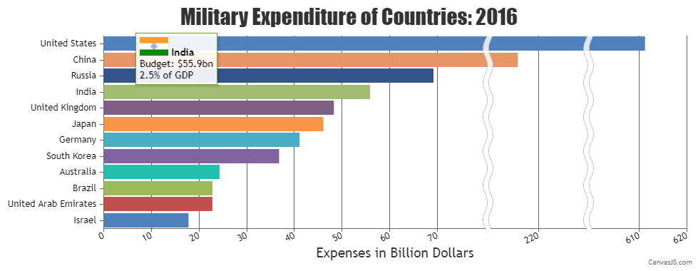
Team CanvasJSYou can use toolTipContent to add image inside the toolTip as shown in the code snippet below –
toolTipContent: "<img src=\"https://canvasjs.com/wp-content/uploads/images/gallery/javascript-column-bar-charts/\"{url}\"\" style=\"width:40px; height:20px;\"> <b>{label}</b><br>Budget: ${y}bn<br>{gdp}% of GDP",Please take a look at this gallery page for an example along with working code on the same.
___________
Indranil Deo
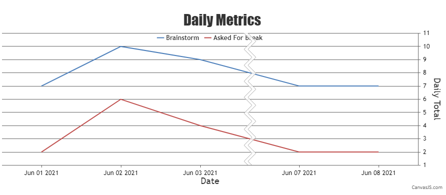
Team CanvasJSBy default, the collapsed region is highlighted using scaleBreaks which can be further hidden by setting the spacing and lineThickness properties.
Please take a look at the below code snippet to show scaleBreaks over the collapsed region –
axisX: {
   "valueFormatString":null,
   "title":"Date",
   scaleBreaks: {
      autoCalculate: true,
      collapsibleThreshold: "15%"
   }
},
Also, kindly take a look at this JSFiddle for a working example to show scaleBreaks.
___________
Indranil Deo
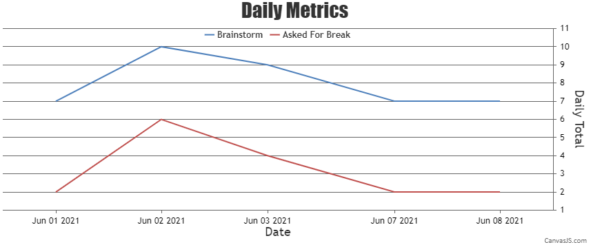
Team CanvasJSWhen the x-values passed are date-time, labels will be rendered at every interval based on the value of intervalType.
For example: if interval is 1 and intervalType is ‘month’ – labels will be shown at every 1 month. Since the axis behaves linearly across the date range it won’t skip months for which there are no dataPoints.
In your case, since you are trying to display axis label for only dataPoint you can use label instead of x.
Alternatively, you can use scaleBreaks to remove the unnecessary region on x-axis as shown in the code snippet below –
axisX: {
   "valueFormatString":null,
   "title":"Date",
   scaleBreaks: {
     autoCalculate: true,
     collapsibleThreshold: "15%",
     lineThickness: 0,
     spacing: 0
   }
}
Please take a look at this updated JSFiddle for an example on removing unnecessary region on x-axis using scaleBreak.

___________
Indranil Deo
Team CanvasJSThanks for reporting the use-case. We will debug and analyze the use-case further to understand the exact scenario and get back to you at the earliest.
___________
Indranil Deo
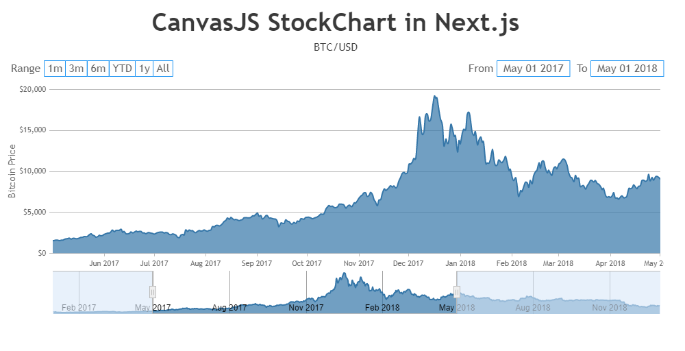
Team CanvasJSThe error “document is not defined” is thrown because document is only available inside the browser and not on the server. Next js executes the code on server side and that’s why the error is thrown.
As a solution, you can use dynamic imports to import a chart component and pass
ssr: falseas the second argument. This way the imported module will only run inside the context of the browser.For example if you want display the Chart as a component then import it dynamically as shown below :
const StockChart = dynamic(() => import("./Chart/StockChart"), { ssr: false });Then use it like a component –
<StockChart />Please take a look at this working sample project to integrate CanvasJS in Next.js. Also, kindly refer to the instructions.txt file for steps to deploy the sample.
___________
Indranil Deo
Team CanvasJSSorry, aligning the indexLabel below the dataPoint marker is not possible as of now.
___________
Indranil Deo
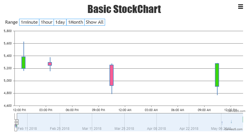
Team CanvasJSon date of 5th feb. there r 3 records. If i filter by month it doesnt sum/average data of 5th feb and show on Y axis. It still show it as different candles
{ x: new Date(2018, 01, 5,12,30,2), y: [5198, 5629, 5159, 5385] },
{ x: new Date(2018, 01, 5,15,30,15), y: [5296, 5378, 5154, 5248] },
{ x: new Date(2018, 01, 5,22,30,15), y: [5254, 5279, 4788, 4924] },The Range Buttons are designed to zoom into a specific range of data and not for sum/average the data. Please check this documentation page for more information.
I get this error: Failed to execute ‘drawImage’ on ‘CanvasRenderingContext2D’: The image argument is a canvas element with a width or height of 0.
I am using canvasjs stockchart and donut chart on same page but different DIV IDs.Can you please create a JSFiddle reproducing the issue you’re facing so that we can look into the code, understand it better and help you out?
___________
Indranil Deo
Team CanvasJSY-Values in candlestick chart is an array of 4 values, but in your code you seem to be passing just one y-value, providing an array of 4 values will work in your case.
Also, the x-axis label format seems to be working fine. The label format is updating to minute, day, month based on the range of the zoomed region. Please take a look at this updated JSFiddle.
If you are still facing the issue, kindly create JSFiddle reproducing the issue you are facing and share it with us along with sample data so that we can look into the code, understand the scenario better and help you out.
___________
Indranil Deo
Team CanvasJSMay 31, 2021 at 6:44 pm in reply to: React stockchart auto range changing on yaxis not working.not working #34473Thanks for reporting the use-case. Based on testing it looks like a bug. We will fix it in our upcoming versions.
___________
Indranil Deo
Team CanvasJSMouse events are captured only when mouse is on top of the chart. Any mouse event fired outside of the chart cannot be captured. Hence, it is not possible to trigger the zoom when mouse event is fired out of the chart as of now.
However, we will reconsider this behavior in future releases.
___________
Indranil Deo
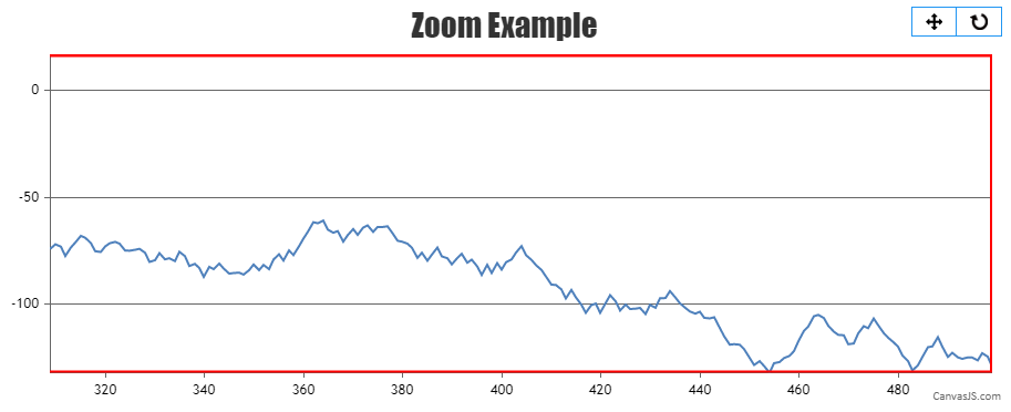
Team CanvasJSTo zoom into the extreme end of the plot area, you need to first check difference between the viewportMinimum/viewportMaximum and minimum/maximum of axes. If the difference is less than a specified threshold, you can set the viewportMinimum/viewportMaximum to the minimum/maximum value of the axes respectively inside the rangeChanged event handler as shown below –
var extremeRangeThreshold = 30;
.
.
rangeChanged: rangeChangedHandler,
.
.
function rangeChangedHandler(e) {
  if(e.trigger === "reset") {
    chart.options.axisX.viewportMinimum = null;
    chart.options.axisX.viewportMaximum = null;
    chart.options.axisY.viewportMinimum = null;
    chart.options.axisY.viewportMaximum = null;
    chart.render();
    return;
  }

  if(e.trigger === "zoom"){
    if(e.chart.axisX[0].maximum - e.chart.axisX[0].viewportMaximum <= extremeRangeThreshold){
      chart.options.axisX.viewportMaximum = null;
      chart.render();
      chart.options.axisX.viewportMaximum = e.chart.axisX[0].maximum;
    }

    if(e.chart.axisX[0].viewportMinimum - e.chart.axisX[0].minimum <= extremeRangeThreshold){
      chart.options.axisX.viewportMinimum = null;
      chart.render();
      chart.options.axisX.viewportMinimum = e.chart.axisX[0].minimum;
    }

    if(e.chart.axisY[0].maximum - e.chart.axisY[0].viewportMaximum <= extremeRangeThreshold){
      chart.options.axisY.viewportMaximum = null;
      chart.render();
      chart.options.axisY.viewportMaximum = e.chart.axisY[0].maximum;
    }

    if(e.chart.axisY[0].viewportMinimum - e.chart.axisY[0].minimum <= extremeRangeThreshold){
      chart.options.axisY.viewportMaximum = null;
      chart.render();
      chart.options.axisY.viewportMinimum = e.chart.axisY[0].minimum;
    }
    chart.render();
  }
}
Please check this JSFiddle for a complete working code.
___________
Indranil Deo
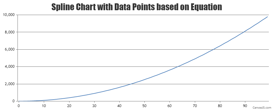
Team CanvasJSYou can generate the dataPoints(x and y-values) based on your formula and render the chart using same. Please check out the below code snippet for generating chart dataPoints using formula –
for (var j = 0; j < dataLength; j++) {
  xVal = j;
  yVal = Math.pow(xVal,2) +  1;
  dps.push({
    x: xVal,
    y: yVal
  });
}
Please take a look at this JSFiddle for a working example.
___________
Indranil Deo
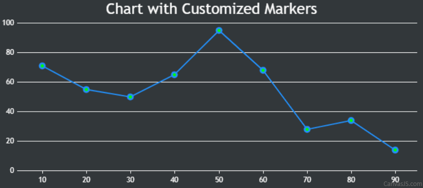
Team CanvasJSYou can customize the line series to highlight the markers using the markerBorderColor, markerBorderThickness, markerColor, etc. properties as shown below –
data: [
  {
    markerBorderColor:"#238EF6",
    markerBorderThickness: 3,
    markerColor: "#00FF00",
    lineColor: "#238EF6",
    type: "line",
    dataPoints: [
      { x: 10, y: 71 },
      { x: 20, y: 55},
      { x: 30, y: 50 },
      { x: 40, y: 65 },
      { x: 50, y: 95 },
      { x: 60, y: 68 },
      { x: 70, y: 28 },
      { x: 80, y: 34 },
      { x: 90, y: 14}
    ]
  }
]
Please take a look at this JSFiddle for a working example. However, creating chart with ripple effect in the dataPoint is not possible as of now.
___________
Indranil Deo
Team CanvasJS