Login to Ask a Question or Reply
You must be logged in to post your query.
Home › Forums › Chart Support › Excluding Date on X Axis when no data
Excluding Date on X Axis when no data
- This topic has 10 replies, 2 voices, and was last updated 5 years, 1 month ago by
Indranil.
-
September 14, 2016 at 1:49 am #12530
Hi,
I am loading a data set that uses date for its x axis. I am seeing a few gaps in the chart, upon inspection it seems that there is an X axis entry being generated for a Date that is not in my data. Is there a way to turn this off?
September 14, 2016 at 1:30 pm #12537gtsafas,
Can you please share a screenshot / jsfiddle so that we can understand the issue better?
—
Sunil UrsSeptember 15, 2016 at 9:27 am #12543Hi Sunil,
I am not allowed to share screenshots and jsfiddle is blocked here. Let me try to explain better.
Assuming the following is true,
1) I have a stacked column graph
2) My x-axis is a date
3) I have data for Jan 1st, Jan 3rd, Jan 4thWhen my graph is rendered it is showing me along the x-axis labels
Jan 1st, Jan 2nd, Jan 3rd, Jan 4th
I do not have any data for Jan 2nd and I dont see it being passed anywhere on my side. Additionally, if I mouse over the gap that Jan 2nd creates I dont get a tooltip, so that leans me even more towards the fact that I am not causing this.
If you guys have an email we can correspond over it, I can share SS there.
Thanks for any help
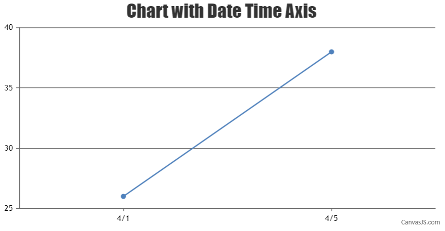
September 16, 2016 at 1:00 am #12549I modified one of your demos below. See how there is only 3/1 and 3/5. I only want to see 3/1 and 3/5 on the x axis. I cant seem to find a setting to do that.
<!DOCTYPE HTML>
<html>
<head>
  <script type="text/javascript">
  window.onload = function () {
    var chart = new CanvasJS.Chart("chartContainer",
    {
      title:{
        text: "Date time axis with interval 3 months"
      },
      axisX:{
        interval: 0,
        intervalType: "day"
      },
      data: [
      {
        type: "line",
        dataPoints: [//array
        {
         x: new Date(2012, 03, 1),
         y: 26,
       },
       {
         x: new Date(2012, 03, 5),
         y: 38
       }

       ]
     }
     ]
   });

    chart.render();
  }
  </script>
  <script type="text/javascript" src="https://cdn.canvasjs.com/canvasjs.min.js"></script>
</head>
<body>
  <div id="chartContainer" style="height: 300px; width: 100%;">
  </div>
</body>
</html>
September 16, 2016 at 10:20 am #12550November 29, 2017 at 9:24 pm #17744Hi, can you explain what to set interval or intervalType to achieve this? I’m also trying to have the chart not display days that have blank data.
November 30, 2017 at 10:56 am #17755When we use the x-values for dataPoint, axis labels are not shown for dataPoint but at every interval of the axis. In your case, as you are trying to display axis label at specified dataPoint you can use label property in dataPoint instead of x-value as shown in the code snippet below –
[
  { label: CanvasJS.formatDate(new Date(2012, 03, 1),"M/D"), y: 26 },
  { label: CanvasJS.formatDate(new Date(2012, 03, 5),"M/D"), y: 38 }
]
Please take a look at this JSFiddle for a working example.
___________
Indranil Deo
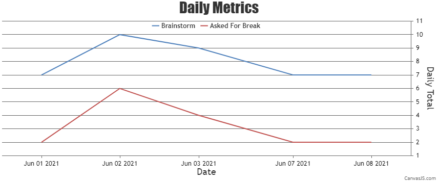
Team CanvasJSJune 8, 2021 at 4:30 am #34546So you are saying there is no option for the default date behavior to not show a date that has no associated data point as ‘gtsafas’ has asked? This seems like a pretty simple option to have. If you are saying to use label, that means that we’d have to loop thru our data to determine the X axis values to use. Not very efficient.
June 8, 2021 at 8:07 pm #34556When the x-values passed are date-time, labels will be rendered at every interval based on the value of intervalType.
For example: if interval is 1 and intervalType is ‘month’ – labels will be shown at every 1 month. Since the axis behaves linearly across the date range it won’t skip months for which there are no dataPoints.
In your case, since you are trying to display axis label for only dataPoint you can use label instead of x.
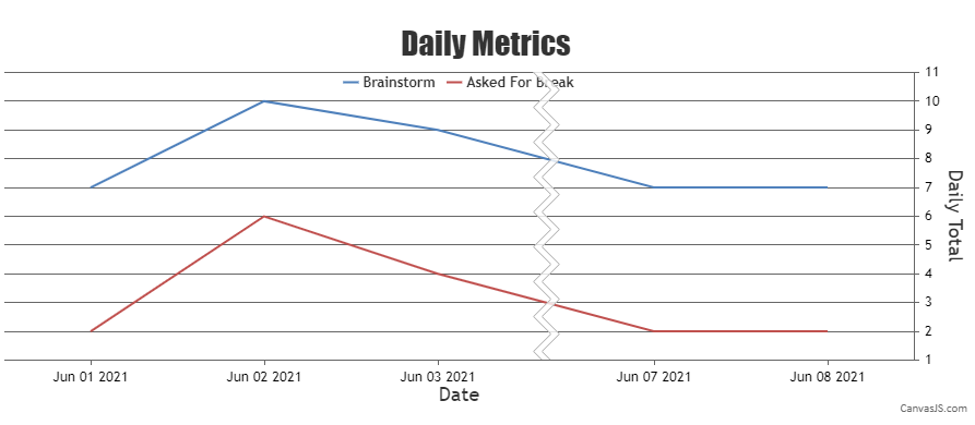
Alternatively, you can use scaleBreaks to remove the unnecessary region on x-axis as shown in the code snippet below –
axisX: {
   "valueFormatString":null,
   "title":"Date",
   scaleBreaks: {
     autoCalculate: true,
     collapsibleThreshold: "15%",
     lineThickness: 0,
     spacing: 0
   }
}
Please take a look at this updated JSFiddle for an example on removing unnecessary region on x-axis using scaleBreak.
___________
Indranil Deo
Team CanvasJSJune 8, 2021 at 9:56 pm #34558Perfect! This works fine, and I can make it mark the chart where there are no datapoints for a better visual.
Thanks
JEJune 9, 2021 at 6:55 pm #34567By default, the collapsed region is highlighted using scaleBreaks which can be further hidden by setting the spacing and lineThickness properties.
Please take a look at the below code snippet to show scaleBreaks over the collapsed region –
axisX: {
   "valueFormatString":null,
   "title":"Date",
   scaleBreaks: {
      autoCalculate: true,
      collapsibleThreshold: "15%"
   }
},
Also, kindly take a look at this JSFiddle for a working example to show scaleBreaks.
___________
Indranil Deo
Team CanvasJS
You must be logged in to reply to this topic.